Wondering how your logo performs? 🧐
Get professional logo reviews in seconds and catch design issues in time.
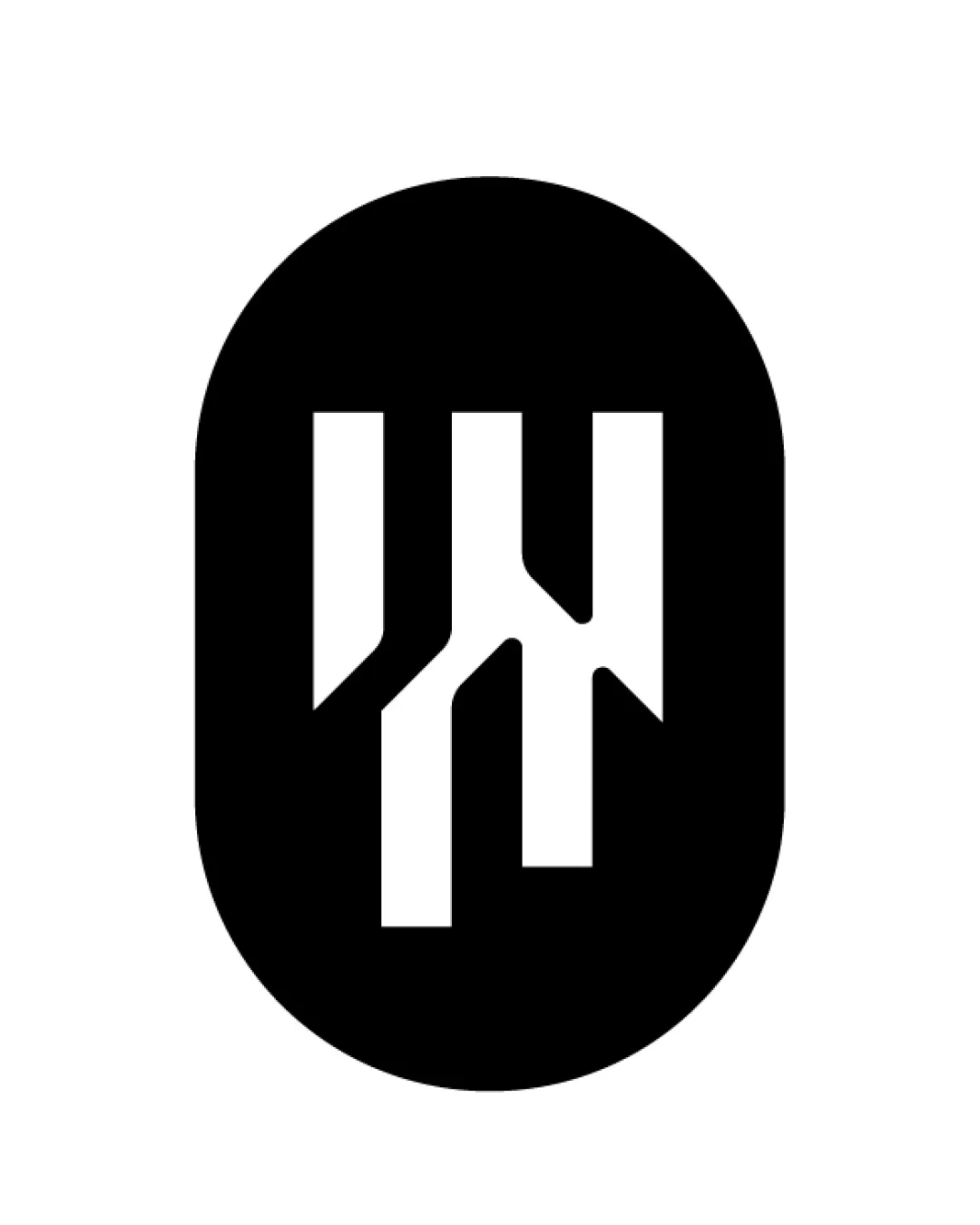
Try it Now!Logo review of nexaview STUDIO
 Logo analysis by AI
Logo type:
Style:
Detected symbol:
Negative space:
Detected text:
Business industry:
Review requested by Frenzypixel
**If AI can recognize or misinterpret it, so can people.
Structured logo review
Legibility
![]() Primary text ('nexaview') is bold and highly readable
Primary text ('nexaview') is bold and highly readable![]() Supporting text ('STUDIO') uses a clean sans-serif for good clarity
Supporting text ('STUDIO') uses a clean sans-serif for good clarity
![]() The intersection of the 'x' and 'a' may cause slight confusion at small sizes or quick glances
The intersection of the 'x' and 'a' may cause slight confusion at small sizes or quick glances![]() Relative size difference between 'nexaview' and 'STUDIO' causes slight visual imbalance
Relative size difference between 'nexaview' and 'STUDIO' causes slight visual imbalance
Scalability versatility
![]() Simple, bold shapes ensure good small-scale readability
Simple, bold shapes ensure good small-scale readability![]() Should reproduce well on business cards and large signage
Should reproduce well on business cards and large signage
![]() Small text ('STUDIO') may be lost at very small sizes such as on app icons or embroidery
Small text ('STUDIO') may be lost at very small sizes such as on app icons or embroidery![]() Framing brackets may become unrecognizable below a certain scale
Framing brackets may become unrecognizable below a certain scale
200x250 px
100×125 px
50×62 px
Balance alignment
![]() Brackets evenly frame the main brand name creating a sense of enclosure
Brackets evenly frame the main brand name creating a sense of enclosure![]() Main text is horizontally centered within the design
Main text is horizontally centered within the design
![]() Vertical spacing between brackets and text can feel slightly tight
Vertical spacing between brackets and text can feel slightly tight![]() The contrast between bold main text and thin subtext can create a slight misalignment in visual weight
The contrast between bold main text and thin subtext can create a slight misalignment in visual weight

Originality
![]() Creative use of viewfinder brackets adds relevance to the studio/media industry
Creative use of viewfinder brackets adds relevance to the studio/media industry![]() Integration of iconography and text is thoughtfully done
Integration of iconography and text is thoughtfully done
![]() Viewfinder/frame motif is moderately common in media logos, reducing full originality
Viewfinder/frame motif is moderately common in media logos, reducing full originality
Logomark wordmark fit
![]() Logomark (brackets) directly supports and emphasizes the wordmark
Logomark (brackets) directly supports and emphasizes the wordmark![]() Visual link between industry and brand name is clear and intentional
Visual link between industry and brand name is clear and intentional
![]() The stylistic difference between the playful bracket curves and the geometric letterforms can feel slightly disconnected
The stylistic difference between the playful bracket curves and the geometric letterforms can feel slightly disconnected
Aesthetic look
![]() Minimalist black-and-white style is modern and professional
Minimalist black-and-white style is modern and professional![]() Overall appearance is bold and attractive—clean without excess decoration
Overall appearance is bold and attractive—clean without excess decoration
![]() Could benefit from a touch more uniqueness to prevent blending into similar industry logos
Could benefit from a touch more uniqueness to prevent blending into similar industry logos
Dual meaning and misinterpretations
![]() No inappropriate or ambiguous visual elements detected
No inappropriate or ambiguous visual elements detected
Color harmony
![]() Restrained to monochrome, ensuring high contrast and broad applicability
Restrained to monochrome, ensuring high contrast and broad applicability![]() No unnecessary or clashing colors
No unnecessary or clashing colors
Black
#000000
Iron
#E0E1DF