Wondering how your logo performs? 🧐
Get professional logo reviews in seconds and catch design issues in time.
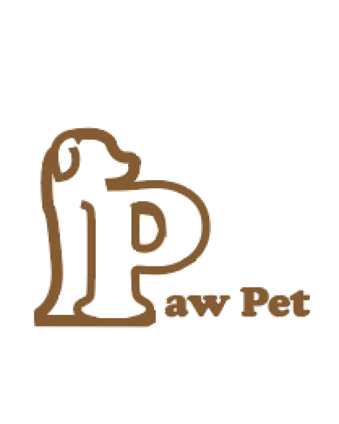
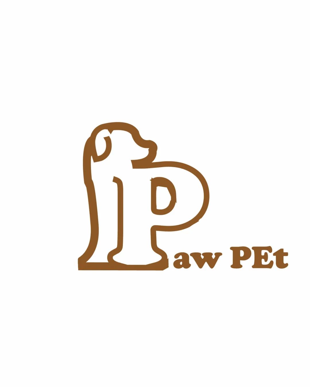
Try it Now!Logo review of Paw PEt
 Logo analysis by AI
Logo type:
Style:
Detected symbol:
Detected text:
Business industry:
Review requested by Madhvi_712
**If AI can recognize or misinterpret it, so can people.
Structured logo review
Legibility
![]() The primary text 'Paw PEt' is readable.
The primary text 'Paw PEt' is readable.![]() Main 'P' is distinguishable from the illustration.
Main 'P' is distinguishable from the illustration.
![]() Lowercase 'aw' and uppercase 'PEt' feel inconsistent and visually awkward.
Lowercase 'aw' and uppercase 'PEt' feel inconsistent and visually awkward.![]() Dog head integrated in 'P' can confuse quick reading.
Dog head integrated in 'P' can confuse quick reading.![]() The thick outline adds visual weight, making small text less clear.
The thick outline adds visual weight, making small text less clear.
Scalability versatility
![]() Bold lines help maintain some clarity when scaled down.
Bold lines help maintain some clarity when scaled down.
![]() Thin details on the dog head may be lost at small sizes (e.g., favicon, embroidery).
Thin details on the dog head may be lost at small sizes (e.g., favicon, embroidery).![]() Outline-heavy style reduces clarity for tiny applications.
Outline-heavy style reduces clarity for tiny applications.![]() May look cluttered or pixelated in very small print.
May look cluttered or pixelated in very small print.
200x250 px
100×125 px
50×62 px
Balance alignment
![]() Central placement of symbol and text beneath aligns logo in a basic way.
Central placement of symbol and text beneath aligns logo in a basic way.
![]() 'P' logomark is much heavier and larger than supporting text, causing imbalance.
'P' logomark is much heavier and larger than supporting text, causing imbalance.![]() Text alignment to the bottom right feels disconnected and not visually anchored.
Text alignment to the bottom right feels disconnected and not visually anchored.![]() The illustration on the 'P' side appears to tip the balance and create left-heavy visual weight.
The illustration on the 'P' side appears to tip the balance and create left-heavy visual weight.

Originality
![]() Creative fusion of letter 'P' with animal form relates to brand name and theme.
Creative fusion of letter 'P' with animal form relates to brand name and theme.![]() Dog head as integral part of the 'P' adds personality.
Dog head as integral part of the 'P' adds personality.
![]() Dog head shape is basic and could be easily replicated; not highly distinctive among pet logos.
Dog head shape is basic and could be easily replicated; not highly distinctive among pet logos.![]() Cartoon outline style is somewhat common in the pet industry.
Cartoon outline style is somewhat common in the pet industry.
Logomark wordmark fit
![]() Theme is consistent (playful, pet-oriented).
Theme is consistent (playful, pet-oriented).
![]() Wordmark style is generic compared to the illustrated logomark.
Wordmark style is generic compared to the illustrated logomark.![]() Font thickness doesn't match the heavy illustration, making them look unrelated.
Font thickness doesn't match the heavy illustration, making them look unrelated.![]() Wordmark lacks unique features tying it visually to the 'P' logomark.
Wordmark lacks unique features tying it visually to the 'P' logomark.
Aesthetic look
![]() Playful and friendly; clear visual connection to pets.
Playful and friendly; clear visual connection to pets.
![]() Text capitalization is erratic and looks unprofessional.
Text capitalization is erratic and looks unprofessional.![]() Outline approach appears amateurish.
Outline approach appears amateurish.![]() Does not feel premium or polished; suitable only for specific casual markets.
Does not feel premium or polished; suitable only for specific casual markets.![]() Not distinctive; lacks sophistication for broader appeal.
Not distinctive; lacks sophistication for broader appeal.
Dual meaning and misinterpretations
![]() No accidental inappropriate shapes or visual gaffes detected.
No accidental inappropriate shapes or visual gaffes detected.
Color harmony
![]() Simple two-tone color scheme is harmonious and pleasant.
Simple two-tone color scheme is harmonious and pleasant.![]() Brown is well-associated with pets and nature.
Brown is well-associated with pets and nature.
![]() Single brown tone may limit vibrancy or adaptability to different backgrounds; lacks contrast for b/w or grayscale versions.
Single brown tone may limit vibrancy or adaptability to different backgrounds; lacks contrast for b/w or grayscale versions.
Brown
#8B5C2B
White
#FFFFFF