Wondering how your logo performs? 🧐
Get professional logo reviews in seconds and catch design issues in time.
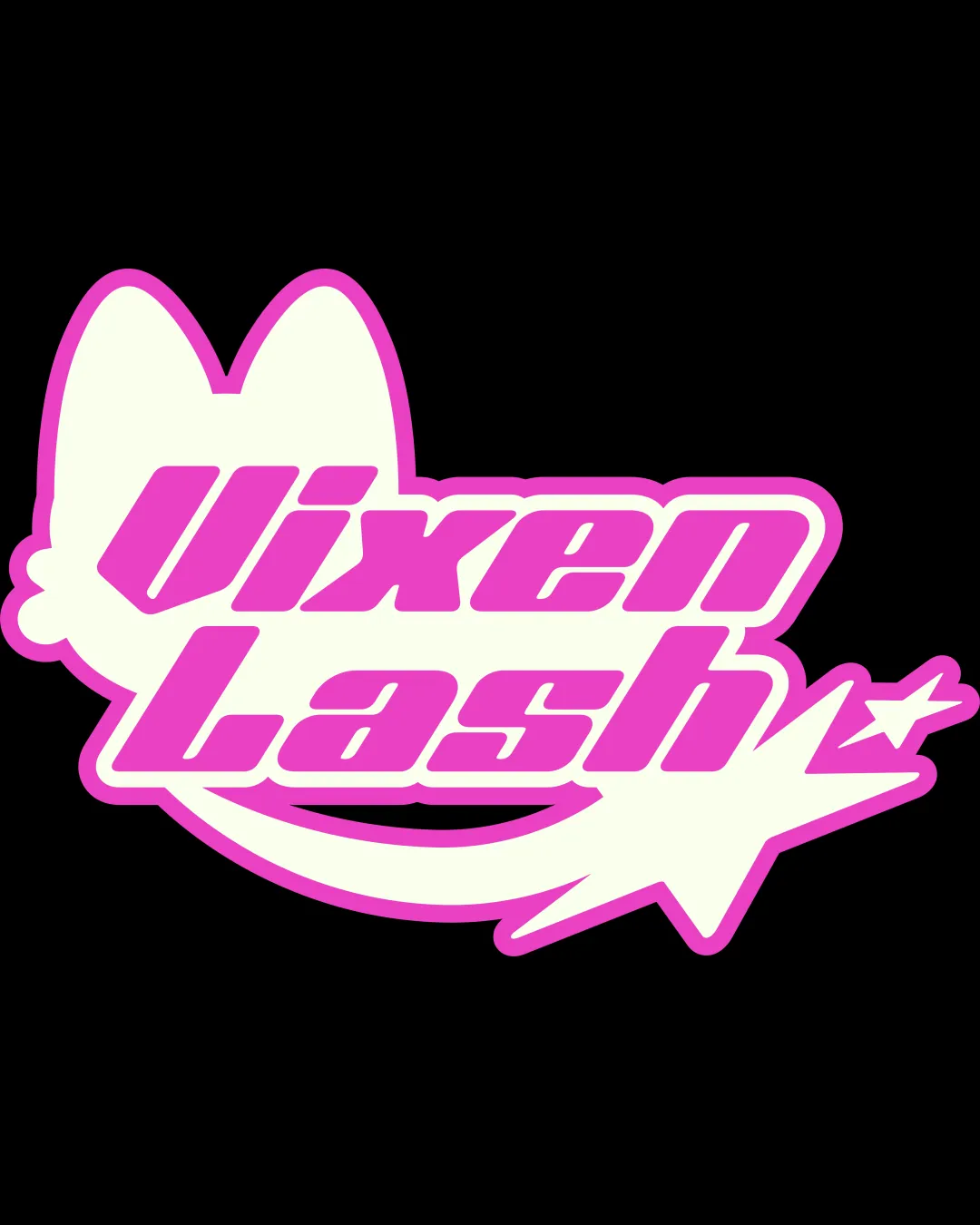
Try it Now!Logo review of Vixen Lash
 Logo analysis by AI
Logo type:
Style:
Detected symbol:
Detected text:
Business industry:
Review requested by Milkaaudrey
**If AI can recognize or misinterpret it, so can people.
Structured logo review
Legibility
![]() Bold, thick typeface stands out against background
Bold, thick typeface stands out against background![]() High contrast between text and background enhances readability
High contrast between text and background enhances readability
![]() Slanted, condensed style combined with a busy outline may reduce legibility at smaller sizes
Slanted, condensed style combined with a busy outline may reduce legibility at smaller sizes
Scalability versatility
![]() Bold lines help maintain clarity at medium sizes
Bold lines help maintain clarity at medium sizes![]() Logo works for signage, product stickers
Logo works for signage, product stickers
![]() Thin negative space between outlines can blur at small scales
Thin negative space between outlines can blur at small scales![]() Small or intricate details like the star may not translate well to embroidery or favicons
Small or intricate details like the star may not translate well to embroidery or favicons![]() Not optimal for monochrome applications
Not optimal for monochrome applications
200x250 px
100×125 px
50×62 px
Balance alignment
![]() Design generally feels centered
Design generally feels centered![]() Cat ears and swoosh frame the text well
Cat ears and swoosh frame the text well
![]() Star and swoosh take visual weight to right side, making logo feel slightly lopsided
Star and swoosh take visual weight to right side, making logo feel slightly lopsided![]() Text alignment within shape doesn’t feel perfectly balanced vertically
Text alignment within shape doesn’t feel perfectly balanced vertically

Originality
![]() Combination of cat ears and star swoosh is somewhat distinct for the beauty space
Combination of cat ears and star swoosh is somewhat distinct for the beauty space![]() Playful style adds personality
Playful style adds personality
![]() Cat ears and stars are overused motifs in beauty/feminine branding
Cat ears and stars are overused motifs in beauty/feminine branding![]() No standout clever twist or highly unique element
No standout clever twist or highly unique element
Logomark wordmark fit
![]() Style of symbol matches playful, bold lettering
Style of symbol matches playful, bold lettering![]() Both elements have consistent thickness and playful appeal
Both elements have consistent thickness and playful appeal
![]() Symbolic elements slightly overpower the text in visual hierarchy
Symbolic elements slightly overpower the text in visual hierarchy
Aesthetic look
![]() Fun, energetic style matches the playful brand name
Fun, energetic style matches the playful brand name![]() Good energy and boldness
Good energy and boldness
![]() Feels visually busy due to outlines, overlapping elements, and combined motifs
Feels visually busy due to outlines, overlapping elements, and combined motifs![]() Somewhat generic aesthetic for the industry
Somewhat generic aesthetic for the industry
Dual meaning and misinterpretations
![]() No inappropriate, negative, or unintended meanings are detected
No inappropriate, negative, or unintended meanings are detected![]() No accidental erotic or violent forms
No accidental erotic or violent forms
Color harmony
![]() Vivid pink and cream combo is youthful and eye-catching
Vivid pink and cream combo is youthful and eye-catching![]() Limited palette maintains consistency
Limited palette maintains consistency
![]() Pink might limit audience reach or become overwhelming in large formats
Pink might limit audience reach or become overwhelming in large formats![]() No adaptable option for alternate backgrounds
No adaptable option for alternate backgrounds
Shocking Pink
#FF4FBC
Mint Cream
#F9FFF8
Black
#000000


