Wondering how your logo performs? 🧐
Get professional logo reviews in seconds and catch design issues in time.
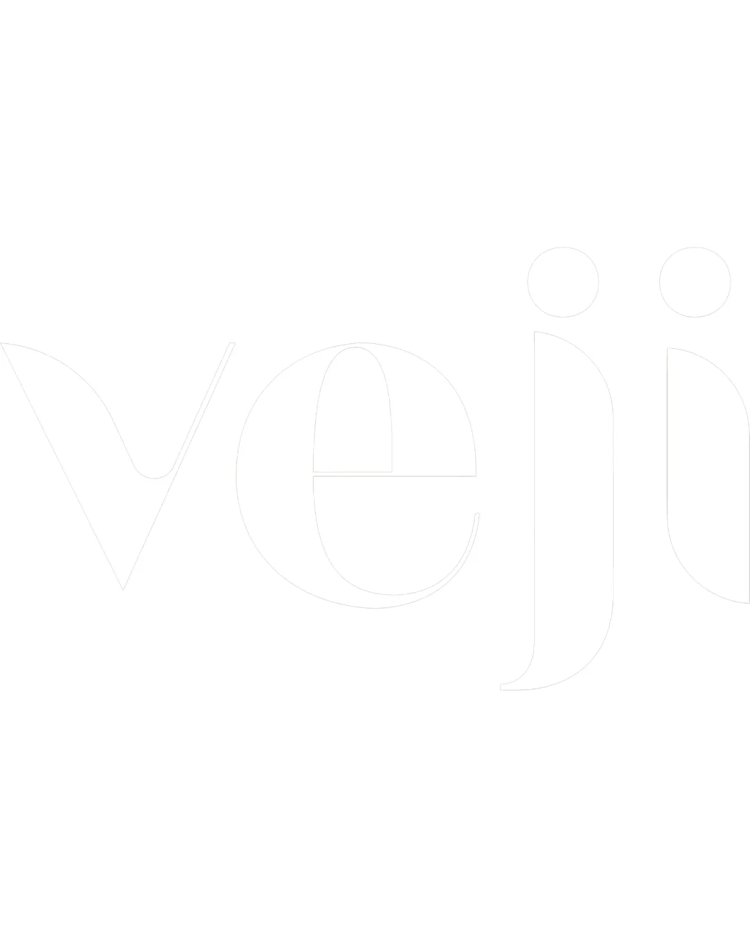
Try it Now!Logo review of veji
 Logo analysis by AI
Logo type:
Style:
Detected text:
Business industry:
Review requested by Frenzypixel
**If AI can recognize or misinterpret it, so can people.
Structured logo review
Legibility
![]() The extreme lightness of the text makes it nearly invisible on a white background, causing severe legibility issues.
The extreme lightness of the text makes it nearly invisible on a white background, causing severe legibility issues.![]() The thin line weight reduces clarity both on screen and in print.
The thin line weight reduces clarity both on screen and in print.
Scalability versatility
![]() Simple wordmark concept could scale well in ideal conditions.
Simple wordmark concept could scale well in ideal conditions.
![]() Excessively thin lines will disappear at small sizes, making the logo impractical for business cards, app icons, or embroidery.
Excessively thin lines will disappear at small sizes, making the logo impractical for business cards, app icons, or embroidery.![]() Without color contrast, the mark will not work on light backgrounds and will be unreadable in many mockups.
Without color contrast, the mark will not work on light backgrounds and will be unreadable in many mockups.
200x250 px
100×125 px
50×62 px
Balance alignment
![]() The geometric type and spacing create visual harmony.
The geometric type and spacing create visual harmony.![]() Alignment between letters is precise.
Alignment between letters is precise.
![]() The extreme minimalism may be perceived as lacking weight, leading to an imbalanced presence on marketing collateral.
The extreme minimalism may be perceived as lacking weight, leading to an imbalanced presence on marketing collateral.

Originality
![]() Lowercase geometric forms give a contemporary look.
Lowercase geometric forms give a contemporary look.
![]() Wordmark is very generic with no distinctive mark or unique typographic twist.
Wordmark is very generic with no distinctive mark or unique typographic twist.
Aesthetic look
![]() Minimalist and modern aesthetic with smooth curves.
Minimalist and modern aesthetic with smooth curves.
![]() The lightness and lack of contrast make the mark feel unfinished and weak.
The lightness and lack of contrast make the mark feel unfinished and weak.![]() Fails to stand out or leave a strong impression visually.
Fails to stand out or leave a strong impression visually.
Dual meaning and misinterpretations
![]() No accidental inappropriate or confusing imagery detected in composition.
No accidental inappropriate or confusing imagery detected in composition.
Color harmony
![]() Monochrome color scheme can suit many brand contexts.
Monochrome color scheme can suit many brand contexts.
![]() Color choice is impractical as pure white disappears on white backgrounds.
Color choice is impractical as pure white disappears on white backgrounds.![]() Lack of contrast severely limits practical, real-world application.
Lack of contrast severely limits practical, real-world application.
White
#FFFFFF