What to preserve
The ornate and calligraphic wordmark aims to evoke a sense of luxury and elegance, aligning with jewelry, perfume, or upscale clothing branding.
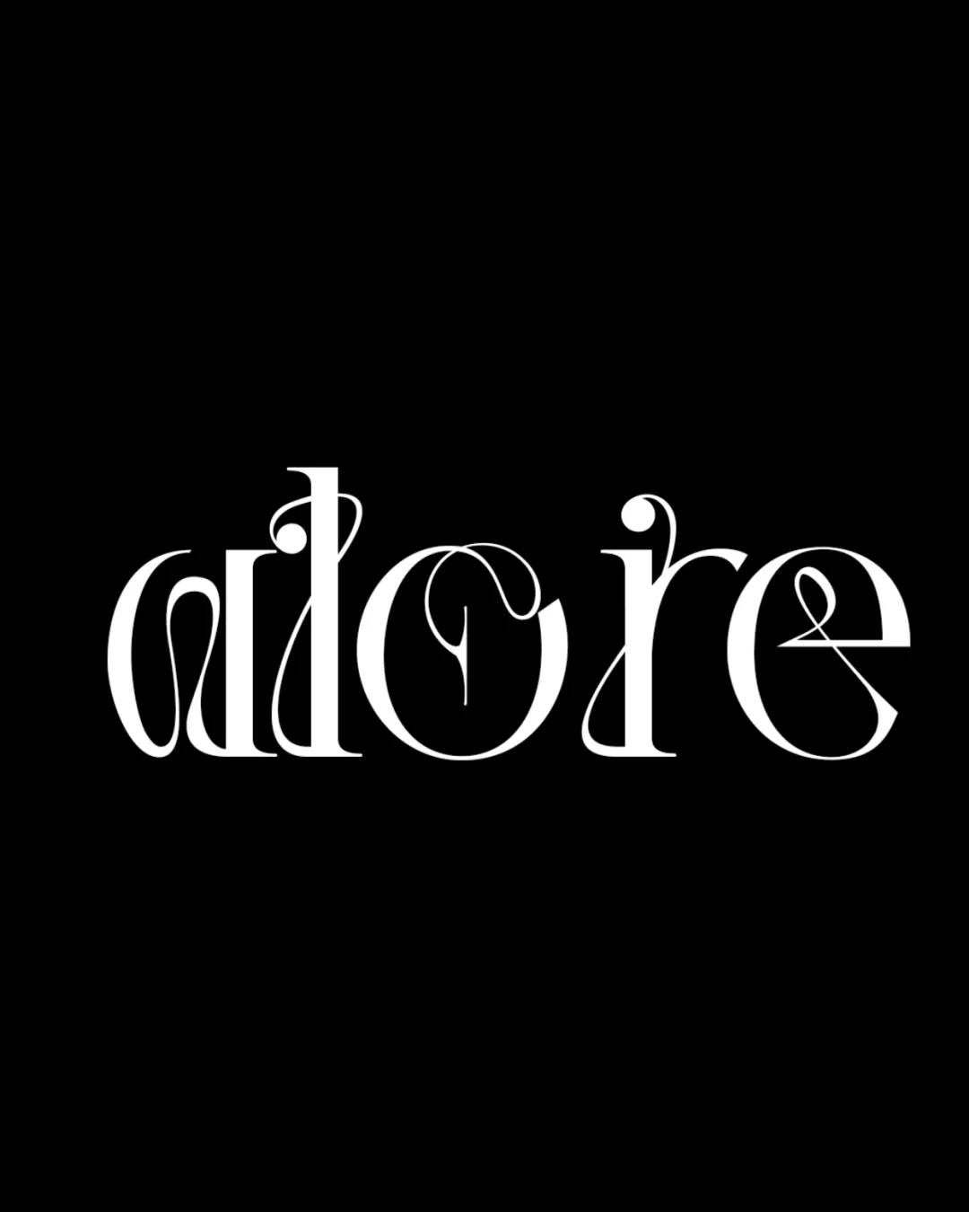
Visually striking and elegant but functionally compromised as a primary logo due to severe legibility and scalability issues.
This wordmark has a workable foundation; improving text readability is the clearest next step.
Focus on the changes that matter. Keep what makes the logo work.
The ornate and calligraphic wordmark aims to evoke a sense of luxury and elegance, aligning with jewelry, perfume, or upscale clothing branding.
Logo preview unavailable. The written feedback is still available on this card.
wordmark
The highly stylized lettering makes the word 'adore' difficult to read at a glance due to unorthodox letterforms and intertwining flourishes (especially 'a', 'd', and 'r').
See the category reviewThe ornate wordmark expresses luxury suited to jewelry, perfume, or fashion, but the extreme stylization undermines practical use for 'jewel perfume cloths' due to difficult legibility.

Inspect spacing with the guide. Optical balance may differ from geometric centering.
The highly stylized lettering makes the word 'adore' difficult to read at a glance due to unorthodox letterforms and intertwining flourishes (especially 'a', 'd', and 'r').
Try: Balance style with clarity; simplify certain letterforms to ensure the name is recognizable, especially on small-scale applications.
Logo preview unavailable. The written feedback is still available on this card.
Delicate details and fine line contrasts risk being lost or blending together at reduced sizes, reducing clarity and impact.
Get a clear logo score, key risks, and priority fix ideas before your client or audience sees it.
More credits needed
Add credits to continue without losing your work.
Then $7/month. Cancel anytime.
Essential logo review with AI
Estimated progress