advize logo review
4/5
Logo score
Logo review of

Advize

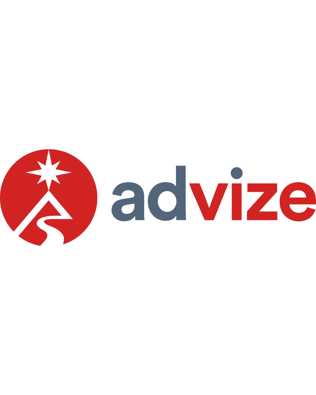
A strong, professional logo with thoughtful symbolism and minor scalability concerns.

Combination Modern Geometric Business Consulting / Technology
5/5
Legibility
4/5
Originality
5/5
Misread
4/5
Balance
3/5
Scale
Your next steps

What to fix first

Focus on the changes that matter. Keep what makes the logo work.

1

Standalone mark

Test standalone mark at small scales to ensure details remain recognizable.

Worth testing Medium priority Low effort
Area to inspectApproximate location

The winding path and star in the mark could lose clarity at very small sizes.

How to check

Print or render the symbol below 24px width and confirm shape/star visibility.

See the category review
2

wordmark

Consider subtle adjustments to color or weight for a more unified look.

Optional refinement Low priority Low effort
Area to inspectApproximate location

Minor weight difference between 'advi' and 'ze' due to two-tone coloring may affect visual cohesion.

How to check

Compare color/weight balance across all letterforms for harmony.

See the category review
Detailed review

Logo performance breakdown

4.5/5

Brief & logo match

Based on your brief
Compared with

Innovation and automation agency for small businesses

Logo effectively signals innovation and guidance with a modern, professional feel.

  • Innovation

    Star and dynamic path imply progress and creative solutions, reflecting innovation.

  • Automation Agency

    Modern, bold letterforms and a clear, concise icon suit a tech-forward service business.

5/5

Legibility

  • Clear, readable sans-serif typeface.
  • Distinct mark and text separation.
4/5

Originality

  • Inventive use of star and path metaphor for guidance/innovation.
  • Distinct color split for emphasis.
4/5

Color harmony

  • Red and blue-gray are well balanced and professional.
Red#BF2526
Blue Gray#5D6B77
White#FFFFFF

Estimated colors. Use the original design file for exact values.

Create a full color palette using these colors

Create new palette
4/5

Balance alignment

  • Type and logo mark are well proportioned.
  • Color blocking provides visual interest.
  • Minor weight difference between 'advi' and 'ze' due to two-tone coloring may affect visual cohesion.

    Optional refinement wordmark

    Try: Consider subtle adjustments to color or weight for a more unified look.

    Check: Compare color/weight balance across all letterforms for harmony.

    Area to inspectApproximate location
Uploaded logoAlignment guide overlay

Inspect spacing with the guide. Optical balance may differ from geometric centering.

3/5

Scalability

  • Mark uses simple geometric forms.
  • The winding path and star in the mark could lose clarity at very small sizes.

    Worth testing Standalone mark

    Try: Test standalone mark at small scales to ensure details remain recognizable.

    Check: Print or render the symbol below 24px width and confirm shape/star visibility.
    Area to inspectApproximate location
Uploaded logo at 200 pixels wide
200 × 250 px
Uploaded logo at 100 pixels wide
100 × 125 px
Uploaded logo at 50 pixels wide
50 × 63 px

Compare the detail at different sizes. Labels show the full image dimensions.

5/5

Misinterpretations

  • No plausible misreadings.
4/5

Symbol & text fit

  • Circular icon complements geometric font.
  • Mark captures 'advice/guidance' theme.

Black & white

Does the shape still work without color?

These tests are available only for logos uploaded in vector (SVG) format.

Background contrast

Find the surfaces where your logo stays clear.

These tests are available only for logos uploaded in vector (SVG) format.

Blur & silhouette

A 3px blur softens fine details so you can check whether the overall shape stays recognizable. If key gaps close or elements merge, the logo may rely too heavily on detail.

These tests are available only for logos uploaded in vector (SVG) format.

Try your own review

Wondering how your logo performs?

Get a clear logo score, key risks, and priority fix ideas before your client or audience sees it.

Review my logo