What to preserve
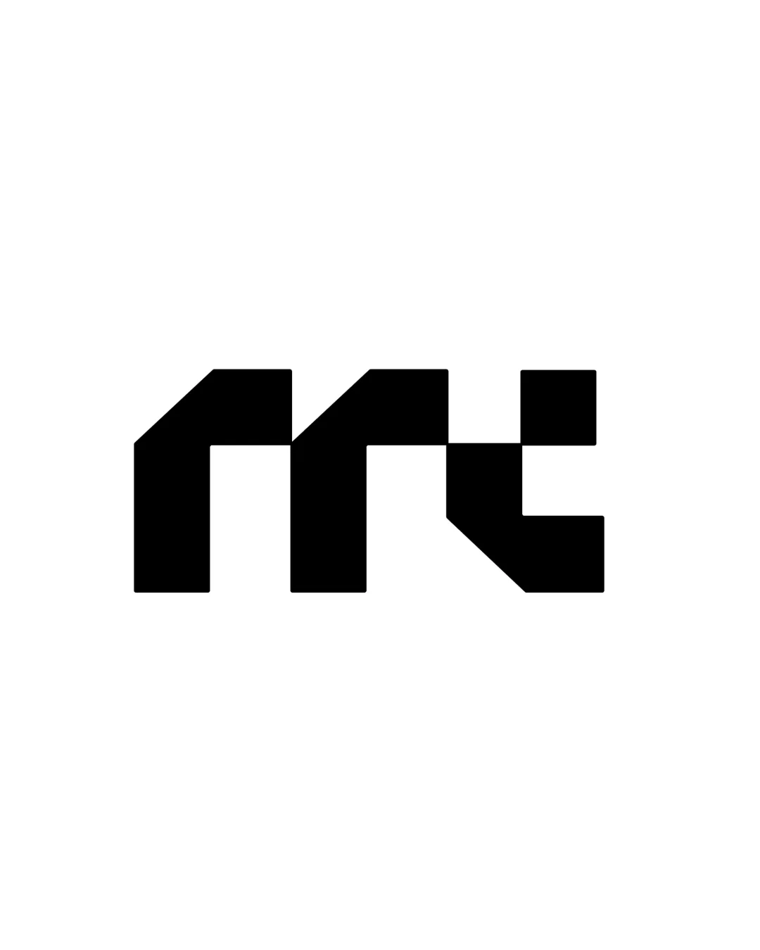
The logo fuses the 'm' and 't' initials into a single geometric monogram, resulting in a compact and highly reproducible symbol.
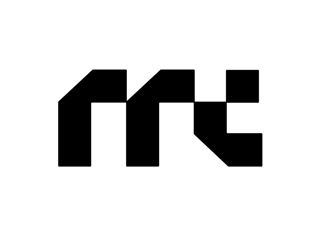
Distinctive, well-balanced monogram; thoroughly modern and highly scalable, with minor legibility risk at small scale.
This monogram shows excellent execution, supported by distinctive construction and clarity at smaller sizes.
Focus on the changes that matter. Keep what makes the logo work.
The logo fuses the 'm' and 't' initials into a single geometric monogram, resulting in a compact and highly reproducible symbol.
Logo preview unavailable. The written feedback is still available on this card.
entire mark
The stylization merges the 'm' and 't', which could create momentary ambiguity for unfamiliar audiences, especially at very small size.
See the category reviewThe geometric monogram strongly embodies the initials 'm' and 't', aligning directly with the personal branding goals for mohammad tabak.

Inspect spacing with the guide. Optical balance may differ from geometric centering.
The stylization merges the 'm' and 't', which could create momentary ambiguity for unfamiliar audiences, especially at very small size.
Try: Test for quick recognition at small sizes and among new viewers.
Logo preview unavailable. The written feedback is still available on this card.
The monogram is distinctive and inventive in its angular, geometric fusion of the letters 'm' and 't', offering a clear personal touch.
Get a clear logo score, key risks, and priority fix ideas before your client or audience sees it.
More credits needed
Add credits to continue without losing your work.
Then $7/month. Cancel anytime.
Essential logo review with AI
Estimated progress