Concept & direction
A friendly red mascot with a geometric, house-like head and approachable expression complements a clear wordmark, signaling an inclusive community or student group.
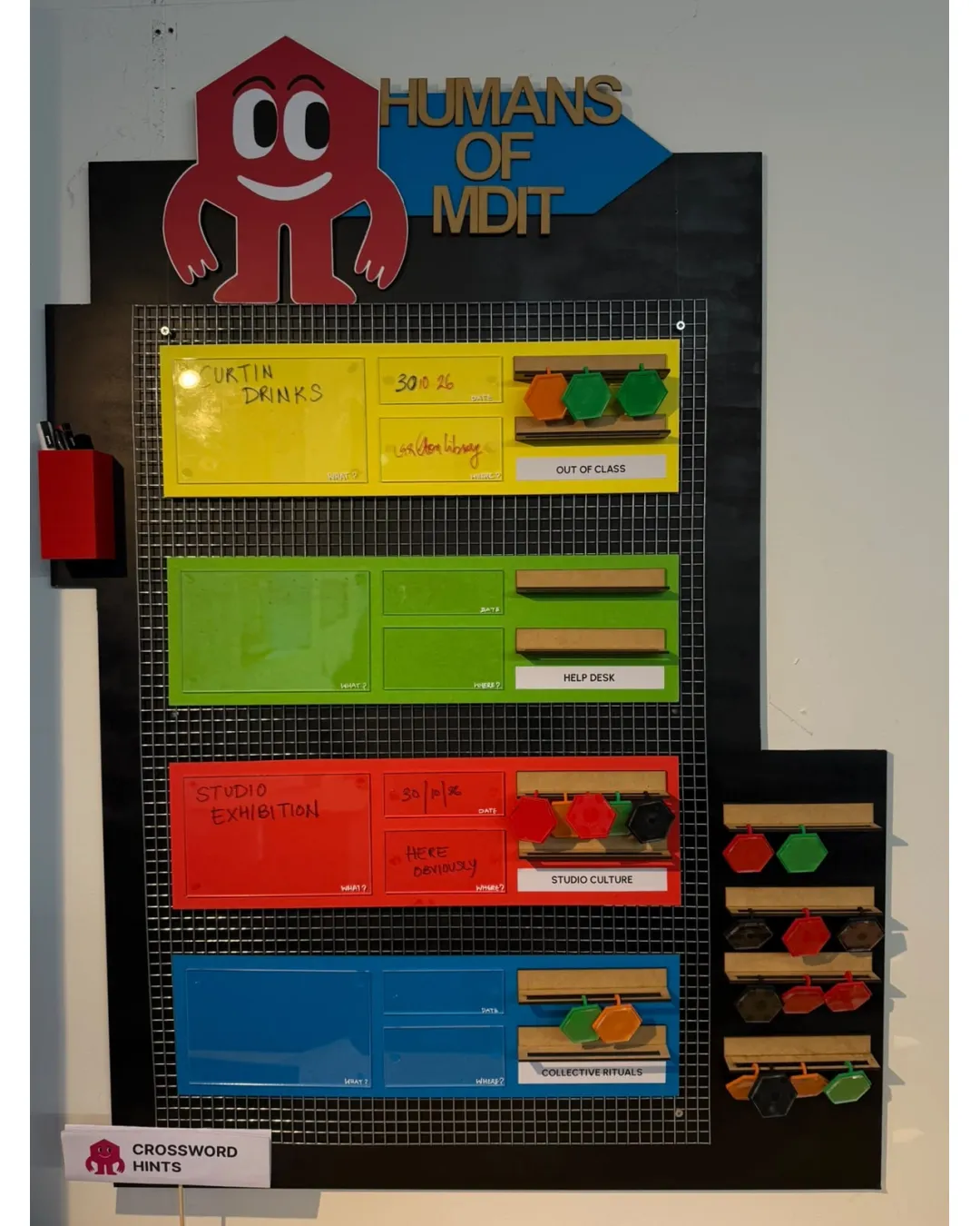
A friendly and distinctive mascot with a clear, well-placed wordmark; best suited for medium and large formats, with minor style alignment and scaling to consider.
This logo lockup shows solid execution, supported by text readability and text hierarchy; improving visual balance is the clearest next step.
Focus on the changes that matter. Keep what makes the logo work.
A friendly red mascot with a geometric, house-like head and approachable expression complements a clear wordmark, signaling an inclusive community or student group.
Standalone mark
The mascot's facial details and four arms may lose clarity at small scale.
See the category reviewThe friendly mascot and clear wordmark powerfully express a welcoming student or community identity, though scalability and stylistic integration could be further optimized.
Wordmark 5/5 · Layout 4/5
Symbol 4/5 · Wordmark 4/5
Estimated colors. Use the original design file for exact values.
Create a full color palette using these colors
Create new paletteSymbol 4/5 · Wordmark 3/5
Symbol 3/5 · Wordmark 4/5 · Layout 3/5
The mascot's facial details and four arms may lose clarity at small scale.
Try: Test mascot clarity at small sizes; consider thicker lines or simpler shapes if needed.
Symbol 3/5 · Wordmark 3/5 · Layout 3/5
Mark silhouette and wordmark use different geometric styles (rounded curves vs. strict sans-serif angles), creating slight visual tension.

Inspect spacing with the guide. Optical balance may differ from geometric centering.
Get a clear logo score, key risks, and priority fix ideas before your client or audience sees it.
More credits needed
Add credits to continue without losing your work.
Then $7/month. Cancel anytime.
Essential logo review with AI
Estimated progress