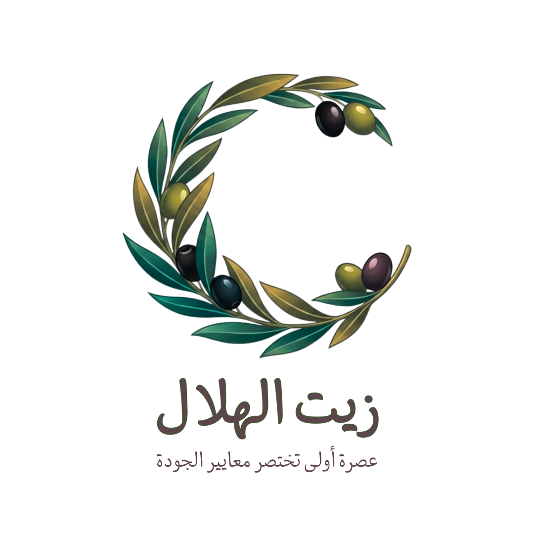
زيت الهلال / Olive Oil Brand Logo logo review
3.8/5
Logo score Combination mark category

زيت الهلال / Olive Oil Brand Logo

creative180100 Essential logo review

Well-crafted sector-appropriate logo with a clear theme, but will benefit from a simplified mark for small-scale applications.

This logo lockup shows solid execution, supported by visual balance and text readability; improving distinctiveness is the clearest next step.

Symbols recognized:
olive branch, olives, crescent shape
Legible text:
زيت الهلال عصرة أولى تختصر معايير الجودة
Combination Mark Painterly, Semi-realistic, Illustrated Food, Olive Oil, Agriculture
4.6/5
Legibility
3/5
Originality
4/5
Balance
3.7/5
Scale
4/5
Color
4/5
Style consistency
Your next steps

What to fix first

Focus on the changes that matter. Keep what makes the logo work.

What to preserve

The design uses an illustrated olive branch shaped like a crescent to clearly signify olive oil production, effectively marrying symbolism and industry relevance.

Spelling & grammar

No obvious issue found

Arabic text appears clear, accurately rendered and contextually correct.
1

Standalone mark (upper portion, olive/leaf cluster)

Test the mark at small sizes and consider a simplified variant.

High priority Worth testing Medium effort

Fine lines and painterly leaf details may blur or merge at small sizes, risking loss of definition and recognition.

See the category review
Detailed review

Logo performance breakdown

5/5

Brief & logo match

Highly relevant olive and crescent motif effectively represents olive oil production and packaging with clear, attractive Arabic typography.

5/5

Misinterpretations

  • No plausible misinterpretations or inappropriate forms detected.
4.6/5

Legibility

Wordmark 5/5 · Layout 4/5

  • Arabic wordmark and tagline are legible and clear.
4/5

Color harmony

Symbol 4/5 · Wordmark 4/5

  • Natural olive-inspired palette; good blending and appealing contrast.
Green#406B59
Olive#A19644
Dark brown/black#221E1B
Purple-grey#B9ACB0
Tan gold#A89E77

Estimated colors. Use the original design file for exact values.

Create a full color palette using these colors

Create new palette
4/5

Balance alignment

Symbol 4/5 · Wordmark 4/5 · Layout 4/5

  • Hierarchical arrangement is clear; main elements well spaced.
  • Overall spacing and hierarchy are functional, but the generous vertical gap between symbol and text may feel slightly disconnected, especially for compact applications.

    Optional refinement arrangement between mark and wordmark/tagline
Uploaded logoAlignment guide overlay

Inspect spacing with the guide. Optical balance may differ from geometric centering.

4/5

Style consistency

  • Symbol and wordmark share mood and theme; visual harmony aligns with industry.
3.7/5

Scalability

Symbol 3/5 · Wordmark 5/5 · Layout 3/5

  • Mark is detailed and clear at medium to large size.
  • Fine lines and painterly leaf details may blur or merge at small sizes, risking loss of definition and recognition.

    Worth testing Standalone mark (upper portion, olive/leaf cluster)

    Try: Test the mark at small sizes and consider a simplified variant.

3/5

Originality

Symbol 3/5 · Wordmark 3/5

  • Painterly olive-crescent motif is appropriate; style adds some distinction.
  • The crescent-olive motif is apt but familiar for the olive oil sector; the painterly execution adds some character.

    Optional refinement Standalone mark
Try your own review

Wondering how your logo performs?

Get a clear logo score, key risks, and priority fix ideas before your client or audience sees it.

Review my logo