Concept & direction
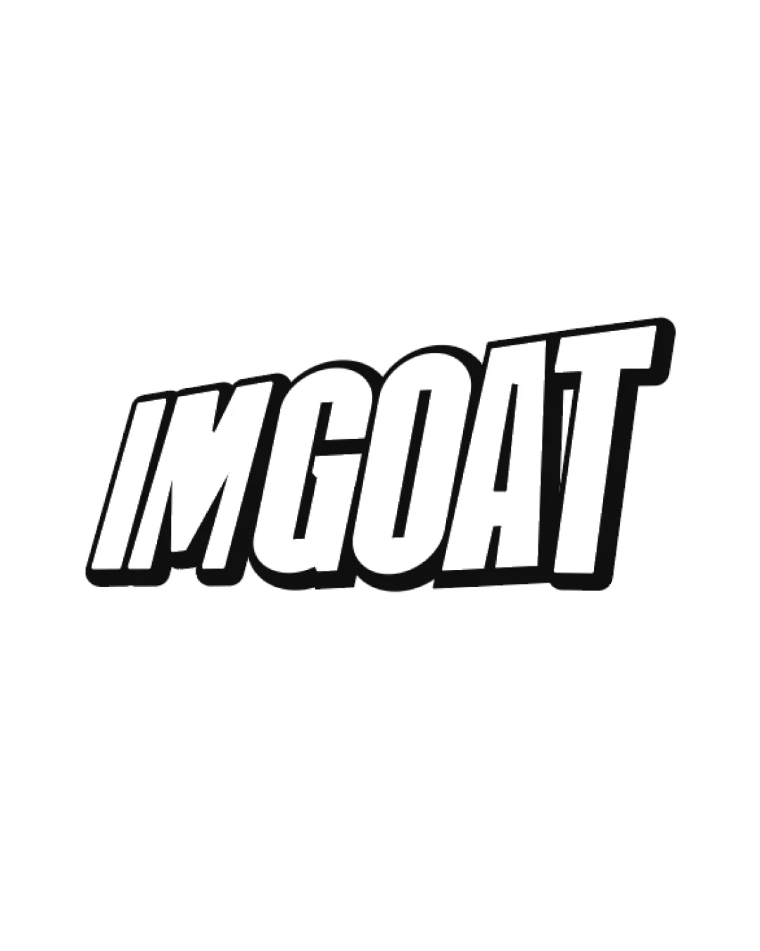
The bold, italicized wordmark uses an assertive, energetic style likely intended to convey standout quality or excitement, but lacks any visual reference to chips or food.
Visually strong and clear, but overly generic for a chips brand; needs a distinctive element or visual tie to chips/snacking to compete effectively.
This wordmark needs more distinctive construction to stand out.
Focus on the changes that matter. Keep what makes the logo work.
The bold, italicized wordmark uses an assertive, energetic style likely intended to convey standout quality or excitement, but lacks any visual reference to chips or food.
whole_wordmark
The logo presents only the word 'IMGOAT' in bold italic sans-serif lettering with no distinctive chip or food-related motif, making it generic for a chips brand.
Add a supporting graphic or adjust the wordmark to evoke chips or flavor.
The bold, energetic wordmark is clear and memorable, but does not directly connect to chips or snacking, limiting brand fit and distinctiveness for a chips brand.
The wordmark is angled and italicized with uniform boldness and a drop-shadow/outline for emphasis, with even spacing and strong visual weight.

Inspect spacing with the guide. Optical balance may differ from geometric centering.
The logo presents only the word 'IMGOAT' in bold italic sans-serif lettering with no distinctive chip or food-related motif, making it generic for a chips brand.
Try: Incorporate a visual element or style that cues chips or snacking to support distinctiveness in the snacks category.
Check: Add a supporting graphic or adjust the wordmark to evoke chips or flavor.
Get a clear logo score, key risks, and priority fix ideas before your client or audience sees it.
More credits needed
Add credits to continue without losing your work.
Then $7/month. Cancel anytime.
Essential logo review with AI
Estimated progress