What to preserve
A gear and machinery emblem combined with an oil drop captures the industrial and lubricant focus, while the bold wordmark builds an aura of strength and trust.
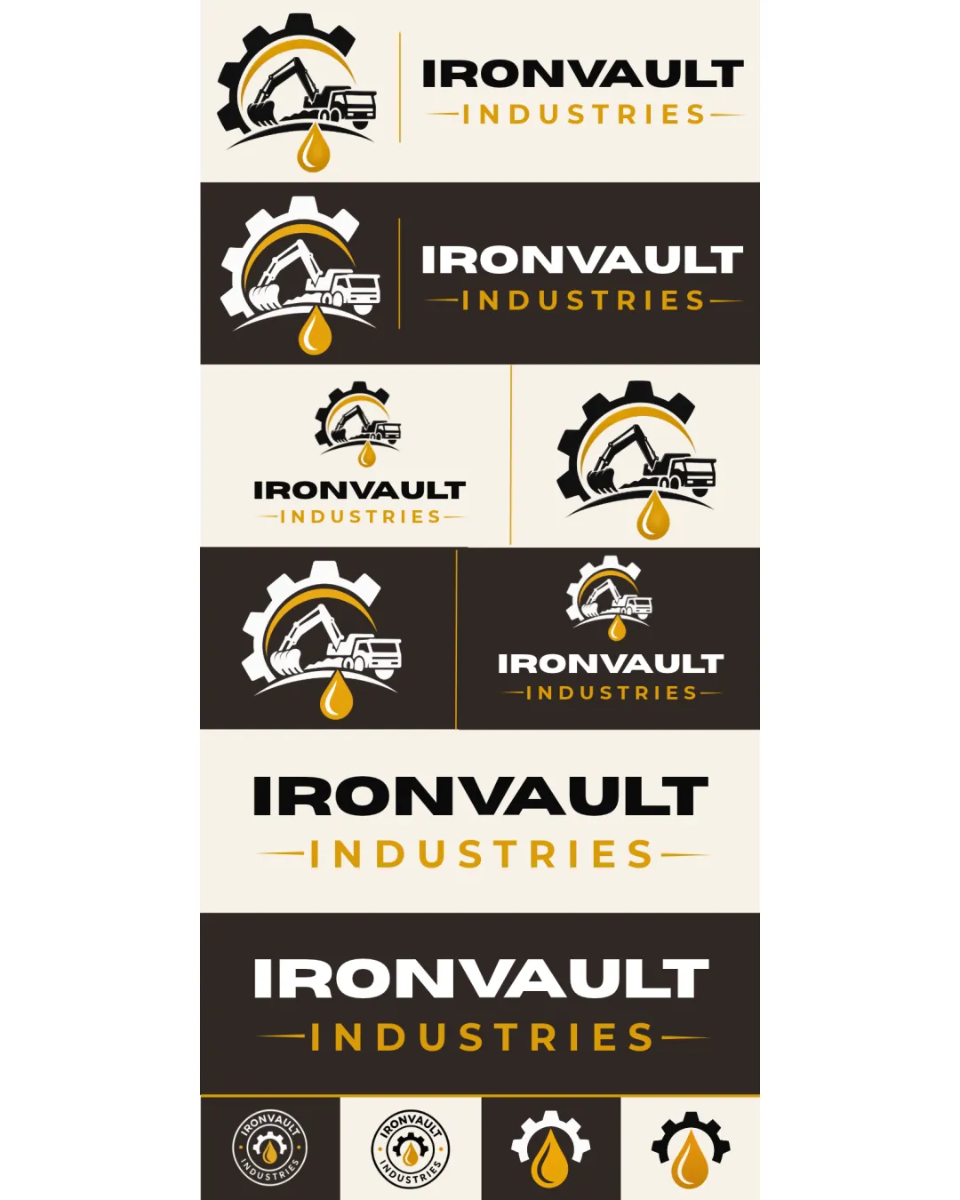
The logo confidently expresses industrial strength and reliability, but the symbol's generic construction and dense detail need refinement for distinctiveness and small-scale legibility.
This logo set shows solid execution, supported by text readability and text hierarchy; improving distinctiveness is the clearest next step.
Focus on the changes that matter. Keep what makes the logo work.
A gear and machinery emblem combined with an oil drop captures the industrial and lubricant focus, while the bold wordmark builds an aura of strength and trust.
mark
Fine lines and overlapping shapes in the excavator/truck/gear emblem risk detail loss at small sizes, especially the cab outline and machinery lines.
See the category reviewThe logo captures strength, reliability, and an established industrial identity, but could better differentiate itself and simplify detail for broader, future-focused brand applications.
Wordmark 5/5 · Layout 4/5
Symbol 4/5 · Wordmark 4/5
Estimated colors. Use the original design file for exact values.
Create a full color palette using these colors
Create new paletteSymbol 3/5 · Wordmark 5/5 · Layout 3/5
Fine lines and overlapping shapes in the excavator/truck/gear emblem risk detail loss at small sizes, especially the cab outline and machinery lines.
Try: Test all emblem variants at small sizes for clarity; consider simplifying shapes for icon usage.
Symbol 3/5 · Wordmark 4/5 · Layout 3/5
There is a slight imbalance in the combination mark: the detailed gear/vehicle mark is dense compared to the open, airy wordmark. This creates a minor visual disconnect in proportion and weight when they are displayed together.

Inspect spacing with the guide. Optical balance may differ from geometric centering.
Symbol 3/5 · Wordmark 3/5
The mark incorporates commonly used industrial motifs: a gear, excavator, truck, and oil drop, arranged in a fairly standard manner, resulting in a familiar rather than distinctive appearance.
This review includes a score but no supporting explanation for this category.
Get a clear logo score, key risks, and priority fix ideas before your client or audience sees it.
More credits needed
Add credits to continue without losing your work.
Then $7/month. Cancel anytime.
Essential logo review with AI
Estimated progress