Concept & direction
The logo uses a clean tooth outline above a professional wordmark, clearly referencing pediatric dentistry in a contemporary style.
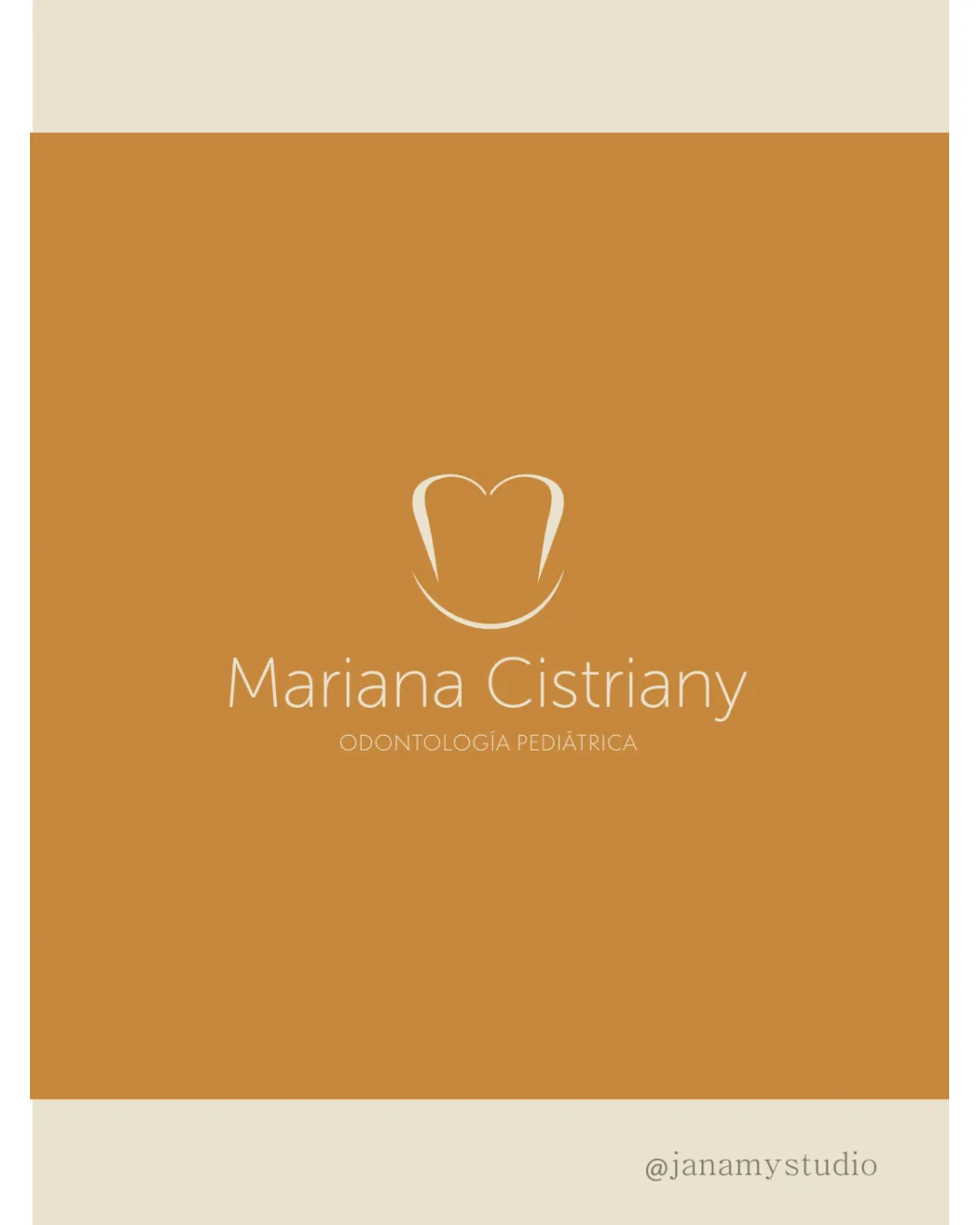
A clean, contemporary dental logo with strong technical fundamentals, but the generic tooth symbol and small tagline limit distinctiveness and utility in pediatric contexts.
This logo lockup shows solid execution, supported by visual balance and text readability; improving distinctiveness is the clearest next step.
Focus on the changes that matter. Keep what makes the logo work.
The logo uses a clean tooth outline above a professional wordmark, clearly referencing pediatric dentistry in a contemporary style.
tagline
The tagline 'ODONTOLOGÍA PEDIÁTRICA' is small and may become illegible at reduced sizes.
See the category reviewThe logo suits a pediatric dentist by using dental imagery and a soft palette, but lacks playful or child-centric touches that would better target young patients or their parents.
Wordmark 4/5 · Layout 4/5
The tagline 'ODONTOLOGÍA PEDIÁTRICA' is small and may become illegible at reduced sizes.
Try: Increase tagline size or weight for small-scale clarity.
Symbol 4/5 · Wordmark 4/5
Warm tan/orange evokes friendliness and approachability, but does not directly signal pediatric or child-focused care.
Estimated colors. Use the original design file for exact values.
Create a full color palette using these colors
Create new paletteSymbol 4/5 · Wordmark 4/5 · Layout 4/5

Inspect spacing with the guide. Optical balance may differ from geometric centering.
Symbol 3/5 · Wordmark 3/5 · Layout 3/5
Symbol 2/5 · Wordmark 3/5
Simple tooth outline is widely used in dental branding, making the symbol generic and lacking additional memorable aspects.
Get a clear logo score, key risks, and priority fix ideas before your client or audience sees it.
More credits needed
Add credits to continue without losing your work.
Then $7/month. Cancel anytime.
Essential logo review with AI
Estimated progress