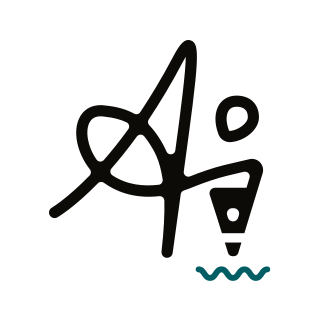
Ai logo review
4/5
Logo score
Logo review of

Ai

Distinctive, clever designer mark that functions well with minimal refinements to scalability and instant recognition.

Combination Minimal Abstract Initial Design/creative
3.5/5
Legibility
4.5/5
Originality
5/5
Misread
4/5
Balance
3/5
Scale
Your next steps

What to fix first

Focus on the changes that matter. Keep what makes the logo work.

1

Pen nib and wavy line (lower band)

Test at various digital and print sizes; consider increasing the thickness if detail is lost.

Worth testing High priority Low effort
Area to inspectApproximate location

The thin turquoise wavy line may become too delicate in reduced sizes or poor print quality, risking loss of detail.

How to check

Verify all elements reproduce cleanly at small scale.
See the category review
2

Primary mark (main band)

Consider slightly refining the 'A' for instant initial recognition without losing the organic feel.

Visible issue Medium priority Medium effort
Area to inspectApproximate location

The handwritten style of the 'A' may cause a short pause in recognition for new viewers, especially at small sizes.

How to check

Test at small and thumbnail sizes to ensure fast legibility.

See the category review
Detailed review

Logo performance breakdown

4.5/5

Brief & logo match

Based on your brief
Compared with

Visual & Web Designer

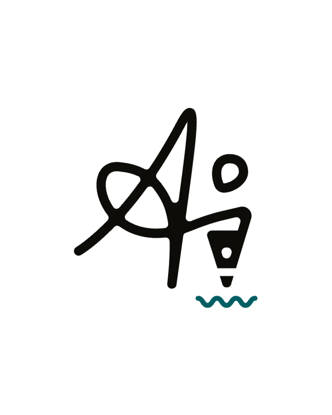
Logo visually represents creative design with initials and pen imagery, making it a strong fit for a designer.

  • Creativity/Visual Design

    The pen nib and initials motif directly communicates design and creativity.

  • Personal Branding

    Handwritten, unique mark creates a recognizable and personal identity.

3.5/5

Legibility

  • Distinctive character combination.
  • Clear pen/creative metaphor.
  • The handwritten style of the 'A' may cause a short pause in recognition for new viewers, especially at small sizes.

    Visible issue Primary mark (main band)

    Try: Consider slightly refining the 'A' for instant initial recognition without losing the organic feel.

    Check: Test at small and thumbnail sizes to ensure fast legibility.

    Area to inspectApproximate location
4.5/5

Originality

  • Inventive pen-initial integration.
  • Strong, memorable silhouette.
4/5

Color harmony

  • Black and teal create clear, effective contrast.
Black#141414
Teal#1B7C7C

Estimated colors. Use the original design file for exact values.

Create a full color palette using these colors

Create new palette
4/5

Balance alignment

  • Composition feels dynamic yet balanced.
Uploaded logoAlignment guide overlay

Inspect spacing with the guide. Optical balance may differ from geometric centering.

3/5

Scalability

  • Simple structure enables some scaling flexibility.
  • The thin turquoise wavy line may become too delicate in reduced sizes or poor print quality, risking loss of detail.

    Worth testing Pen nib and wavy line (lower band)

    Try: Test at various digital and print sizes; consider increasing the thickness if detail is lost.

    Check: Verify all elements reproduce cleanly at small scale.

    Area to inspectApproximate location
Uploaded logo at 200 pixels wide
200 × 250 px
Uploaded logo at 100 pixels wide
100 × 125 px
Uploaded logo at 50 pixels wide
50 × 63 px

Compare the detail at different sizes. Labels show the full image dimensions.

5/5

Misinterpretations

  • No misleading alternate reading.

Black & white

Does the shape still work without color?

Preparing artwork...

Background contrast

Find the surfaces where your logo stays clear.

Compare the mark and lettering on each surface.

Blur & silhouette

A 3px blur softens fine details so you can check whether the overall shape stays recognizable. If key gaps close or elements merge, the logo may rely too heavily on detail.

Original
3px blur

Look for clear separation between shapes and a distinctive outline.

Try your own review

Wondering how your logo performs?

Get a clear logo score, key risks, and priority fix ideas before your client or audience sees it.

Review my logo