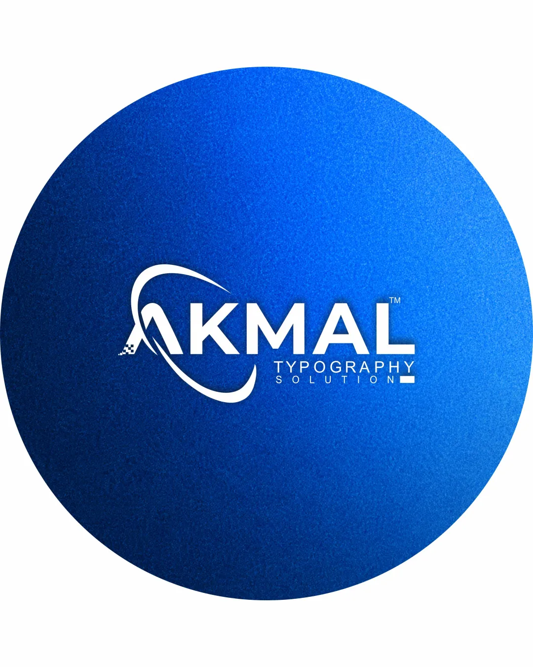
AKMAL TYPOGRAPHY SOLUTION logo review
3.3 / 5
Logo score
Logo review of

Akmal Typography Solution

Safe and usable in many situations, but not distinctive or polished enough for high-end branding.

Combination Mark Bold Sans-serif Tech/minimalist Design Services
4/5
Legibility
3/5
Originality
5/5
Misread
4/5
Balance
3/5
Scale
Action plan

What to fix first

The most important fixes to handle before polishing the full presentation.

1

Improve legibility and scalability of the 'TYPOGRAPHY SOLUTION' subtext, possibly by increasing font weight or size and simplifying effects.

High priority

Subtext loses clarity at small sizes and hurts logo usability.

Impact: High · Effort: Low

2

Refine or uniquely stylize the 'A' swoosh to enhance distinctiveness and avoid generic tech/creative trope.

Medium priority

Orbit swoosh design is common and limits brand memorability.

Impact: Medium · Effort: Medium

Detailed review

Logo performance breakdown

4/5

Legibility

Checkmark icon Main text 'AKMAL' is bold and clear.
Checkmark icon Well-contrasted against blue background.

Warning icon Small subtext 'TYPOGRAPHY SOLUTION' is less legible, especially at small sizes.

3/5

Originality

Checkmark icon Letter A with orbit effect integrates some identity.

Warning icon Orbit/swoosh-A concept is widely used and generic in tech and creative branding.
Warning icon Oval background is standard.

4/5

Color harmony

Checkmark icon Clean blue and white palette feels trustworthy and premium.

Warning icon Text contrast could be even stronger with different subtext weight or background shift.

True Blue
#0057E7

White
#FFFFFF

Your palette is close. Refine the color roles and combinations before updating the logo.

Build brand colors
4/5

Balance alignment

Checkmark icon Text and symbol are well-aligned and visually centered.
Checkmark icon Oval background provides symmetry.

Warning icon Minor crowding between swoosh and 'A'.

logo 200x250 pixels scalability test alignment grid overlay
3/5

Scalability

Checkmark icon Simple letterforms and distinct symbol.

Warning icon Fine details in subtext and symbol tail may be lost at small scales.
Warning icon Full-gradient oval may be hard to reproduce in single-color or low-res.

logo 200x250 pixels scalability test

200x250 px

logo 100x125 pixels scalability test

100×125 px

logo 50x62 pixels scalability test

50×62 px

5/5

Misinterpretations

Checkmark icon No inappropriate or confusing visual readings detected.

Beta

No AI design signals found

Likely designed by a human

Design choices and typography appear intentional and cohesive, with no overt AI artifacts.

  • Consistent letterforms and symbol integration
  • Text alignment and swoosh construction are resolved

Visual assessment; not definitive proof of authorship.

4 / 5

Logo structure & brief match

Checkmark icon A-symbol serves as anchor for the 'AKMAL' wordmark.

Warning icon Visual connection between swoosh and subtext is weak.

Checkmark icon Bold And Powerful Design: Bold sans-serif font and large shapes deliver strong and assertive visual impression.
Checkmark icon Clean Digital Sign Letter A In Oval: Prominently features digital-styled 'A' and is covered by a clear oval background.
Checkmark icon Blue Trustable Premium Texture: Texture and blue palette succeed in suggesting premium and trustable qualities.
Checkmark icon Typography Solution, Simple And Clean Bold Serif: Font is bold and clean, though it is sans-serif, not serif as brief requests.

Try your own review

Wondering how your logo performs?

Get a clear logo score, key risks, and priority fix ideas before your client or audience sees it.

Review my logo