AKŞAYĀ logo review
4/5
Logo score
Logo review of

Akşayā

A premium-feeling mark and wordmark pairing, suitable for luxury/spiritual/wellness sectors, needing simplification for versatile usage.

Combination Mark Ornate, Modern-gold Gradient Wellness/spiritual/luxury
5/5
Legibility
3.5/5
Originality
5/5
Misread
5/5
Balance
3/5
Scale
Your next steps

What to fix first

Focus on the changes that matter. Keep what makes the logo work.

1

Standalone mark

Test the mark at small scales and in flat-color/monochrome for essential clarity.

Worth testing High priority Medium effort
Area to inspectApproximate location

Intricate gradients, sparkles, and fine details in the symbol may not reproduce well at small sizes or in single-color formats.

How to check

Visual clarity and identity preserved in reduced/flat versions.
See the category review
2

Standalone mark

Explore subtle customizations or integration to further differentiate.

Optional refinement Medium priority Medium effort

While the motif is elegant and well-constructed, use of lotus, infinity, and a ceremonial pot is common in South Asian luxury or spiritual brands.

How to check

Visual distinction from typical category icons in a lineup.

See the category review
Detailed review

Logo performance breakdown

4/5

Brief & logo match

Based on an inferred industry
Compared with

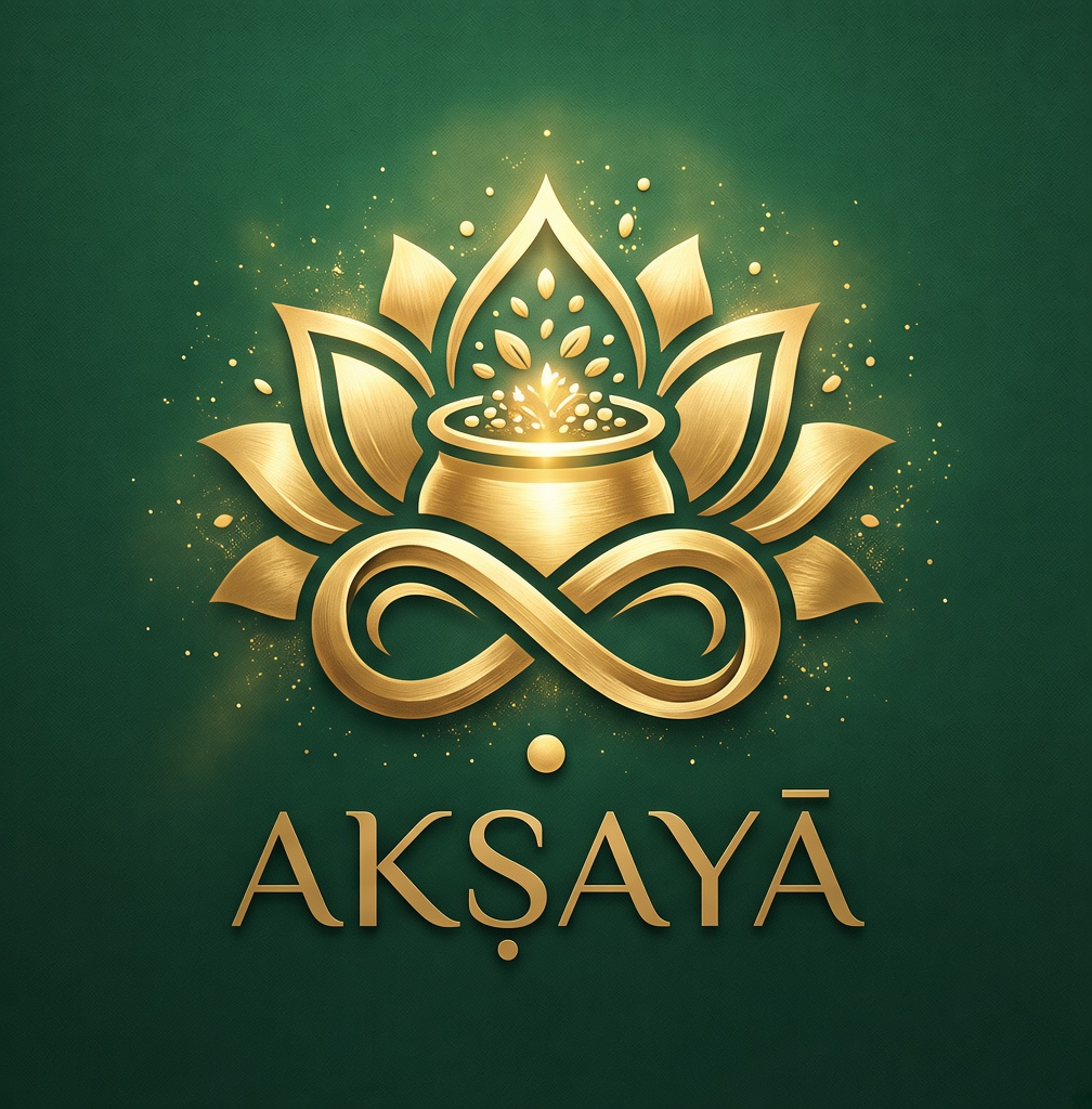
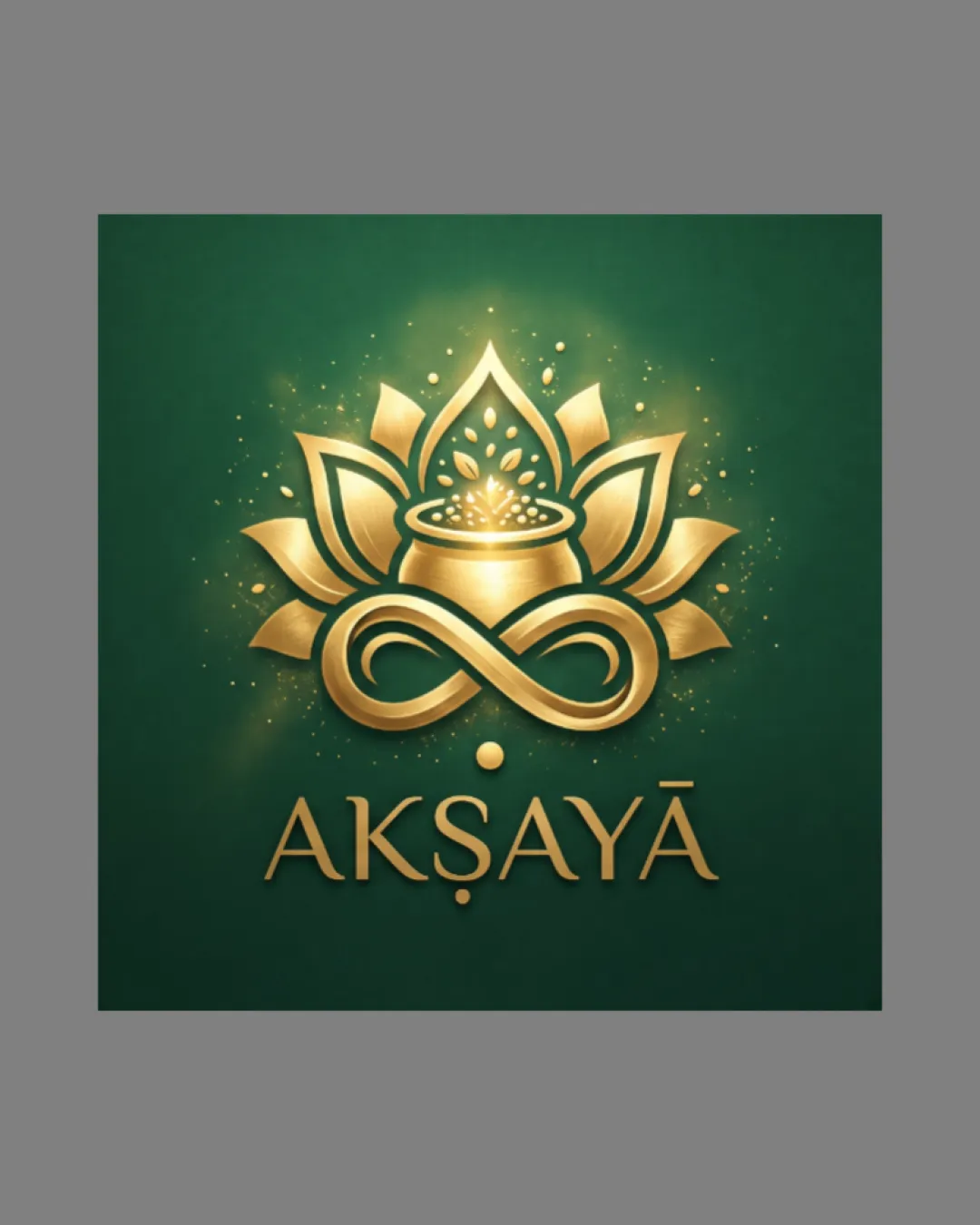
Synthesis of lotus, pot, and infinity motifs in a gold-on-green palette typically targets spiritual, wellness, or luxury industries.

The logo strongly matches luxury/spiritual/wellness cues, but the symbolism is fairly familiar and ornate detailing risks small-scale usability.

  • Motif Fusion

    Lotus, kalash (pot), and infinity symbol are synthesized to imply abundance, spirituality, and continuity, suggesting a fit for premium wellness or spiritual/luxury context.

  • Ornate/luxury Tone

    Gold gradients and spark accents directly communicate a feeling of luxury and festivity.

5/5

Legibility

  • Wordmark is clear, well-spaced, and highly readable.
  • Letterforms and diacritics are accurately rendered.
3.5/5

Originality

  • Ornate gold treatments add contemporary luxury flair.
  • Infinity integration gives a distinct touch.
  • While the motif is elegant and well-constructed, use of lotus, infinity, and a ceremonial pot is common in South Asian luxury or spiritual brands.

    Optional refinement Standalone mark

    Try: Explore subtle customizations or integration to further differentiate.

    Check: Visual distinction from typical category icons in a lineup.

5/5

Color harmony

  • Rich gold gradients contrast beautifully against deep green.
Dark Green#17553C
Gold#E1B13C
White highlights#FFFFFF

Estimated colors. Use the original design file for exact values.

Create a full color palette using these colors

Create new palette
5/5

Balance alignment

  • Excellent alignment between symbol, wordmark, and accent dot.
  • Weight distribution feels premium and harmonious.
Uploaded logoAlignment guide overlay

Inspect spacing with the guide. Optical balance may differ from geometric centering.

3/5

Scalability

  • Mark offers a strong, recognizable silhouette.
  • Intricate gradients, sparkles, and fine details in the symbol may not reproduce well at small sizes or in single-color formats.

    Worth testing Standalone mark

    Try: Test the mark at small scales and in flat-color/monochrome for essential clarity.

    Check: Visual clarity and identity preserved in reduced/flat versions.

    Area to inspectApproximate location
Uploaded logo at 200 pixels wide
200 × 250 px
Uploaded logo at 100 pixels wide
100 × 125 px
Uploaded logo at 50 pixels wide
50 × 63 px

Compare the detail at different sizes. Labels show the full image dimensions.

5/5

Misinterpretations

  • No negative or confusing secondary readings.
5/5

Symbol & text fit

  • Mark and wordmark both utilize gold gradients and blend stylistically.
  • Themes of abundance and eternity are consistent across elements.

Black & white

Does the shape still work without color?

Preparing artwork...

Background contrast

Find the surfaces where your logo stays clear.

Compare the mark and lettering on each surface.

Blur & silhouette

A 3px blur softens fine details so you can check whether the overall shape stays recognizable. If key gaps close or elements merge, the logo may rely too heavily on detail.

Original
3px blur

Look for clear separation between shapes and a distinctive outline.

Try your own review

Wondering how your logo performs?

Get a clear logo score, key risks, and priority fix ideas before your client or audience sees it.

Review my logo