AMANECER JOYERÍA logo review
4/5
Logo score
Logo review of

Amanecer Joyería

Elegant, evocative logo concept with strong industry fit and only minor refinements needed.

Combination Elegant, Serif Wordmark With Artistic Symbol Jewelry
5/5
Legibility
4/5
Originality
5/5
Misread
4/5
Balance
3/5
Scale
Your next steps

What to fix first

Focus on the changes that matter. Keep what makes the logo work.

1

Standalone mark

Test mark legibility at reduced sizes and simplify rays if needed.

Worth testing High priority Medium effort
Area to inspectApproximate location

The intricate sunrays may lose clarity or blend together at small sizes, particularly in print or low-resolution uses.

How to check

Print or export the mark below 2 cm diameter and assess recognition.

See the category review
2

wordmark and Standalone mark composition

Standardize the symbol-to-wordmark proportion, baseline, and spacing.

Optional refinement Medium priority Low effort

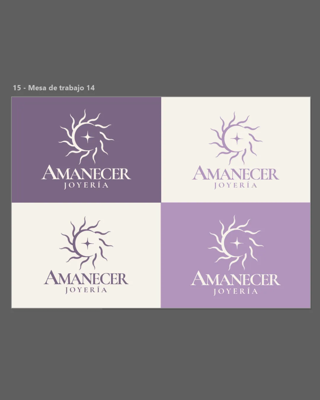
There is a slightly uneven visual relationship between the symbol and the wordmark—word size and mark placement vary subtly between versions.

How to check

Review all lockups for consistent alignment and balance.

See the category review
Detailed review

Logo performance breakdown

5/5

Brief & logo match

Based on your brief
Compared with

Peruvian fine jewelry emphasizing symbolic, emotional value over ostentatious luxury.

Design convincingly expresses the artisanal and symbolic focus detailed in the brief.

  • Artisanal Craftsmanship

    Carefully drawn sun motif and classic serif reflect handmade, quality feel.

  • Emotional/symbolic Meaning

    Radiant symbol evokes dawn and new beginnings fitting the name 'Amanecer' (sunrise).

5/5

Legibility

  • Text is highly readable and well-kerned.
4/5

Originality

  • Artistic sun treatment gives some distinction.
  • The radiant sun motif is elegant but somewhat familiar in jewelry and luxury markets; the treatment adds distinction, but it could be pushed further for uniqueness.

    Optional refinement Standalone mark

    Try: Explore subtle customizations: gemstone detail, more integrated rays or minimal negative space.

    Check: Test distinctiveness in mockups and competitor context.

4/5

Color harmony

  • Muted purple and cream palette feels refined and appropriate.
White#EDE6DF
Purple#A28CB4

Estimated colors. Use the original design file for exact values.

Create a full color palette using these colors

Create new palette
4/5

Balance alignment

  • Generally harmonious composition.
  • Elegant wordmark pairing.
  • There is a slightly uneven visual relationship between the symbol and the wordmark—word size and mark placement vary subtly between versions.

    Optional refinement wordmark and Standalone mark composition

    Try: Standardize the symbol-to-wordmark proportion, baseline, and spacing.

    Check: Review all lockups for consistent alignment and balance.

Uploaded logoAlignment guide overlay

Inspect spacing with the guide. Optical balance may differ from geometric centering.

3/5

Scalability

  • Symbol is elegant and compact.
  • The intricate sunrays may lose clarity or blend together at small sizes, particularly in print or low-resolution uses.

    Worth testing Standalone mark

    Try: Test mark legibility at reduced sizes and simplify rays if needed.

    Check: Print or export the mark below 2 cm diameter and assess recognition.

    Area to inspectApproximate location
Uploaded logo at 200 pixels wide
200 × 250 px
Uploaded logo at 100 pixels wide
100 × 125 px
Uploaded logo at 50 pixels wide
50 × 63 px

Compare the detail at different sizes. Labels show the full image dimensions.

5/5

Misinterpretations

  • No unintended readings detected.
4/5

Symbol & text fit

  • Symbol and wordmark work together coherently.

Black & white

Does the shape still work without color?

These tests are available only for logos uploaded in vector (SVG) format.

Background contrast

Find the surfaces where your logo stays clear.

These tests are available only for logos uploaded in vector (SVG) format.

Blur & silhouette

A 3px blur softens fine details so you can check whether the overall shape stays recognizable. If key gaps close or elements merge, the logo may rely too heavily on detail.

These tests are available only for logos uploaded in vector (SVG) format.

Try your own review

Wondering how your logo performs?

Get a clear logo score, key risks, and priority fix ideas before your client or audience sees it.

Review my logo