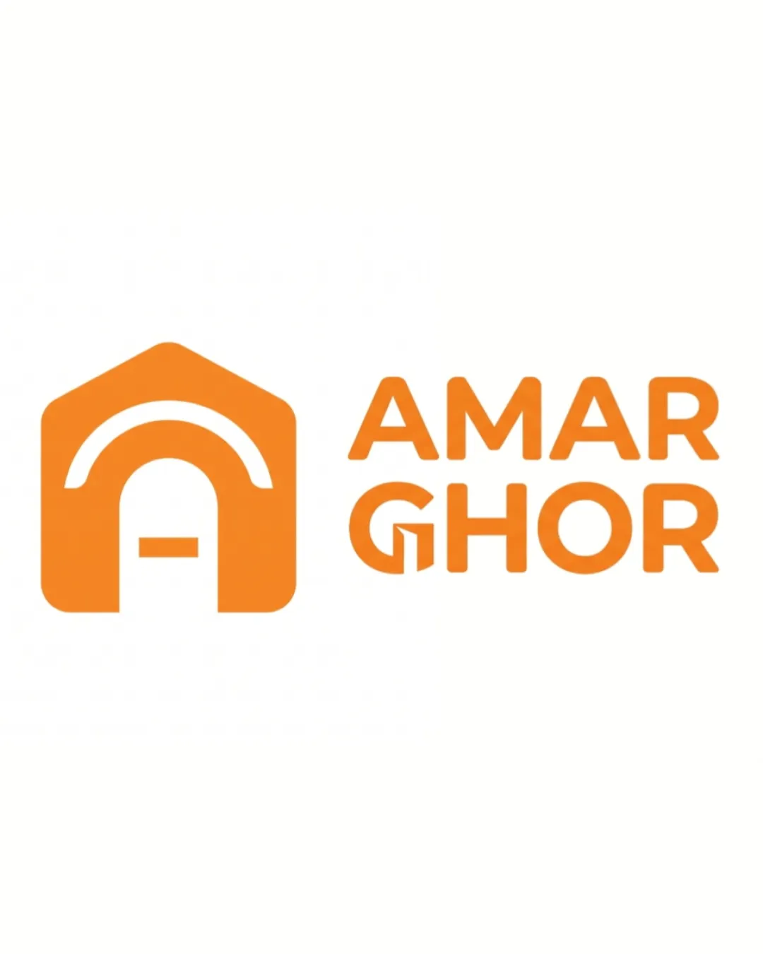
AMAR GHOR logo review
4/5
Logo score
Logo review of

Amar Ghor

A strong, versatile identity with great clarity, though the icon could be further differentiated for memorability.

Combination Modern Geometric Home Goods / Baby Products
5/5
Legibility
3/5
Originality
5/5
Misread
4/5
Balance
4/5
Scale
Your next steps

What to fix first

Focus on the changes that matter. Keep what makes the logo work.

1

Standalone mark

Refine the icon to add a subtle unique detail or characteristic.

Optional refinement Medium priority Medium effort
Area to inspectApproximate location

The house-with-door icon, though clean, is common among home-related brands and could feel generic without additional identity layers.

How to check

Test distinction within the home goods sector at glance.

See the category review
2

overall

Increase padding between the icon and wordmark.

Optional refinement Medium priority Low effort

The spacing between the house icon and wordmark feels slightly tight, which could become crowded at small scale.

How to check

Check clear space and lockup balance at small sizes.

See the category review
Detailed review

Logo performance breakdown

4/5

Brief & logo match

Based on your brief
Compared with

Brand for waterproof bedsheets and home appliances aimed at parents of young children and adult men; logo mainly for Facebook and website.

The logo logically fits a home-focused store and is readable for digital use, but the icon could better reflect the specific product proposition.

  • Primary Audience: Parents And Men 30-45

    The house theme directly connects to home-keeping and child care needs, suitable for both parents and homemakers.

  • Focus On Waterproof Bedsheets And Home Appliances

    The home icon represents the broad home appliance theme, but lacks a direct waterproof/wellness element.

5/5

Legibility

  • Text is clear and easy to read.
3/5

Originality

  • Icon has a familiar but effective construction.
  • The house-with-door icon, though clean, is common among home-related brands and could feel generic without additional identity layers.

    Optional refinement Standalone mark

    Try: Refine the icon to add a subtle unique detail or characteristic.

    Check: Test distinction within the home goods sector at glance.
    Area to inspectApproximate location
4/5

Balance alignment

  • Mark and wordmark are well aligned and proportioned.
  • The spacing between the house icon and wordmark feels slightly tight, which could become crowded at small scale.

    Optional refinement overall

    Try: Increase padding between the icon and wordmark.

    Check: Check clear space and lockup balance at small sizes.

Uploaded logoAlignment guide overlay

Inspect spacing with the guide. Optical balance may differ from geometric centering.

4/5

Scalability

  • Simple forms scale well.
  • Monochrome makes it versatile.
Uploaded logo at 200 pixels wide
200 × 250 px
Uploaded logo at 100 pixels wide
100 × 125 px
Uploaded logo at 50 pixels wide
50 × 63 px

Compare the detail at different sizes. Labels show the full image dimensions.

5/5

Misinterpretations

  • No evident double meanings or risks.
4/5

Symbol & text fit

  • The doorway in the 'G' links mark and name.

Black & white

Does the shape still work without color?

These tests are available only for logos uploaded in vector (SVG) format.

Background contrast

Find the surfaces where your logo stays clear.

These tests are available only for logos uploaded in vector (SVG) format.

Blur & silhouette

A 3px blur softens fine details so you can check whether the overall shape stays recognizable. If key gaps close or elements merge, the logo may rely too heavily on detail.

These tests are available only for logos uploaded in vector (SVG) format.

Try your own review

Wondering how your logo performs?

Get a clear logo score, key risks, and priority fix ideas before your client or audience sees it.

Review my logo