AMBRÉ WINE & DINE logo review
4.5/5
Logo score
Logo review of

Ambré Wine & Dine

Logo is strong, visually appealing, and suitable for professional presentation with minor adjustments for peak versatility.

Combination Mark Sophisticated Minimalist Restaurant/hospitality
4/5
Legibility
4/5
Originality
5/5
Misread
5/5
Balance
4/5
Scale
Your next steps

What to fix first

Focus on the changes that matter. Keep what makes the logo work.

1

Strengthen letterform clarity for very small uses (e.g. favicon, embroidery).

Medium priority Medium effort

Thin strokes and accent marks may blur or disappear at sizes below 24px.

Improved legibility and scalability across all applications.
2

Develop single-color and reversed variants for broad use cases.

High priority Medium effort

Brand flexibility is increased with robust monochrome versions.

Ensures applicability on a wide range of backgrounds and print processes.

3

Explore further mark uniqueness options (e.g. subtler hand/wine glass integration).

Low priority Medium effort

Prevents generic feel if used by similar establishments.

Could improve distinctiveness in a competitive wine/dine market.

Detailed review

Logo performance breakdown

Not scored

Brief & logo match

From the original review
  • Restaurant Identity

    Visually communicates sophistication and hospitality suitable for a wine and dine concept.

4/5

Legibility

  • Main wordmark is easily readable
  • Type choice matches upscale atmosphere
  • Accent on E and thin strokes may reduce clarity at small scale
4/5

Originality

  • Wine-glass-initial concept is tastefully executed
  • Hand motif adds personality
  • Wine glass/letter combinations are somewhat common in the wine/dine industry
5/5

Color harmony

  • Warm reds and neutrals evoke wine and dining atmosphere
  • Palette is both sophisticated and inviting
SeaShell#FAF7ED
QuickSand#A89B89
Tosca#AE3120
BrownTumbleweed#382C21

Estimated colors. Use the original design file for exact values.

Create a full color palette using these colors

Create new palette

5/5

Balance alignment

  • Elements are well-balanced and visually centered
  • Consistent spacing between mark, wordmark, and tagline
Uploaded logoAlignment guide overlay

Inspect spacing with the guide. Optical balance may differ from geometric centering.

4/5

Scalability

  • Bold mark and clear letterforms aid recognition at various sizes
  • Thin strokes and accent details in type might suffer in very small applications
Uploaded logo at 200 pixels wide
200 × 250 px
Uploaded logo at 100 pixels wide
100 × 125 px
Uploaded logo at 50 pixels wide
50 × 63 px

Compare the detail at different sizes. Labels show the full image dimensions.

5/5

Misinterpretations

  • No unintended or inappropriate dual readings detected
5/5

Symbol & text fit

  • Mark and wordmark have strong stylistic cohesion
  • Unified use of color and geometry

Black & white

Does the shape still work without color?

These tests are available only for logos uploaded in vector (SVG) format.

Background contrast

Find the surfaces where your logo stays clear.

These tests are available only for logos uploaded in vector (SVG) format.

Blur & silhouette

A 3px blur softens fine details so you can check whether the overall shape stays recognizable. If key gaps close or elements merge, the logo may rely too heavily on detail.

These tests are available only for logos uploaded in vector (SVG) format.

4/5
Market fit

Category positioning

Well positioned, with minor differentiation risk.

Visually appropriate for upscale restaurants; mark originality is decent but could be even more distinctive to stand out.

1
Category Fit
Good fit

Matches wine/dine and hospitality sector aesthetic.

Strong style cues, little risk of confusion.

2
Differentiation Risk
Some overlap

Wine glass + letter mark is somewhat common.

May resemble other restaurant or bar logos if not further distinguished.

3
Market Signal
Clear signal

Conveys upscale yet inviting environment.

Appropriate visual cues for the intended market.

How to stand out more
  • Subtle tweaks to the mark can sharpen uniqueness.
  • Consider emphasizing either the hand or wine glass aspect for bolder differentiation.
From design file to real use

Use-case readiness

How the logo may work in practice, and what to check before production.

  • 2 look suitable
  • 3 need adjustment

Website header

Looks suitable

Clear and impactful for digital banners.

Social/avatar

Adjust first

Mark works, but tagline and accent may disappear at tiny scale.

Favicon/app icon

Adjust first

Simplified mark-only variant recommended for clarity.

Print/signage

Looks suitable

Color and composition effective for print and signage.

One color use

Adjust first

Will need a solid single-color version for diverse applications.

Delivery checklist

Logo suite verification

The logo versions to prepare before sending final files to a client or team.

Detected in this upload

Already included

Visible
Uploaded logo
Reviewed upload

Full color lockup logo (mark + wordmark + tagline)

Core identity asset.

Before delivery

Versions to remember

Format templates

Mark-only version (no text)

High priority Recommended

Essential for small-scale and avatar/favicon uses.

One-color (solid black/white) variant

High priority Recommended

Needed for print, merch, or difficult backgrounds.

Reversed/knockout version

Medium priority Recommended

Ensures legibility on dark backgrounds.

Horizontal lockup

Low priority Optional

Helpful for horizontal signage or web banners.

Presentation kit

Finalize and present this logo

Put the design into words. Use these notes to build your client presentation.

Describe the logo

The elements that make up the identity.

Primary lockup description

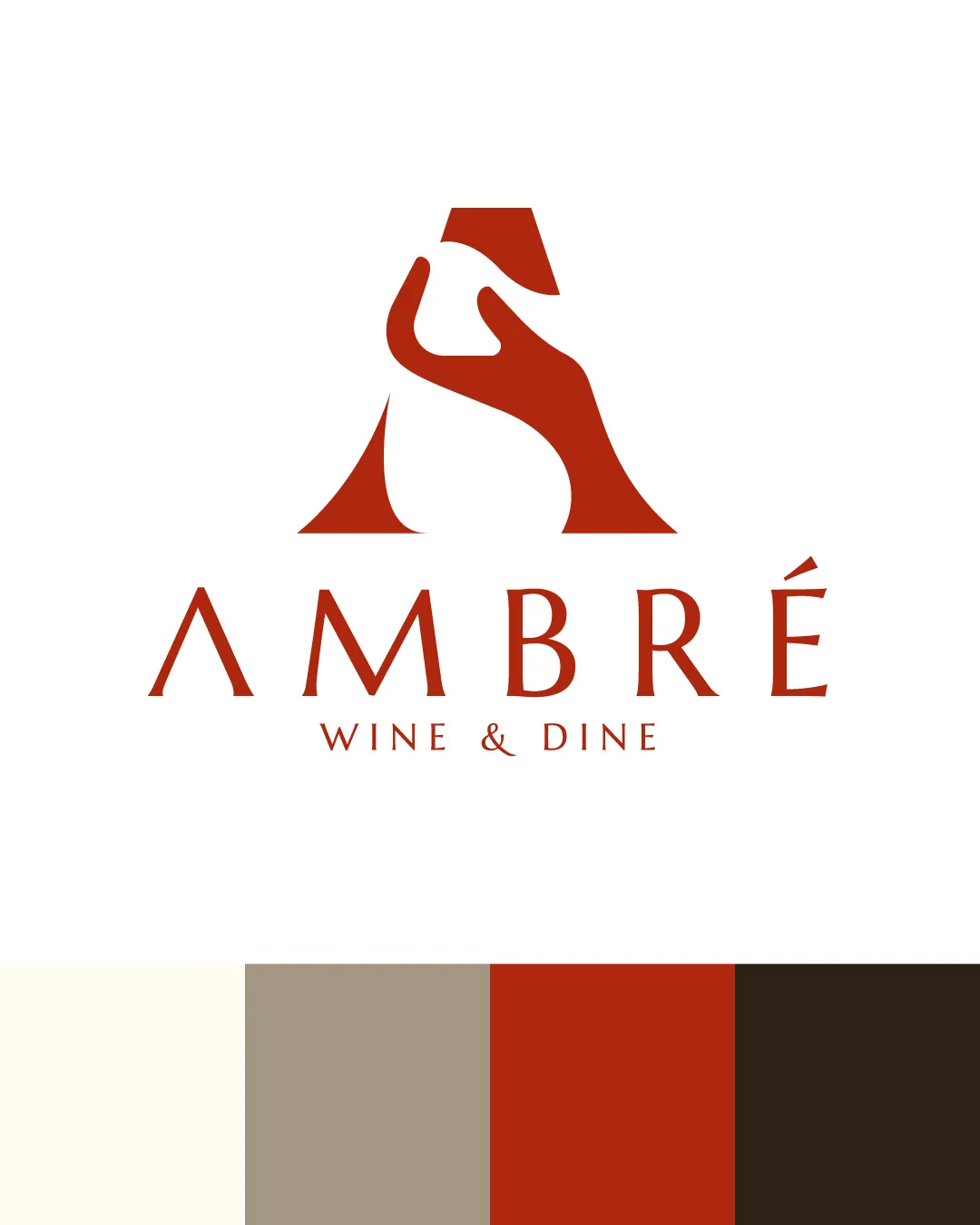
The main logo features a sophisticated letter 'A' that integrates a hand holding a wine glass, conveying both the brand initial and the concept of wine hospitality, above the wordmark 'AMBRÉ WINE & DINE' in elegant, custom serif type.

Wordmark description

The wordmark uses a thin, refined serif type with distinctive accents and spacing, enhancing a sense of luxury.

Logomark description

The logomark is a stylized 'A' formed from the negative space of a hand holding a wine glass, blending brand identity with a visual nod to dining.

Color palette description

The palette features a blend of deep reds, rich browns, soft taupes, and warm off-whites—evoking the tones of wine, earth, and fine dining interiors.

Explain the direction

The story and thinking behind the design.

Positioning statement

A refined logo capturing the essence of sophisticated dining with a warm, welcoming touch.

Design rationale

  1. Combines the initial 'A' with a wine glass and hand gesture for hospitality.
  2. Custom type and earthy palette evoke an upscale yet approachable wine and dine environment.

Tips for the logo presentation

Mockup ideas

  • Wine bottle label with the mark as a seal.
  • Menu cover with the full color lockup.
  • Backlit restaurant signage with the mark and wordmark.

Possible objections

  • May question if mark is distinctive enough within food and beverage sector.
  • Possible concern about small-scale clarity.

Presentation tips

  • Emphasize dual-concept mark (letter + wine glass + hospitality).
  • Present mockups at very small sizes to preempt clarity questions.
Try your own review

Wondering how your logo performs?

Get a clear logo score, key risks, and priority fix ideas before your client or audience sees it.

Review my logo