Wondering how your logo performs? 🧐
Get professional logo reviews in seconds and catch design issues in time.
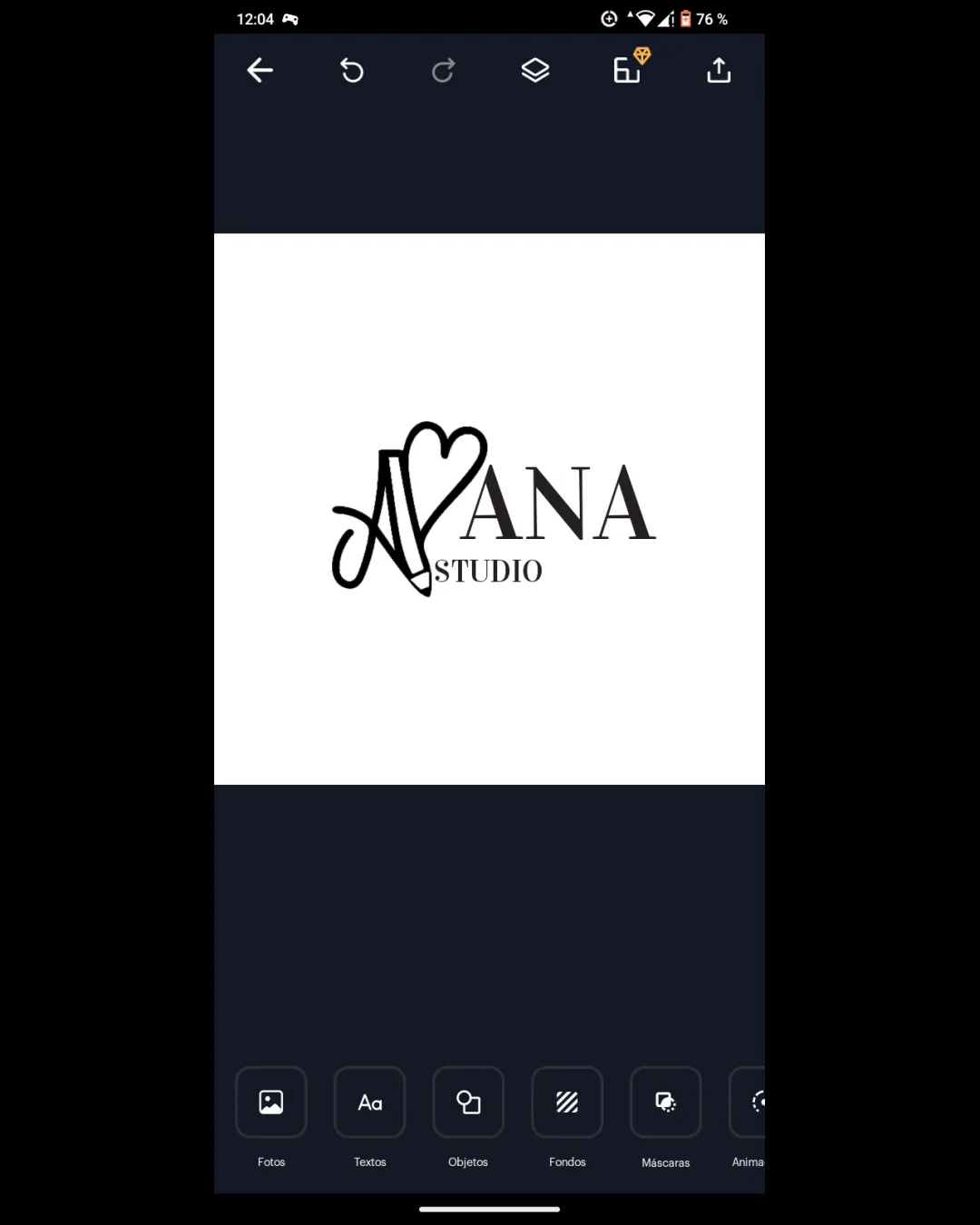
Try it Now!Logo review of ANA STUDIO
 Logo analysis by AI
Logo type:
Style:
Detected symbol:
Detected text:
Business industry:
Review requested by Anafrodriguezp
**If AI can recognize or misinterpret it, so can people.
Structured logo review
Legibility
![]() The main word 'ANA' is set in a clear serif font and easily readable.
The main word 'ANA' is set in a clear serif font and easily readable.![]() The 'STUDIO' text is legible though small.
The 'STUDIO' text is legible though small.
![]() 'AV' monogram may be confusing or misread by those unfamiliar with the brand.
'AV' monogram may be confusing or misread by those unfamiliar with the brand.![]() The handwritten style can create ambiguity, especially at smaller scales.
The handwritten style can create ambiguity, especially at smaller scales.![]() The 'STUDIO' text is smaller than ideal and risks legibility loss at reduced sizes.
The 'STUDIO' text is smaller than ideal and risks legibility loss at reduced sizes.
Scalability versatility
![]() The high contrast ensures basic reproduction in black and white.
The high contrast ensures basic reproduction in black and white.![]() Clean background allows for flexible use on light surfaces.
Clean background allows for flexible use on light surfaces.
![]() Thin, script elements of the 'AV' monogram and small 'STUDIO' text will not reproduce well in small print formats like business cards or embroidery.
Thin, script elements of the 'AV' monogram and small 'STUDIO' text will not reproduce well in small print formats like business cards or embroidery.![]() Monogram complexity may be lost in favicon or app icon formats.
Monogram complexity may be lost in favicon or app icon formats.![]() Not optimal for signage due to thin lines and scale issues.
Not optimal for signage due to thin lines and scale issues.
200x250 px
100×125 px
50×62 px
Balance alignment
![]() The overall composition maintains a centered alignment and visual stability.
The overall composition maintains a centered alignment and visual stability.
![]() 'AV' monogram is visually heavier than the rest, drawing attention unevenly.
'AV' monogram is visually heavier than the rest, drawing attention unevenly.![]() 'STUDIO' appears cramped and slightly misaligned relative to the main text.
'STUDIO' appears cramped and slightly misaligned relative to the main text.![]() The heart element introduces imbalance as it floats above the baseline.
The heart element introduces imbalance as it floats above the baseline.

Originality
![]() Incorporating a heart into the monogram demonstrates a creative approach.
Incorporating a heart into the monogram demonstrates a creative approach.![]() The transition from script to serif is uncommon and gives some distinction.
The transition from script to serif is uncommon and gives some distinction.
![]() Monogram hearts are common in beauty and wellness industries, which reduces uniqueness.
Monogram hearts are common in beauty and wellness industries, which reduces uniqueness.![]() Does not introduce a particularly novel treatment beyond the monogram-heart merge.
Does not introduce a particularly novel treatment beyond the monogram-heart merge.
Logomark wordmark fit
![]() Strong stylistic contrast between handwritten and serif conveys separation of elements.
Strong stylistic contrast between handwritten and serif conveys separation of elements.
![]() Script 'AV' feels stylistically detached from the straightforward serif of 'ANA', lacking harmonic cohesion.
Script 'AV' feels stylistically detached from the straightforward serif of 'ANA', lacking harmonic cohesion.![]() Logomark size and flourish overpower the wordmark at a glance.
Logomark size and flourish overpower the wordmark at a glance.
Aesthetic look
![]() Visually appealing for the industry with a friendly, welcoming script.
Visually appealing for the industry with a friendly, welcoming script.
![]() Slightly busy due to multiple font styles and the heart flourish.
Slightly busy due to multiple font styles and the heart flourish.![]() The monogram's heaviness and heart shape feel a bit forced, making it less clean.
The monogram's heaviness and heart shape feel a bit forced, making it less clean.
Dual meaning and misinterpretations
![]() No inappropriate dual meanings or offensive visuals detected.
No inappropriate dual meanings or offensive visuals detected.
Color harmony
![]() Monochrome palette is classic, ensures versatility and elegance.
Monochrome palette is classic, ensures versatility and elegance.![]() No clashing or excessive colors.
No clashing or excessive colors.
Black
#000000
White
#FFFFFF


