 View review
Logo score
Logo review ofArabic Calligraphy
Review the detailed scores below to see what is working and what should be refined first.
Legibility
Originality
Color
Balance
Scale
Detailed review
Logo performance breakdown
Legibility
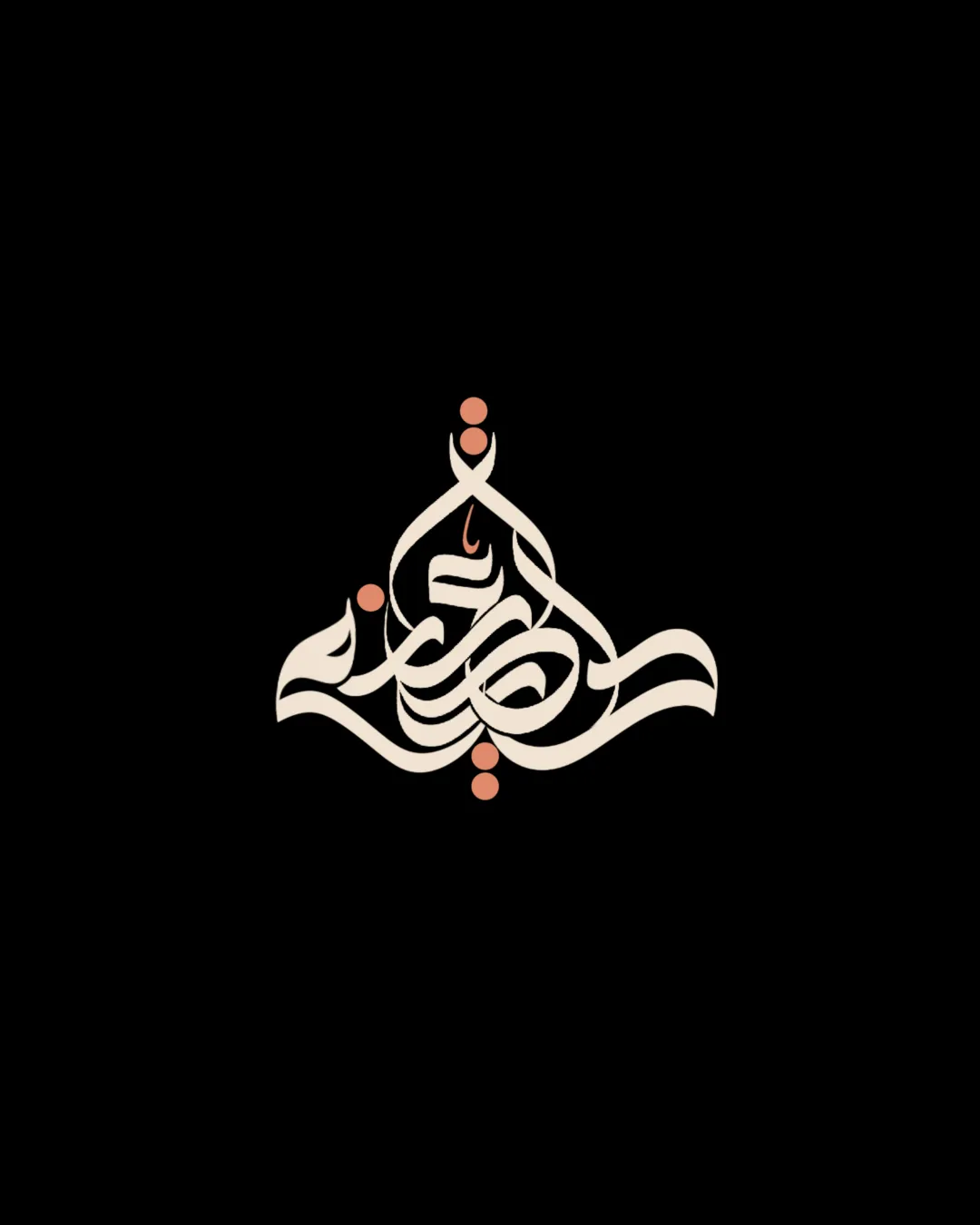
![]() Beautiful and intricate calligraphic forms.
Beautiful and intricate calligraphic forms.![]() Dots add cultural authenticity.
Dots add cultural authenticity.
![]() Extreme ornamentation reduces readability, especially for untrained viewers.
Extreme ornamentation reduces readability, especially for untrained viewers.![]() Text is difficult to distinguish at smaller sizes or for non-Arabic readers.
Text is difficult to distinguish at smaller sizes or for non-Arabic readers.
Originality
![]() Highly original due to bespoke Arabic calligraphy.
Highly original due to bespoke Arabic calligraphy.![]() Distinctive letterform integrations and expressive line work.
Distinctive letterform integrations and expressive line work.
Color harmony
![]() Subtle, minimal color scheme enhances focus on form.
Subtle, minimal color scheme enhances focus on form.![]() Colors are complementary and non-distracting.
Colors are complementary and non-distracting.
Albescent White
#F5ECD9
Copper
#D2846A
Black
#000000
Balance alignment
![]() Symmetrical composition, balanced top-to-bottom and side-to-side.
Symmetrical composition, balanced top-to-bottom and side-to-side.![]() Smooth flow gives a harmonious presence.
Smooth flow gives a harmonious presence.
![]() Dot placement could disrupt visual flow depending on usage context.
Dot placement could disrupt visual flow depending on usage context.![]() Sometimes feels slightly weighted towards the bottom due to the larger flourishes.
Sometimes feels slightly weighted towards the bottom due to the larger flourishes.

Scalability
![]() Visually striking at large formats (e.g., signage, event banners, posters).
Visually striking at large formats (e.g., signage, event banners, posters).
![]() Complex details and thin strokes may not be legible at small sizes (e.g., business cards, mobile app icons).
Complex details and thin strokes may not be legible at small sizes (e.g., business cards, mobile app icons).![]() Ornamentation will blur in embroidery or on compact product labels.
Ornamentation will blur in embroidery or on compact product labels.
200x250 px
100×125 px
50×62 px
Misinterpretations
![]() No inappropriate visual associations detected.
No inappropriate visual associations detected.
Try your own review
Review my logo
Wondering how your logo performs?
Get a clear logo score, key risks, and priority fix ideas before your client or audience sees it.
Keep exploring