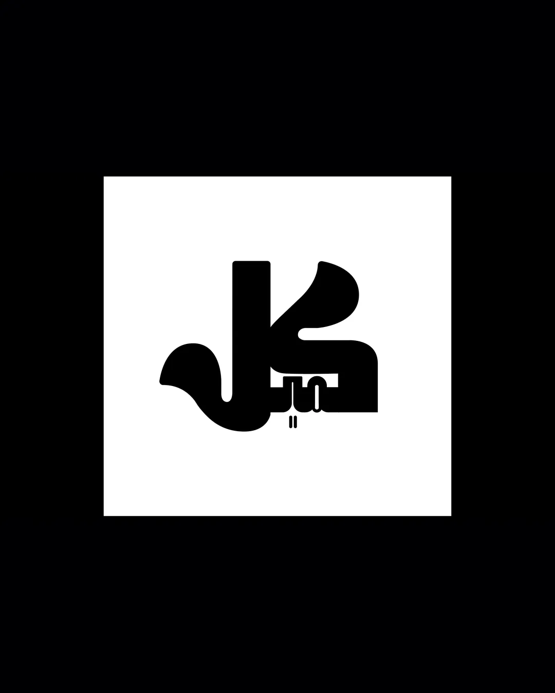
Arabic characters resembling 'كل' logo review
3.9 / 5
Logo score

Logo review ofArabic Characters Resembling 'كل'

Review the detailed scores below to see what is working and what should be refined first.

Logotype / Lettermark Modern, Bold, Geometric Creative
2/5
Legibility
4/5
Originality
5/5
Misread
4/5
Balance
3/5
Scale
Review next
Detailed review

Logo performance breakdown

2/5

Legibility

Checkmark icon Bold, high-contrast, and simple color scheme enhances recognition at a distance.

Warning icon Text is quite stylized, which significantly reduces readability for those unfamiliar with the script or for quick glances.
Warning icon Lower portions of the letters merge, making them difficult to distinguish individually.

4/5

Originality

Checkmark icon Script is highly stylized and custom, giving it a recognizable and unique character.
Checkmark icon Uncommon geometric treatment.

Warning icon If generalized geometric Arabic scripts are common in this industry, may lose some distinctiveness, but the execution here is original.

5/5

Color harmony

Checkmark icon High contrast black-and-white is universally harmonious and versatile.
Checkmark icon Minimal color palette enhances timelessness.

Black
#000000

White
#FFFFFF

4/5

Balance alignment

Checkmark icon Design feels horizontally balanced, with visual weight distributed relatively evenly.
Checkmark icon Symmetrical and consistent boldness.

Warning icon Bottom decorations and extensions may disrupt visual harmony depending on application placement.

logo 200x250 pixels scalability test alignment grid overlay
3/5

Scalability

Checkmark icon Thick, bold lines ensure decent visibility at many sizes.
Checkmark icon Logo could work on billboards, posters, and large-scale applications.

Warning icon Extreme stylization and densely packed characters make small-scale reproduction problematic; details will blur on business cards or small digital icons.
Warning icon Complex shape is not embroidery-friendly or suitable as a mobile app favicon.

logo 200x250 pixels scalability test

200x250 px

logo 100x125 pixels scalability test

100×125 px

logo 50x62 pixels scalability test

50×62 px

5/5

Misinterpretations

Checkmark icon No obvious risks of inappropriate visual forms or dual interpretations for mass audiences.

Try your own review

Wondering how your logo performs?

Get a clear logo score, key risks, and priority fix ideas before your client or audience sees it.

Review my logo