What to preserve
The logo combines a bold, abstract arch shape with a clean, modern wordmark. The symbol subtly references the brand name (Arco = arch) and hints at product forms typical in furniture design.
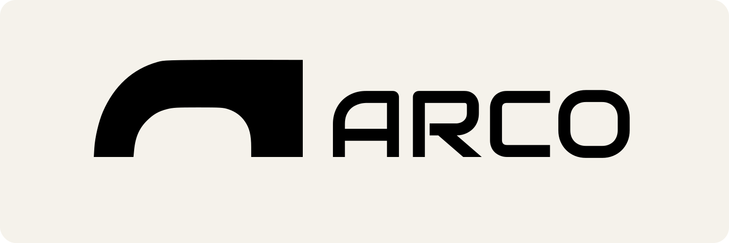
A memorable, relevant, and functionally strong logo that would be elevated by fine-tuning mark/word weight and introducing a distinct accent color.
Focus on the changes that matter. Keep what makes the logo work.
The logo combines a bold, abstract arch shape with a clean, modern wordmark. The symbol subtly references the brand name (Arco = arch) and hints at product forms typical in furniture design.
Current combination is slightly top-heavy; better alignment will enhance professionalism.
Medium improvement to visual harmony and polish
Palette is serviceable but could be more distinctive for stronger brand identity.
Enhances brand memorability without compromising elegance
The arch motif subtly references construction, strength, and the name Arco, aligning well with modern furniture branding.
Estimated colors. Use the original design file for exact values.
Create a full color palette using these colors
Create new palette

Inspect spacing with the guide. Optical balance may differ from geometric centering.
Does the shape still work without color?
Find the surfaces where your logo stays clear.
Compare the mark and lettering on each surface.
Shows the lower-contrast areas of the logo (5th percentile). Tiny details may have lower contrast. Good ≥ 4.5:1 · Medium ≥ 3:1 · Bad < 3:1. A visual guide, not an accessibility rating.
A 3px blur softens fine details so you can check whether the overall shape stays recognizable. If key gaps close or elements merge, the logo may rely too heavily on detail.
Look for clear separation between shapes and a distinctive outline.
Get a clear logo score, key risks, and priority fix ideas before your client or audience sees it.
More credits needed
Add credits to continue without losing your work.
Then $7/month. Cancel anytime.
Essential logo review with AI
Estimated progress