Wondering how your logo performs? 🧐
Get professional logo reviews in seconds and catch design issues in time.
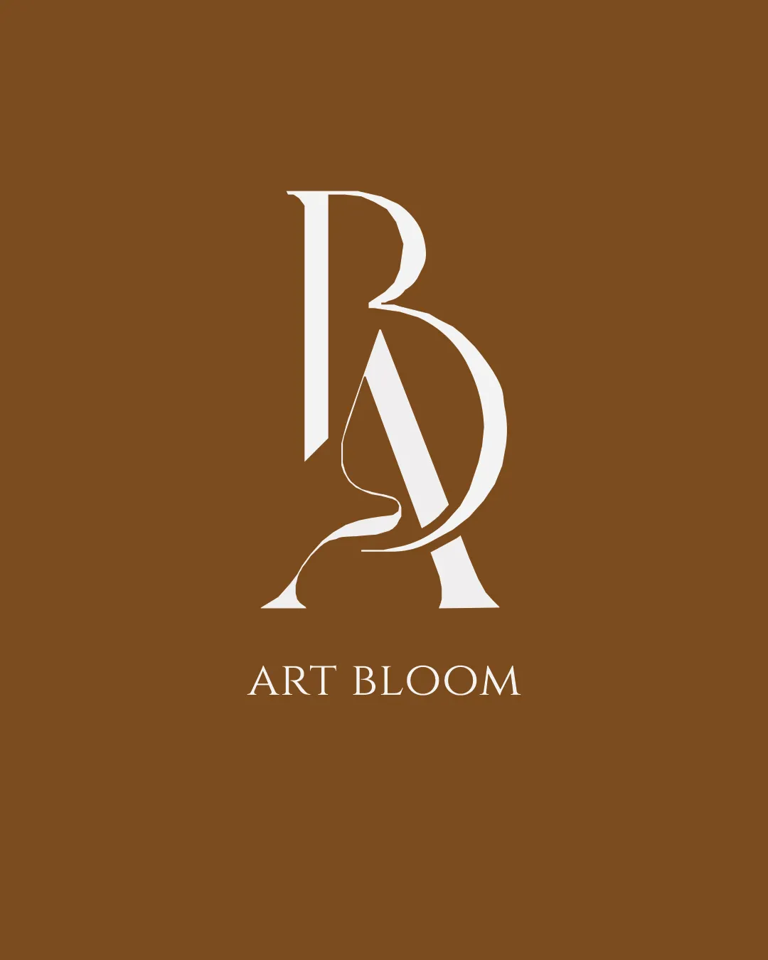
Try it Now!Logo review of ART BLOOM
 Logo analysis by AI
Logo type:
Style:
Detected symbol:
Negative space:
Detected text:
Business industry:
Review requested by Sheza_sherin
**If AI can recognize or misinterpret it, so can people.
Structured logo review
Legibility
![]() The 'ART BLOOM' wordmark is clear and set in a classic serif font, aiding readability
The 'ART BLOOM' wordmark is clear and set in a classic serif font, aiding readability![]() Monogram letters are distinguishable for those familiar with the brand or context
Monogram letters are distinguishable for those familiar with the brand or context
![]() The integration of the floral shape within the monogram slightly complicates the immediate recognition of the B and A for first-time viewers
The integration of the floral shape within the monogram slightly complicates the immediate recognition of the B and A for first-time viewers
Scalability versatility
![]() Simple color palette aids in single-color reproduction
Simple color palette aids in single-color reproduction![]() Balanced mark and wordmark allows for stacked and horizontal versions
Balanced mark and wordmark allows for stacked and horizontal versions
![]() Fine linework in the floral outline may be lost at very small sizes (e.g., favicon, small embroidery)
Fine linework in the floral outline may be lost at very small sizes (e.g., favicon, small embroidery)![]() Monogram complexity could hinder legibility on tiny merchandise or social media avatars
Monogram complexity could hinder legibility on tiny merchandise or social media avatars
200x250 px
100×125 px
50×62 px
Balance alignment
![]() Monogram is visually centered and well-proportioned
Monogram is visually centered and well-proportioned![]() Wordmark aligns symmetrically beneath the symbol
Wordmark aligns symmetrically beneath the symbol
![]() The thin floral line slightly disrupts geometric alignment with rest of the monogram
The thin floral line slightly disrupts geometric alignment with rest of the monogram

Originality
![]() Creative use of negative space for a floral symbol supports the brand name
Creative use of negative space for a floral symbol supports the brand name![]() BA monogram feels unique, with integrated art-related motif
BA monogram feels unique, with integrated art-related motif
![]() Monogram-based marks are somewhat common in the art and luxury sector
Monogram-based marks are somewhat common in the art and luxury sector
Logomark wordmark fit
![]() Serif style of the wordmark matches and enhances the elegance of the monogram
Serif style of the wordmark matches and enhances the elegance of the monogram![]() Proportion and spacing are harmonious
Proportion and spacing are harmonious
Aesthetic look
![]() Minimalistic elegance and high visual appeal
Minimalistic elegance and high visual appeal![]() Single accent color projects luxury and warmth
Single accent color projects luxury and warmth
Dual meaning and misinterpretations
![]() No inappropriate or confusing forms detected; floral element reinforces positive brand messaging
No inappropriate or confusing forms detected; floral element reinforces positive brand messaging
Color harmony
![]() Muted brown and ivory palette exudes sophistication and balance
Muted brown and ivory palette exudes sophistication and balance![]() Contrast supports readability and memorability
Contrast supports readability and memorability
Brown
#8A5B28
Ivory
#F5EADB