 View review
Logo score
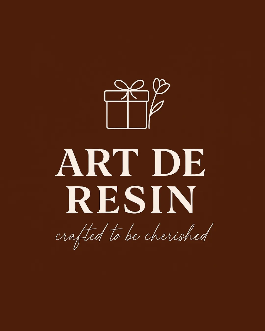
Logo review ofArt De Resin, Crafted To Be Cherished
Review the detailed scores below to see what is working and what should be refined first.
Legibility
Originality
Misread
Balance
Scale
Detailed review
Logo performance breakdown
Legibility
![]() Main wordmark 'ART DE RESIN' uses a classic serif font with good contrast against the background.
Main wordmark 'ART DE RESIN' uses a classic serif font with good contrast against the background.![]() Tagline is legible in larger formats.
Tagline is legible in larger formats.
![]() Tagline 'crafted to be cherished' uses a thin, script font that may become difficult to read at smaller scales or from a distance.
Tagline 'crafted to be cherished' uses a thin, script font that may become difficult to read at smaller scales or from a distance.
Originality
![]() The gift box with flower provides a gentle, crafted-themed touch relevant to the industry.
The gift box with flower provides a gentle, crafted-themed touch relevant to the industry.
![]() The gift box and flower motif is fairly common and lacks a unique twist or clever integration.
The gift box and flower motif is fairly common and lacks a unique twist or clever integration.![]() No creative use of negative space or customized iconography.
No creative use of negative space or customized iconography.
Color harmony
![]() Sophisticated two-color palette with high contrast.
Sophisticated two-color palette with high contrast.![]() Consistent and non-distracting.
Consistent and non-distracting.
Rich Brown
#4B1D08
Beige
#F5E8DA
Balance alignment
![]() Overall vertical stacking is harmonious.
Overall vertical stacking is harmonious.![]() Good visual hierarchy between symbol, wordmark, and tagline.
Good visual hierarchy between symbol, wordmark, and tagline.
![]() The flower stem overlaps with the box which may make the symbol feel a bit imbalanced — the weight distribution is slightly right-heavy.
The flower stem overlaps with the box which may make the symbol feel a bit imbalanced — the weight distribution is slightly right-heavy.

Scalability
![]() Symbol and primary text maintain clarity when reduced moderately.
Symbol and primary text maintain clarity when reduced moderately.![]() Logo works well for packaging, online banners, and product labels.
Logo works well for packaging, online banners, and product labels.
![]() Thin lines in the gift/flower icon and tagline may disappear in small sizes or embroidery.
Thin lines in the gift/flower icon and tagline may disappear in small sizes or embroidery.![]() Potential loss of elegance and readability in small-scale applications like favicons or pens.
Potential loss of elegance and readability in small-scale applications like favicons or pens.
200x250 px
100×125 px
50×62 px
Misinterpretations
![]() No inappropriate or unintended visuals detected.
No inappropriate or unintended visuals detected.![]() Symbol and text are clear in meaning.
Symbol and text are clear in meaning.
Symbol & text fit
![]() Symbol complements the refined serif wordmark.
Symbol complements the refined serif wordmark.
![]() Both elements share an elegant, minimal style.
Both elements share an elegant, minimal style.
![]() Wordmark feels more premium/classic, while the line-art gift box veers towards playful — slight style mismatch.
Wordmark feels more premium/classic, while the line-art gift box veers towards playful — slight style mismatch.
Try your own review
Review my logo
Wondering how your logo performs?
Get a clear logo score, key risks, and priority fix ideas before your client or audience sees it.
Keep exploring


