Wondering how your logo performs? 🧐
Get professional logo reviews in seconds and catch design issues in time.
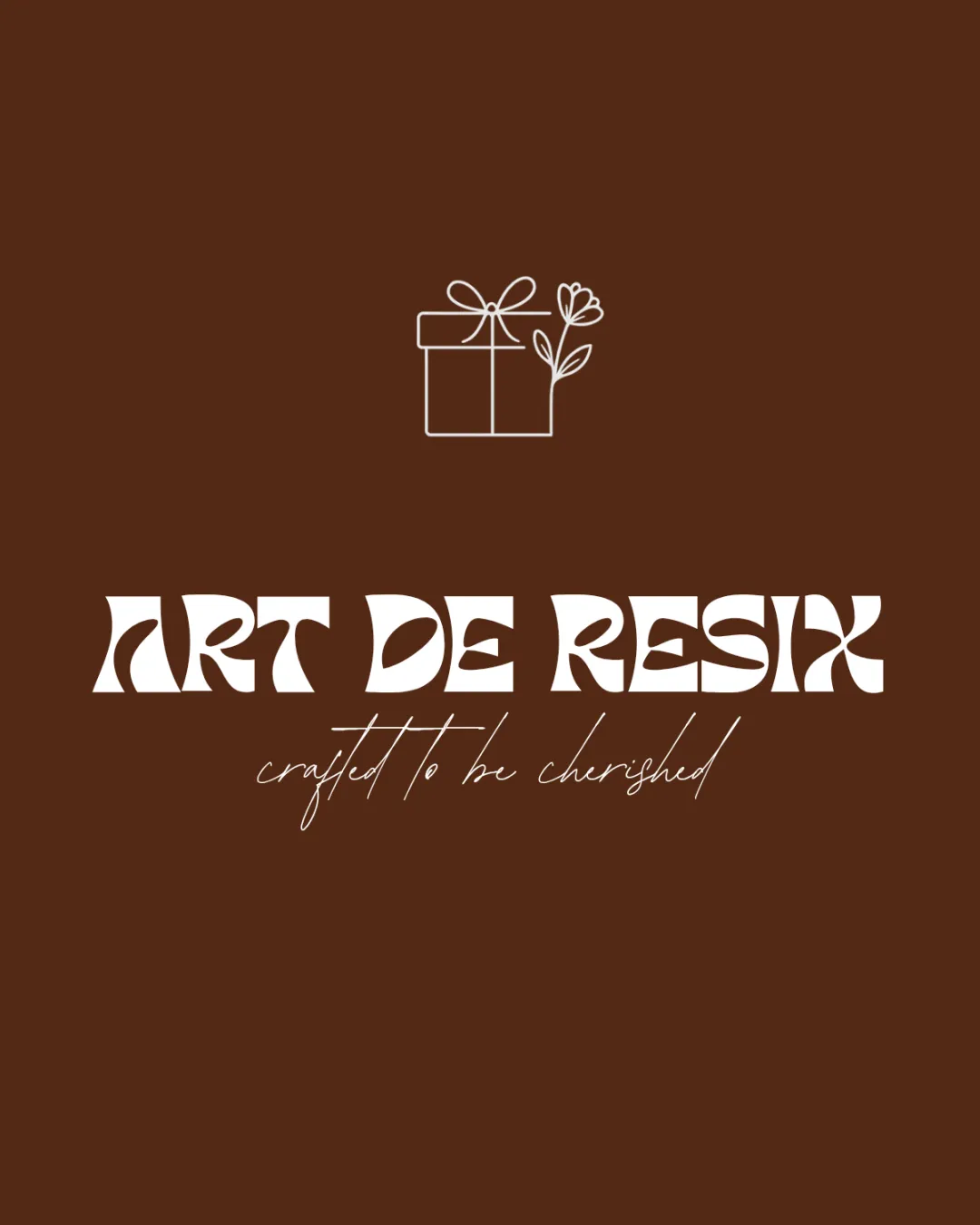
Try it Now!Logo review of ART DE RESIX, crafted to be cherished
 Logo analysis by AI
Logo type:
Style:
Detected symbol:
Detected text:
Business industry:
Review requested by Sheza_sherin
**If AI can recognize or misinterpret it, so can people.
Structured logo review
Legibility
![]() Tagline font is elegant and adds a hand-crafted touch.
Tagline font is elegant and adds a hand-crafted touch.
![]() Main wordmark is difficult to read, especially at smaller sizes or quick glances.
Main wordmark is difficult to read, especially at smaller sizes or quick glances.![]() Decorative font is over-stylized, making letter recognition problematic for 'RESIX'.
Decorative font is over-stylized, making letter recognition problematic for 'RESIX'.![]() Low contrast between the script tagline and background reduces clarity.
Low contrast between the script tagline and background reduces clarity.
Scalability versatility
![]() Simple icon might hold up in very small applications if used standalone.
Simple icon might hold up in very small applications if used standalone.![]() Good impact on large banners or digital graphics.
Good impact on large banners or digital graphics.
![]() Complex, ornate letterforms of the main wordmark will become illegible when reduced, such as in favicons or embroidery.
Complex, ornate letterforms of the main wordmark will become illegible when reduced, such as in favicons or embroidery.![]() Thin script tagline will disappear at small sizes.
Thin script tagline will disappear at small sizes.![]() Logo loses detail and clarity for smaller merch or packaging labels.
Logo loses detail and clarity for smaller merch or packaging labels.
200x250 px
100×125 px
50×62 px
Balance alignment
![]() Central alignment is generally maintained between icon and text.
Central alignment is generally maintained between icon and text.![]() Gift box icon and text are visually distributed in a traditional layout.
Gift box icon and text are visually distributed in a traditional layout.
![]() Visual weight is unbalanced: dense, heavy wordmark clashes with the light, delicate tagline and line-art icon.
Visual weight is unbalanced: dense, heavy wordmark clashes with the light, delicate tagline and line-art icon.![]() Tagline is under-emphasized compared to the blocky main text, causing a visual hierarchy issue.
Tagline is under-emphasized compared to the blocky main text, causing a visual hierarchy issue.

Originality
![]() Combination of gift box with flower is industry-relevant.
Combination of gift box with flower is industry-relevant.![]() Wordmark features a unique, though problematic, font.
Wordmark features a unique, though problematic, font.
![]() Gift box and floral element are common motifs for the industry and do not break new ground.
Gift box and floral element are common motifs for the industry and do not break new ground.![]() No clever negative space or fresh conceptual thinking apparent in the icon.
No clever negative space or fresh conceptual thinking apparent in the icon.
Logomark wordmark fit
![]() Both elements use line-based, modern styles.
Both elements use line-based, modern styles.
![]() Delicate line art icon conflicts with the bold, heavy, intricate wordmark—visual disconnect is pronounced.
Delicate line art icon conflicts with the bold, heavy, intricate wordmark—visual disconnect is pronounced.![]() Font style does not echo or reinforce the softness of the icon or the tagline.
Font style does not echo or reinforce the softness of the icon or the tagline.
Aesthetic look
![]() Color palette provides a warm, inviting tone.
Color palette provides a warm, inviting tone.![]() Script tagline adds some elegance and sophistication.
Script tagline adds some elegance and sophistication.
![]() Main wordmark font is visually jarring and interrupts flow.
Main wordmark font is visually jarring and interrupts flow.![]() The combination of ornate and delicate elements creates conflicting moods that hinder overall harmony.
The combination of ornate and delicate elements creates conflicting moods that hinder overall harmony.![]() Logo appears busy due to three typographic/graphic styles.
Logo appears busy due to three typographic/graphic styles.
Dual meaning and misinterpretations
![]() No inappropriate or misleading symbols detected.
No inappropriate or misleading symbols detected.
Color harmony
![]() Appropriate and consistent use of two colors—warm brown and white.
Appropriate and consistent use of two colors—warm brown and white.![]() Simple palette facilitates brand recognition and is not overwhelming.
Simple palette facilitates brand recognition and is not overwhelming.
Milk Chocolate
#5C2B13
White
#FFFFFF


