Wondering how your logo performs? 🧐
Get professional logo reviews in seconds and catch design issues in time.
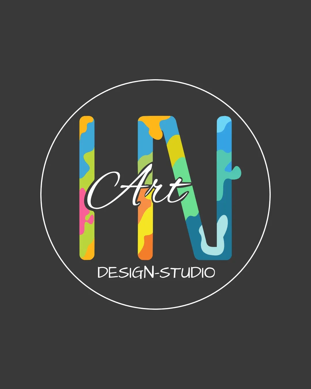
Try it Now!Logo review of Art, DESIGN-STUDIO
 Logo analysis by AI
Logo type:
Style:
Detected symbol:
Detected text:
Business industry:
Review requested by Branka.stojanovic-32
**If AI can recognize or misinterpret it, so can people.
Structured logo review
Legibility
![]() The word 'Art' in script is clearly separated from the background.
The word 'Art' in script is clearly separated from the background.![]() 'DESIGN-STUDIO' in all-caps is readable.
'DESIGN-STUDIO' in all-caps is readable.
![]() The color splash effect on the main letterform makes it ambiguous whether it's 'LN', 'IN', or 'IV', possibly confusing viewers.
The color splash effect on the main letterform makes it ambiguous whether it's 'LN', 'IN', or 'IV', possibly confusing viewers.![]() 'Art' overlaps the main letters, causing some readability conflict.
'Art' overlaps the main letters, causing some readability conflict.
Scalability versatility
![]() Bold lines on the main letterform should render well at medium-to-large sizes and in digital media.
Bold lines on the main letterform should render well at medium-to-large sizes and in digital media.
![]() Small text ('DESIGN-STUDIO') may blur at small sizes or on print outputs like business cards.
Small text ('DESIGN-STUDIO') may blur at small sizes or on print outputs like business cards.![]() Intricate color patterning will lose clarity at smaller sizes and become muddled in embroidery or favicon form.
Intricate color patterning will lose clarity at smaller sizes and become muddled in embroidery or favicon form.![]() 'Art' in script may become illegible when shrunk.
'Art' in script may become illegible when shrunk.
200x250 px
100×125 px
50×62 px
Balance alignment
![]() Central alignment of all elements inside the circle provides initial structural order.
Central alignment of all elements inside the circle provides initial structural order.
![]() 'Art' overlaps awkwardly with the main symbol, creating visual clutter and balance issues.
'Art' overlaps awkwardly with the main symbol, creating visual clutter and balance issues.![]() The underline of 'N' (if it is an N) and the placement of 'DESIGN-STUDIO' could be better harmonized vertically.
The underline of 'N' (if it is an N) and the placement of 'DESIGN-STUDIO' could be better harmonized vertically.

Originality
![]() Use of color-camouflage on the main letterform is playful and somewhat unique for creative fields.
Use of color-camouflage on the main letterform is playful and somewhat unique for creative fields.
![]() Color-splashed letters are common in art/creative studios; there’s little unexpected or novel in the conceptual approach.
Color-splashed letters are common in art/creative studios; there’s little unexpected or novel in the conceptual approach.![]() Letter ambiguity reduces uniqueness, as the form is not clearly one letter or combination.
Letter ambiguity reduces uniqueness, as the form is not clearly one letter or combination.
Logomark wordmark fit
![]() Circle contains and relates all elements.
Circle contains and relates all elements.
![]() Font styles are mismatched: rigid geometric letterform vs. script 'Art' vs. sterile sans for 'DESIGN-STUDIO'.
Font styles are mismatched: rigid geometric letterform vs. script 'Art' vs. sterile sans for 'DESIGN-STUDIO'.![]() Words and symbol visually compete for attention, rather than complementing each other.
Words and symbol visually compete for attention, rather than complementing each other.
Aesthetic look
![]() Playful, colorful quality adds vibrancy.
Playful, colorful quality adds vibrancy.![]() Dark background helps colors pop.
Dark background helps colors pop.
![]() Overlapping text and busy color palette diminish overall aesthetic refinement.
Overlapping text and busy color palette diminish overall aesthetic refinement.![]() Logo looks crowded and somewhat chaotic for high-end applications.
Logo looks crowded and somewhat chaotic for high-end applications.
Dual meaning and misinterpretations
![]() No inappropriate or accidental shapes perceived.
No inappropriate or accidental shapes perceived.
Color harmony
![]() Vivid palette is energetic and likely to appeal to a creative audience.
Vivid palette is energetic and likely to appeal to a creative audience.
![]() Too many competing bright colors and ambiguous blends harm brand recall.
Too many competing bright colors and ambiguous blends harm brand recall.![]() Lack of a core color theme; difficult to apply in monotone or practical branding scenarios.
Lack of a core color theme; difficult to apply in monotone or practical branding scenarios.
Mine Shaft
#444444
Sunglow
#FFDE59
Picton Blue
#18C2E4
Mantis
#6EDD4F
Froly
#F86666
Saffron
#F8BC25


