Wondering how your logo performs? 🧐
Get professional logo reviews in seconds and catch design issues in time.
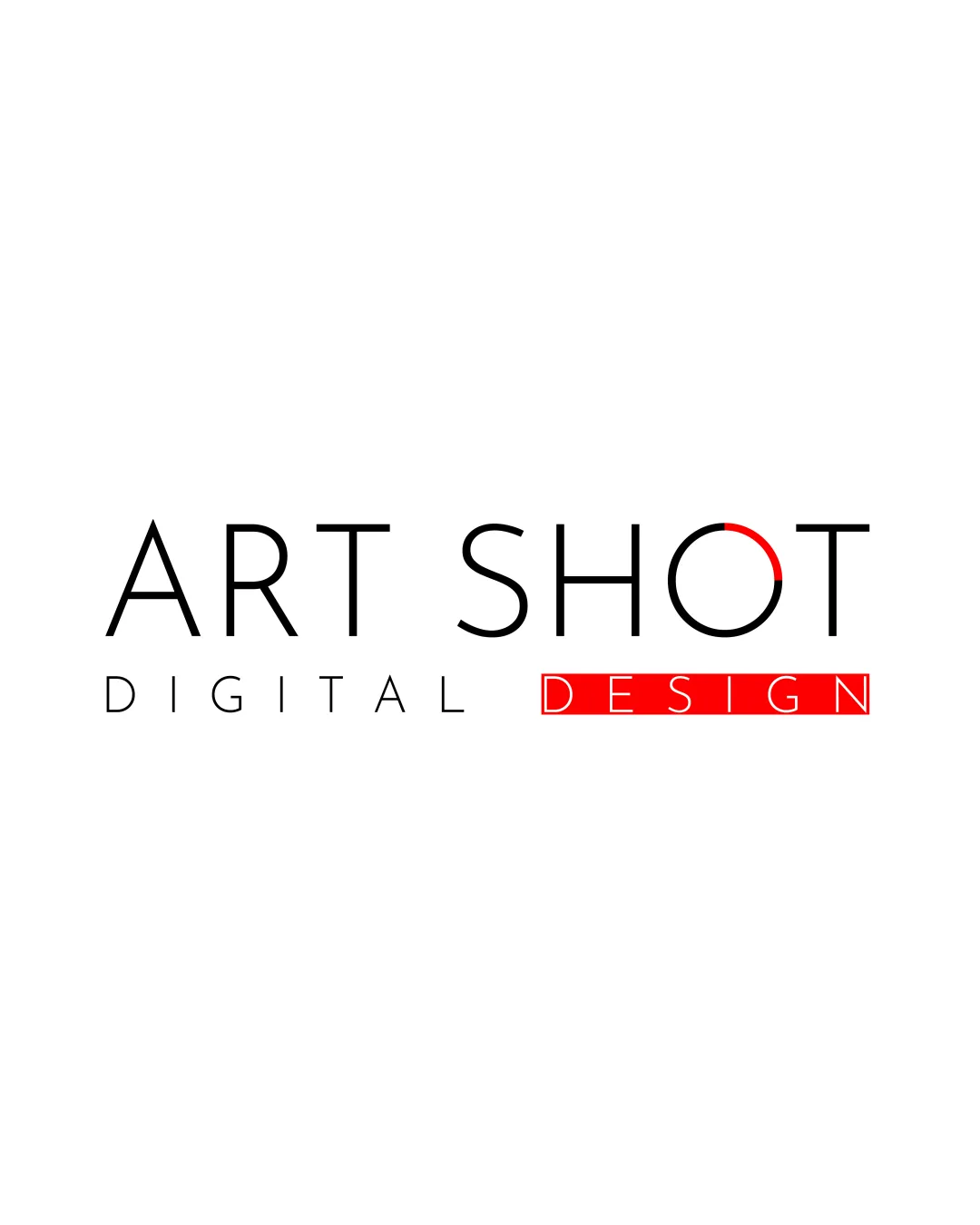
Try it Now!Logo review of ART SHOT DIGITAL DESIGN
 Logo analysis by AI
Logo type:
Style:
Detected symbol:
Detected text:
Business industry:
Review requested by Badrsharl
**If AI can recognize or misinterpret it, so can people.
Structured logo review
Legibility
![]() Clean, sans-serif typography maximizes readability.
Clean, sans-serif typography maximizes readability.![]() High contrast between text and background.
High contrast between text and background.
Scalability versatility
![]() Simple lines and minimal elements ensure good legibility at small sizes.
Simple lines and minimal elements ensure good legibility at small sizes.![]() Flat color palette is easily adaptable for different mediums.
Flat color palette is easily adaptable for different mediums.
![]() Thin lines in the 'O' accent might disappear on very small applications or embroidery.
Thin lines in the 'O' accent might disappear on very small applications or embroidery.![]() The boxed 'DESIGN' text may lose clarity as the logo is reduced further.
The boxed 'DESIGN' text may lose clarity as the logo is reduced further.
200x250 px
100×125 px
50×62 px
Balance alignment
![]() Word and letter spacing feel clean in the main 'ART SHOT' line.
Word and letter spacing feel clean in the main 'ART SHOT' line.![]() The red arc draws visual attention without overpowering the overall mark.
The red arc draws visual attention without overpowering the overall mark.
![]() The boxed 'DESIGN' feels detached and visually heavier compared to the rest of the layout, slightly destabilizing balance.
The boxed 'DESIGN' feels detached and visually heavier compared to the rest of the layout, slightly destabilizing balance.![]() Vertical alignment and size between 'DIGITAL' and 'DESIGN' create a discordant hierarchy.
Vertical alignment and size between 'DIGITAL' and 'DESIGN' create a discordant hierarchy.

Originality
![]() Partial arc in the 'O' offers a recognizable touch within an otherwise standard wordmark.
Partial arc in the 'O' offers a recognizable touch within an otherwise standard wordmark.![]() Red accent adds some uniqueness and modern feel.
Red accent adds some uniqueness and modern feel.
![]() Overall, the design is highly generic and easily replicated by wordmark generators.
Overall, the design is highly generic and easily replicated by wordmark generators.![]() Boxing 'DESIGN' in red is a common design trope and doesn't establish strong brand distinctiveness.
Boxing 'DESIGN' in red is a common design trope and doesn't establish strong brand distinctiveness.
Logomark wordmark fit
![]() The partial arc in the 'O' relates visually to the creative theme suggested by the name.
The partial arc in the 'O' relates visually to the creative theme suggested by the name.
![]() The graphic treatment is not fully integrated with the rest of the typography, making the accent feel slightly separate.
The graphic treatment is not fully integrated with the rest of the typography, making the accent feel slightly separate.
Aesthetic look
![]() Minimalism and geometric alignment create a modern, professional appearance.
Minimalism and geometric alignment create a modern, professional appearance.![]() Whitespace is used effectively for clarity.
Whitespace is used effectively for clarity.
![]() Visual disconnect between the understated ‘DIGITAL’ and bold ‘DESIGN’ box makes layout seem less unified.
Visual disconnect between the understated ‘DIGITAL’ and bold ‘DESIGN’ box makes layout seem less unified.
Dual meaning and misinterpretations
![]() No inappropriate or confusing secondary imagery detected.
No inappropriate or confusing secondary imagery detected.![]() Symbolism (arc in 'O') is subtle and not open to misinterpretation.
Symbolism (arc in 'O') is subtle and not open to misinterpretation.
Color harmony
![]() Limited color palette (black, white, red) maintains focus and professionalism.
Limited color palette (black, white, red) maintains focus and professionalism.![]() Red accent draws attention and aligns with 'design' emphasis.
Red accent draws attention and aligns with 'design' emphasis.
![]() Red box is visually dominant and could overpower finer accents if not managed across different backgrounds.
Red box is visually dominant and could overpower finer accents if not managed across different backgrounds.
Black
#000000
White
#FFFFFF
Red
#FF0000


