 View review
Logo score
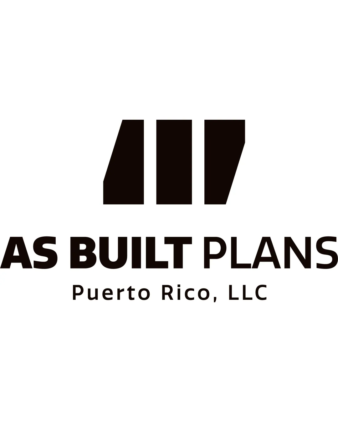
Logo review ofAs Built Plans Puerto Rico, Llc
Review the detailed scores below to see what is working and what should be refined first.
Legibility
Originality
Misread
Balance
Scale
Detailed review
Logo performance breakdown
Legibility
![]() Clear and bold typography ensures readability.
Clear and bold typography ensures readability.![]() Contrasting colors enhance text visibility.
Contrasting colors enhance text visibility.
Originality
![]() Abstract pattern gives a unique touch.
Abstract pattern gives a unique touch.
![]() Geometric shapes can be seen as somewhat generic.
Geometric shapes can be seen as somewhat generic.
Color harmony
![]() Monochrome design maintains simplicity.
Monochrome design maintains simplicity.
![]() Lack of color variety might limit brand personality.
Lack of color variety might limit brand personality.
Your palette is close. Explore sharper color combinations with Colorfly.design before updating the logo.
Explore palettesBalance alignment
![]() Well-balanced between symbol and text.
Well-balanced between symbol and text.
![]() Slight misalignment between text lines could be improved.
Slight misalignment between text lines could be improved.

Scalability
![]() Simple design allows for good scalability.
Simple design allows for good scalability.![]() Can be used on various mediums without losing clarity.
Can be used on various mediums without losing clarity.
![]() Abstract shapes may lose detail at very small sizes.
Abstract shapes may lose detail at very small sizes.
200x250 px
100×125 px
50×62 px
Misinterpretations
![]() No inappropriate or misleading elements detected.
No inappropriate or misleading elements detected.
Try your own review
Review my logo
Wondering how your logo performs?
Get a clear logo score, key risks, and priority fix ideas before your client or audience sees it.
Keep exploring


