Wondering how your logo performs? 🧐
Get professional logo reviews in seconds and catch design issues in time.
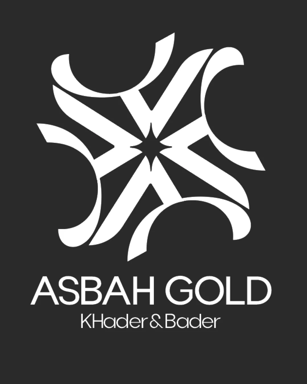
Try it Now!Logo review of ASBAH GOLD, KHadEr & Bader
 Logo analysis by AI
Logo type:
Style:
Detected symbol:
Negative space:
Detected text:
Business industry:
Review requested by Rama1998
**If AI can recognize or misinterpret it, so can people.
Structured logo review
Legibility
![]() Primary brand name 'ASBAH GOLD' is clear and uses a legible font.
Primary brand name 'ASBAH GOLD' is clear and uses a legible font.![]() High contrast between text and background.
High contrast between text and background.
![]() Secondary text 'KHadEr & Bader' contains inconsistent capitalization, reducing professional appearance.
Secondary text 'KHadEr & Bader' contains inconsistent capitalization, reducing professional appearance.![]() Fine lines in the secondary line reduce legibility at smaller sizes.
Fine lines in the secondary line reduce legibility at smaller sizes.
Scalability versatility
![]() Bold central symbol is distinct at medium to large sizes (e.g., signage, packaging).
Bold central symbol is distinct at medium to large sizes (e.g., signage, packaging).
![]() Complex geometric mark may lose clarity and detail at small sizes (e.g., jewelry engraving, business cards, favicon).
Complex geometric mark may lose clarity and detail at small sizes (e.g., jewelry engraving, business cards, favicon).![]() Thin lines and small secondary text risk becoming illegible on compact applications.
Thin lines and small secondary text risk becoming illegible on compact applications.
200x250 px
100×125 px
50×62 px
Balance alignment
![]() Geometric arrangement creates a sense of symmetry and order.
Geometric arrangement creates a sense of symmetry and order.![]() Logo and wordmark are vertically aligned and centered.
Logo and wordmark are vertically aligned and centered.
![]() Crescents in the symbol feel slightly uneven, with varying thickness adding mild visual imbalance.
Crescents in the symbol feel slightly uneven, with varying thickness adding mild visual imbalance.![]() Spacing between main and secondary text could be improved.
Spacing between main and secondary text could be improved.

Originality
![]() Ornamental mark references Middle Eastern motifs, which relate well to the jewelry/gold industry.
Ornamental mark references Middle Eastern motifs, which relate well to the jewelry/gold industry.![]() The use of geometric abstraction provides distinctiveness.
The use of geometric abstraction provides distinctiveness.
![]() Mandala/starburst forms in luxury/jewelry logos are frequently used—feels somewhat expected.
Mandala/starburst forms in luxury/jewelry logos are frequently used—feels somewhat expected.![]() No immediately recognizable letter customization or uniquely hidden motif.
No immediately recognizable letter customization or uniquely hidden motif.
Logomark wordmark fit
![]() Both the mark and wordmark have a clean, contemporary aesthetic.
Both the mark and wordmark have a clean, contemporary aesthetic.![]() Monochrome color palette ensures unity.
Monochrome color palette ensures unity.
![]() The elegant, ornamental mark feels more intricate compared to the simple sans-serif type; subtle mismatch in sophistication.
The elegant, ornamental mark feels more intricate compared to the simple sans-serif type; subtle mismatch in sophistication.![]() Wordmark spacing and case inconsistency detract from cohesiveness.
Wordmark spacing and case inconsistency detract from cohesiveness.
Aesthetic look
![]() The symbol is visually appealing and stylish.
The symbol is visually appealing and stylish.![]() Balanced proportions and clear contrast.
Balanced proportions and clear contrast.
![]() Potential visual noise from the intricate mark at smaller sizes.
Potential visual noise from the intricate mark at smaller sizes.![]() Typographic inconsistencies disrupt optimal aesthetic harmony.
Typographic inconsistencies disrupt optimal aesthetic harmony.
Dual meaning and misinterpretations
![]() No inappropriate or unintended imagery detected in the mark.
No inappropriate or unintended imagery detected in the mark.
Color harmony
![]() Simple monochrome scheme is timeless and highly versatile.
Simple monochrome scheme is timeless and highly versatile.![]() Excellent contrast enhances legibility and visual impact.
Excellent contrast enhances legibility and visual impact.
White
#FFFFFF
Dark Gray
#232323


