आशीष पैथोलॉजी, खून, .. logo review
2.5/5
Logo score
Logo review of

आशीष पैथोलॉजी, खून, ..

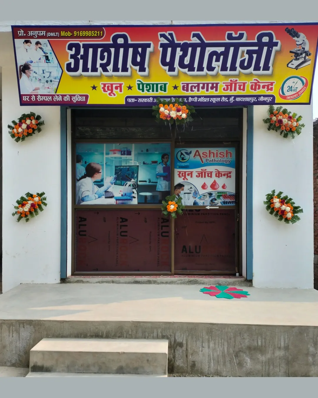
This signage is functional as a local lab identifier, but lacks uniqueness and refinement for memorable branding.

Combination Traditional Diagnostic/lab Signage Clinical/pathology Laboratory
3.5/5
Legibility
2/5
Originality
5/5
Misread
2.5/5
Balance
2.5/5
Scale
Your next steps

What to fix first

Focus on the changes that matter. Keep what makes the logo work.

1

main signboard

Explore unique visual treatments, custom typography, or a signature mark for memorability.

Visible issue High priority Medium effort

The logo uses generic imagery (microscope, diagnostic photo collage) and standard bold fonts, lacking distinctiveness compared to typical pathology labs.

How to check

Assess new concepts for distinct identity value.

See the category review
2

main signboard

Streamline typographic hierarchy for easier scanning and emphasis.

Optional refinement Medium priority Medium effort
Area to inspectApproximate location

Dense text blocks and multiple color highlights create visual busyness; main name and service offerings compete for attention.

How to check

Compare before/after signage for improved focus and clarity.

See the category review
Detailed review

Logo performance breakdown

3/5

Brief & logo match

Based on an inferred industry
Compared with

Pathology/clinical diagnostics; signage functions as local informational branding.

The visual approach clearly signals a pathology lab but is generic and lacks distinct branding.

  • Laboratory Identity

    Microscope icon and medical references clearly communicate a diagnostic lab.

  • Clarity Of Services

    Numerous highlighted keywords (blood, urine, phlegm) make main offerings obvious, but could overwhelm or distract.

3.5/5

Legibility

  • Text is large and readable at signboard size.
2/5

Originality

  • The logo uses generic imagery (microscope, diagnostic photo collage) and standard bold fonts, lacking distinctiveness compared to typical pathology labs.

    Visible issue main signboard

    Try: Explore unique visual treatments, custom typography, or a signature mark for memorability.

    Check: Assess new concepts for distinct identity value.

3.5/5

Color harmony

  • Bright palette draws attention.
Yellow#FFBC11
Red#D8131B
Dark Blue#252158
White#FFFFFF
Green#00A651

Estimated colors. Use the original design file for exact values.

Create a full color palette using these colors

Create new palette
2.5/5

Balance alignment

  • Dense text blocks and multiple color highlights create visual busyness; main name and service offerings compete for attention.

    Optional refinement main signboard

    Try: Streamline typographic hierarchy for easier scanning and emphasis.

    Check: Compare before/after signage for improved focus and clarity.

    Area to inspectApproximate location
Uploaded logoAlignment guide overlay

Inspect spacing with the guide. Optical balance may differ from geometric centering.

2.5/5

Scalability

  • Complex backgrounds and detailed photo overlays may not reproduce well at small sizes or low resolution.

    Worth testing full logo

    Try: Test a simplified version suitable for print, stamps, or small online use.

    Check: Verify legibility and recognizability at reduced sizes.

Uploaded logo at 200 pixels wide
200 × 250 px
Uploaded logo at 100 pixels wide
100 × 125 px
Uploaded logo at 50 pixels wide
50 × 63 px

Compare the detail at different sizes. Labels show the full image dimensions.

5/5

Misinterpretations

  • No unintended shapes or confusing negative space.
3/5

Symbol & text fit

  • Microscope icon broadly matches the pathology theme.

Black & white

Does the shape still work without color?

These tests are available only for logos uploaded in vector (SVG) format.

Background contrast

Find the surfaces where your logo stays clear.

These tests are available only for logos uploaded in vector (SVG) format.

Blur & silhouette

A 3px blur softens fine details so you can check whether the overall shape stays recognizable. If key gaps close or elements merge, the logo may rely too heavily on detail.

These tests are available only for logos uploaded in vector (SVG) format.

Try your own review

Wondering how your logo performs?

Get a clear logo score, key risks, and priority fix ideas before your client or audience sees it.

Review my logo