 View review
Logo score
Logo review of
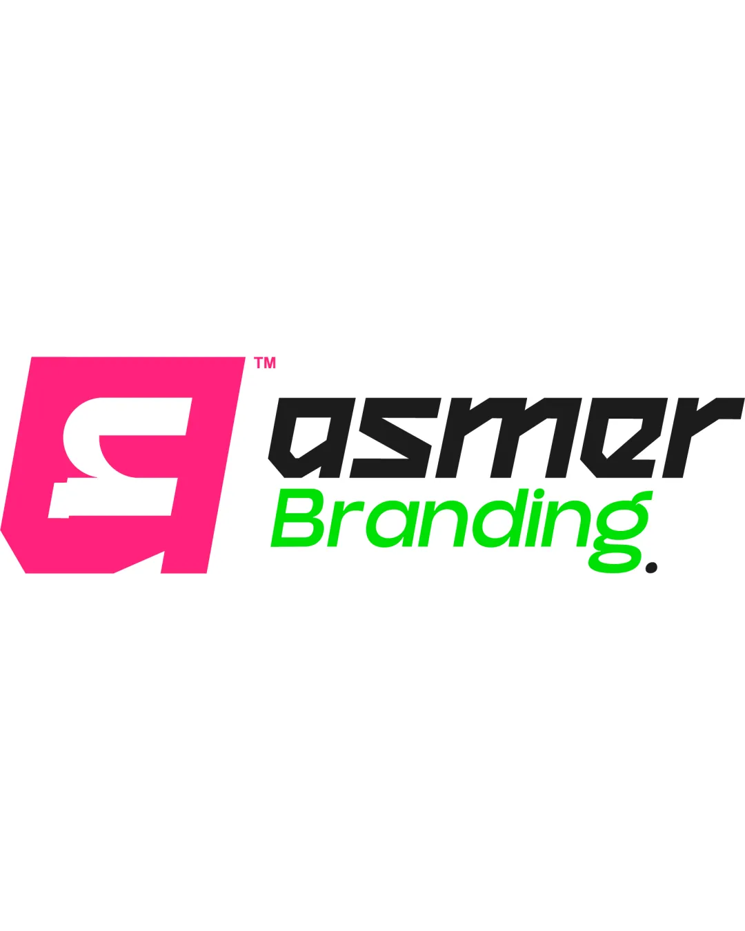
Asmer Branding.
A vibrant and functional identity with strong creative direction, but undercut by typographic and conceptual over-familiarity.
Legibility
Originality
Misread
Balance
Scale
Action plan
What to fix first
The most important fixes to handle before polishing the full presentation.
1
Refine wordmark typography for clarity and memorability.
High priorityCurrent type design hinders quick brand recall and may confuse at a glance.
Impact: Improved Readability And Distinction. · Effort: Medium
2
Consider minor adjustments to color harmony for broader appeal without sacrificing distinctiveness.
Medium priorityBright pink and green may be off-putting to conservative clients or audiences.
Impact: Helps Ensure Versatility And Perception In Different Contexts And Media. · Effort: Low
Detailed review
Logo performance breakdown
Legibility
 Wordmark is mostly clear and distinguishable.
 'asmer' typeface is slightly unconventional, making quick reading less immediate. Contrast between pink mark and background is good, but some may misread the monogram.
Originality
Bold pink geometric block is eye-catching.
Monogram-in-block is a common technique in branding; relies on color rather than unique form.
Color harmony
Bright palette differentiates brand from traditional competitors.
Pink and green combination may not appeal universally or suggest professional seriousness.
Pink
#FF1FA6
Black
#111111
Bright Green
#32FF32
Color may be holding this logo back. Build a stronger strategic palette before updating the logo.
Build brand colorsBalance alignment
Mark and wordmark are visually linked by the diagonal baseline. Distinct color and scale separation create hierarchy.
Diagonal text layout introduces a slight imbalance; mark outweighs text optically.

Scalability
Mark and text remain identifiable at smaller sizes. Simple forms adapt well for different media.
Fine negative spaces inside the monogram could blur at very small scales.
200x250 px
100×125 px
50×62 px
Misinterpretations
No obvious misinterpretation or awkward negative space.
Logo structure & brief match
Monogram's style complements the angular wordmark.
Wordmark and mark could feel more unified stylistically.
Industry: Modern approach feels appropriate for a creative branding agency.
Try your own review
Review my logo
Wondering how your logo performs?
Get a clear logo score, key risks, and priority fix ideas before your client or audience sees it.
Keep exploring