
AVALUXE INTERIORS logo logo review
4.4/5
Logo score Combination mark category

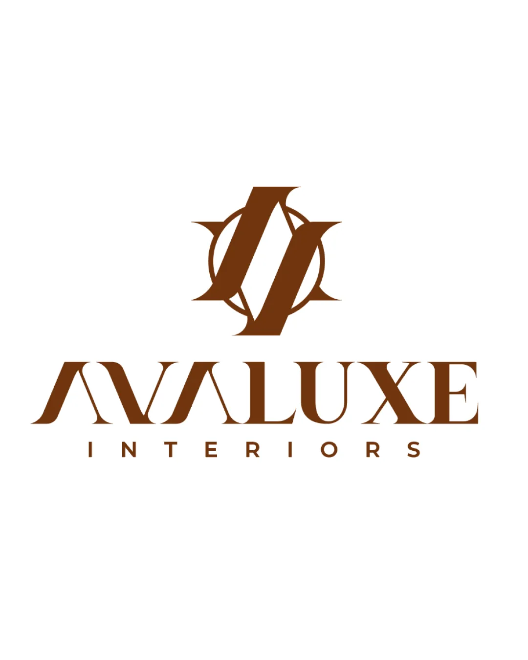
AVALUXE INTERIORS logo

graphstorm Advanced logo review

A strong, confident visual identity; sharp forms, strong luxury cues, and modern composition make it well-suited to the interior design sector.

This logo lockup shows strong execution, supported by visual balance and distinctive construction.

Combination Mark Monogram + Modern Serif Wordmark Interior Design
4.3/5
Legibility
4/5
Originality
5/5
Balance
4/5
Scale
4/5
Style consistency
Your next steps

What to fix first

Focus on the changes that matter. Keep what makes the logo work.

1

monogram, wordmark

Test subtle tweaks to the wordmark's angles or the monogram's terminals to further harmonize their treatments.

Medium priority Optional refinement Medium effort

The monogram's heavy geometric angles contrast with the wordmark's classic serif forms, slightly reducing complete visual unity.

How to check

The current contrast is intentional and contemporary, but minor enhancements could improve brand cohesion without sacrificing modernity.

See the category review
Detailed review

Logo performance breakdown

5/5

Brief & logo match

The logo's bold monogram, sharp geometric style, and strong serif wordmark directly embody the confident, modern, and contemporary luxury brief.

4.3/5

Legibility

Monogram 4/5 · Wordmark 4/5 · Layout 5/5

  • Distinctive, sharp letterforms in main name remain legible despite stylization.
4/5

Originality

Monogram 4/5 · Wordmark 4/5

  • Monogram's form and interaction with the wordmark are visually unique for luxury/interior design.
5/5

Balance alignment

Monogram 5/5 · Wordmark 5/5 · Layout 5/5

  • Mark, wordmark, and tagline visually balanced; strong centering and stable proportions.
Uploaded logoAlignment guide overlay

Inspect spacing with the guide. Optical balance may differ from geometric centering.

4/5

Scalability

Monogram 4/5 · Wordmark 4/5 · Layout 4/5

  • Monogram and main wordmark scale well; only tagline may risk small-scale loss.
  • The tagline is quite small compared to other elements, which may affect clarity at reduced sizes or poor print conditions.

    Worth testing wordmark

    Try: Test print and small-scale clarity of the tagline, considering modest increases in spacing or weight if needed.

5/5

Misinterpretations

  • No unintended readings or visual confusion present.
4/5

Style consistency

  • Monogram and wordmark both sharp; slight style contrast but deliberate and contemporary.
  • The monogram's heavy geometric angles contrast with the wordmark's classic serif forms, slightly reducing complete visual unity.

    Optional refinement monogram, wordmark

    Try: Test subtle tweaks to the wordmark's angles or the monogram's terminals to further harmonize their treatments.

    Check: The current contrast is intentional and contemporary, but minor enhancements could improve brand cohesion without sacrificing modernity.
4.5/5
Market fit

Category positioning

Distinguishes itself within the luxury/contemporary interior design space while maintaining clear category relevance.

1
Category Fit
Good fit

Uses classic luxury signifiers—serif, monogram, and geometric motif—matching high-end design sector cues.

2
Differentiation Risk
Distinct enough

Bold angles and the unique monogram provide an edge, though monogrammed marks are common in luxury/design.

Brand impression

Logo personality

The impression your logo creates.

The design projects bold confidence and modern luxury through strong forms and sharp, contemporary details.

AI interpretation of the visible design. These describe personality, not quality.

Presence

Strongly bold

How strongly it attracts attention.

UnderstatedBold

Large, centered monogram and pronounced, stylized lettering command immediate attention.

Attitude

Leans serious

How serious or lighthearted it feels.

SeriousPlayful

The sharp geometry and refined serif are serious and commanding, not playful.

Formality

Strongly formal

How relaxed or formal it appears.

CasualFormal

Serif typography, structure, and centering create a highly formal, professional impression.

Style

Strongly contemporary

Heritage cues versus a current look.

ClassicContemporary

Distinct geometric motif and modern type treatment evoke a fully contemporary aesthetic.

Emotional tone

Leans cool

Its emotional feel, beyond colour temperature.

WarmCool

Warm brown hues soften the overall presentation, but crisp lines keep it more neutral than cozy.

Positioning

Strongly luxury

Everyday appeal versus luxury cues.

EverydayLuxury

Opulent layout, luxury cues, and monogram symbolism align with upper-tier market positioning.

From design file to real use

Use-case readiness

See your logo in context, then check what needs attention before production. Settings use the colors detected in your logo where available.

  • 9 look suitable

Website header

Ready

Desktop

Mobile

Favicon

Ready

Google search

Ready

Social media avatar

Ready

Business card

Ready

Signs & signage

Ready

Packaging & labels

Ready

Embroidery

Ready

One-color printing

Ready
Delivery checklist

Logo delivery checklist

Format templates · Included versions and delivery checklist
Uploaded logo
Reviewed upload

Primary logo lockup

Included

A mark and wordmark are both visible in the uploaded asset.

Uploaded logo
Reviewed upload

One-color logo version

Included

A monochrome version is visible. Test its detail and contrast at the intended size before production.

Standalone wordmark

High priority Recommended

Export the wordmark separately, without the symbol or tagline, for narrow placements and smaller sizes.

Standalone logomark or monogram

High priority Recommended

Export the existing symbol, mascot, or monogram on its own for avatars, favicons, and compact placements. Check its clarity at small sizes.

Wordmark with tagline

Medium priority Recommended

Prepare a separate wordmark with the existing tagline for larger placements. Keep the tagline-free wordmark for small sizes.

Brand color palette

Medium priority Recommended

Define the intended brand colors separately without changing this monochrome review score.

Presentation kit

Logo presentation copy and mockup ideas

Logo presentation ideas

Hover over or select a slide to highlight its notes.

Slide 1

Positioning statement

Modern luxury meets sharp professionalism in this refined identity for a leading interior design agency.

Slide 2

Primary lockup

A geometric AA monogram inside a sharp circle motif sits above a modern, angular serif wordmark reading 'AVALUXE', with 'INTERIORS' spaced below.

Slide 3 · Application idea

Mockup idea 1

Brushed metallic door plaque for a luxury office suite entrance.

Slide 4

Monogram

Angular overlapping A's encircled by sharp point extensions, forming a cohesive, iconic geometric badge.

Slide 5 · Application idea

Mockup idea 2

Letterhead and invoice pairing the monogram as a seal at top left, wordmark below.

Slide 6

Wordmark

AVALUXE is rendered in a high-contrast, modern serif typeface with strong, stylized diagonals; INTERIORS appears in minimalist uppercase sans-serif beneath.

Slide 7 · Application idea

Mockup idea 3

Silk-finished business cards with raised monogram foil and sharp text contrast.

Slide 8

Design rationale

The geometric monogram captures exclusivity and strength, echoing bespoke design solutions.
The angular, stylish serif wordmark reinforces a premium, contemporary aesthetic for high-end interiors.

Try your own review

Wondering how your logo performs?

Get a clear logo score, key risks, and priority fix ideas before your client or audience sees it.

Review my logo