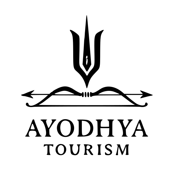
AYODHYA TOURISM logo review
4/5
Logo score
Logo review of

Ayodhya Tourism

This logo is strong, meaningful, and almost ready for broad use; confirm legibility in small sizes and consider minor alignment tuning.

Combination Mark Monochrome Traditional Travel, Pilgrimage, Tourism
5/5
Legibility
4/5
Originality
5/5
Misread
4/5
Balance
3/5
Scale
Your next steps

What to fix first

Focus on the changes that matter. Keep what makes the logo work.

1

bow and arrow logomark

Test logo at minimum display sizes for digital and print to confirm line clarity.

Worth testing High priority Low effort
Area to inspectApproximate location

Fine lines in the bow and arrow may become indistinct at small sizes.

How to check

Reduce logo to smaller dimensions and confirm if details are still clear.
See the category review
2

overall mark and text alignment

Slightly reduce vertical gap between symbol and text for more unified appearance.

Optional refinement Medium priority Low effort

Vertical spacing between the logomark and the wordmark creates slightly disconnected visual flow.

How to check

Visually compare spacing before and after adjustment for improved cohesion.

See the category review
Detailed review

Logo performance breakdown

5/5

Brief & logo match

Based on your brief
Compared with

traavel agency, pilgrimage travellers premium and budget all over india, main logo used on profiles of social media website google business profile and other places

Iconography and text clearly signal Ayodhya pilgrimage tourism, fitting the brief for wide profile and digital visibility.

  • Ayodhya/spiritual Symbolism

    Trident and bow-arrow directly refer to Ayodhya's mythological and religious context, aligning with pilgrimage tourism.

  • Travel/tourism Identity

    Wordmark is direct about the sector and classic in style, suitable for both premium and budget offerings.

5/5

Legibility

  • Strong, clear typeface.
  • Simple, readable composition.
4/5

Originality

  • Symbol meaningfully references Ayodhya.
  • Unique combination of cultural motifs.
4/5

Balance alignment

  • Central alignment is clean.
  • Composition feels stable.
  • Vertical spacing between the logomark and the wordmark creates slightly disconnected visual flow.

    Optional refinement overall mark and text alignment

    Try: Slightly reduce vertical gap between symbol and text for more unified appearance.

    Check: Visually compare spacing before and after adjustment for improved cohesion.

Uploaded logoAlignment guide overlay

Inspect spacing with the guide. Optical balance may differ from geometric centering.

3/5

Scalability

  • Crisp lines in large sizes.
  • Fine lines in the bow and arrow may become indistinct at small sizes.

    Worth testing bow and arrow logomark

    Try: Test logo at minimum display sizes for digital and print to confirm line clarity.

    Check: Reduce logo to smaller dimensions and confirm if details are still clear.

    Area to inspectApproximate location
Uploaded logo at 200 pixels wide
200 × 250 px
Uploaded logo at 100 pixels wide
100 × 125 px
Uploaded logo at 50 pixels wide
50 × 63 px

Compare the detail at different sizes. Labels show the full image dimensions.

5/5

Misinterpretations

  • No unintended readings.
4/5

Symbol & text fit

  • Visual link between historic symbolism and brand name.

Black & white

Does the shape still work without color?

Preparing artwork...

Background contrast

Find the surfaces where your logo stays clear.

Compare the mark and lettering on each surface.

Blur & silhouette

A 3px blur softens fine details so you can check whether the overall shape stays recognizable. If key gaps close or elements merge, the logo may rely too heavily on detail.

Original
3px blur

Look for clear separation between shapes and a distinctive outline.

Try your own review

Wondering how your logo performs?

Get a clear logo score, key risks, and priority fix ideas before your client or audience sees it.

Review my logo