Azrah Mukhray The love of Kashmiri beyond logo review
4/5
Logo score
Logo review of

Azrah Mukhray The Love Of Kashmiri Beyond

A strong, culturally relevant identity with minor technical adjustments needed for optimal scalability and tagline legibility.

Combination Classic With Regional Motif Fashion/apparel
3.5/5
Legibility
4/5
Originality
5/5
Misread
4/5
Balance
3/5
Scale
Your next steps

What to fix first

Focus on the changes that matter. Keep what makes the logo work.

1

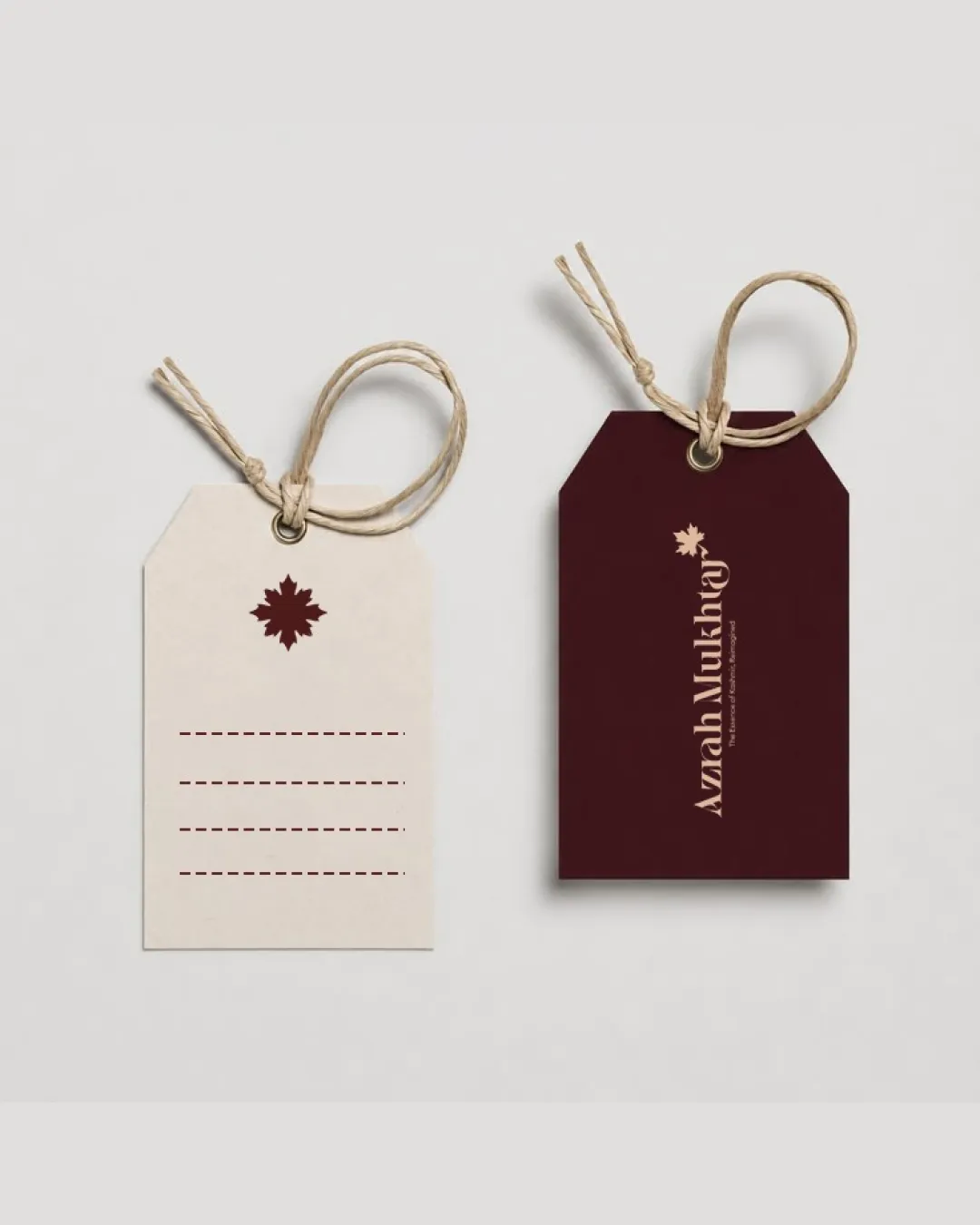
wordmark (small text)

Increase tagline size or ensure high contrast if used at small scales.

Visible issue Medium priority Low effort
Area to inspectApproximate location

The tagline 'The love of Kashmiri beyond' is quite small and may not be readable at small scales or on dark backgrounds.

How to check

Check tagline readability at typical print and web sizes.

See the category review
2

Standalone mark (leaf symbol)

Test the leaf mark at reduced sizes for detail retention.

Worth testing Medium priority Low effort
Area to inspectApproximate location

The small, detailed points of the leaf symbol may lose clarity at very small sizes.

How to check

Verify legibility and recognition at 2cm or smaller.

See the category review
Detailed review

Logo performance breakdown

5/5

Brief & logo match

Based on your brief
Compared with

Fashion label reviving traditional Kashmiri craft with modern silhouettes.

The logo convincingly blends regional heritage with contemporary fashion cues.

  • Cultural Authenticity

    The chinar leaf is a recognizable Kashmiri symbol, aligning with revival of traditional crafts.

  • Modern Appeal

    The clean serif type and minimal layout offer a sophisticated, modern presentation.

3.5/5

Legibility

  • Primary wordmark is readable and distinctive.
  • The tagline 'The love of Kashmiri beyond' is quite small and may not be readable at small scales or on dark backgrounds.

    Visible issue wordmark (small text)

    Try: Increase tagline size or ensure high contrast if used at small scales.

    Check: Check tagline readability at typical print and web sizes.

    Area to inspectApproximate location
4/5

Originality

  • Stylized leaf and serif typography echo Kashmiri craft with a modern edge.
4/5

Color harmony

  • Rich maroon and cream create distinctive luxury feel.
DarkBrown#4C2526
OffWhite#F6EFE5

Estimated colors. Use the original design file for exact values.

Create a full color palette using these colors

Create new palette
4/5

Balance alignment

  • Centered vertical lockup has classic appeal.
  • The vertical arrangement of the leaf mark and wordmark is centered but the small leaf may feel detached at certain sizes or layouts.

    Optional refinement wordmark and mark arrangement

    Try: Consider proportion adjustments or alternate lockups for versatility.

    Check: Test visual cohesion in horizontal, stacked, and minimal lockups.

Uploaded logoAlignment guide overlay

Inspect spacing with the guide. Optical balance may differ from geometric centering.

3/5

Scalability

  • Leaf mark is simple enough for medium sizes.
  • The small, detailed points of the leaf symbol may lose clarity at very small sizes.

    Worth testing Standalone mark (leaf symbol)

    Try: Test the leaf mark at reduced sizes for detail retention.

    Check: Verify legibility and recognition at 2cm or smaller.

    Area to inspectApproximate location
Uploaded logo at 200 pixels wide
200 × 250 px
Uploaded logo at 100 pixels wide
100 × 125 px
Uploaded logo at 50 pixels wide
50 × 63 px

Compare the detail at different sizes. Labels show the full image dimensions.

5/5

Misinterpretations

  • No negative shapes or unintended readings.
4/5

Symbol & text fit

  • Leaf symbol and serif type pair elegantly and share cultural resonance.

Black & white

Does the shape still work without color?

These tests are available only for logos uploaded in vector (SVG) format.

Background contrast

Find the surfaces where your logo stays clear.

These tests are available only for logos uploaded in vector (SVG) format.

Blur & silhouette

A 3px blur softens fine details so you can check whether the overall shape stays recognizable. If key gaps close or elements merge, the logo may rely too heavily on detail.

These tests are available only for logos uploaded in vector (SVG) format.

Try your own review

Wondering how your logo performs?

Get a clear logo score, key risks, and priority fix ideas before your client or audience sees it.

Review my logo