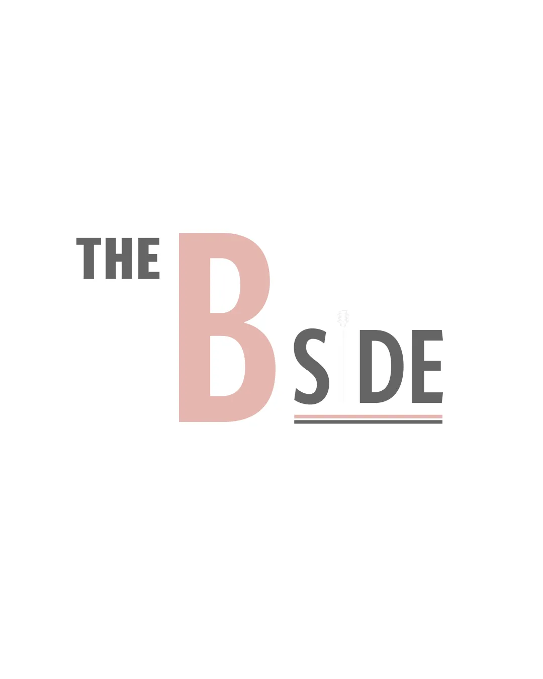
THE B SIDE logo review
3.4 / 5
Logo score
Logo review of

The B Side

Functional and relevant but visually underdeveloped; requires key adjustments for a polished impression.

Wordmark Minimalist Geometric Music
4/5
Legibility
3/5
Originality
5/5
Misread
3/5
Balance
4/5
Scale
Action plan

What to fix first

The most important fixes to handle before polishing the full presentation.

1

Reduce the size of the 'B' or rebalance the layout for improved visual harmony.

High priority

Oversized 'B' causes imbalance and draws excess attention, detracting from overall cohesion.

Impact: High · Effort: Low

2

Increase the thickness of the underline for 'SIDE' or simplify for greater scalability.

Medium priority

Current underline may disappear at small scales, slightly affecting versatility.

Impact: Medium · Effort: Low

Detailed review

Logo performance breakdown

4/5

Legibility

Checkmark icon Text is clear and easily readable
Checkmark icon Good use of contrasting colors for separation

Warning icon Slight difference in color intensity for emphasis may slightly reduce immediate readability

3/5

Originality

Checkmark icon Nice play with hierarchy and underline for 'SIDE'

Warning icon Large letter for accent is a fairly common technique, lacks unique twist

4/5

Color harmony

Checkmark icon Cohesive muted palette; pink and gray pair well

Warning icon Contrast between colors is somewhat soft, so may not be impactful on all backgrounds

Blanched Pink
#DAB8B2

Dark Gray
#555555

White
#FFFFFF

Your palette is close. Refine the color roles and combinations before updating the logo.

Build brand colors
3/5

Balance alignment

Checkmark icon Text is generally visually aligned and well-spaced

Warning icon Oversized 'B' creates slight imbalance, pulling the eye too much leftward
Warning icon 'S' positioned slightly awkwardly relative to 'B'

logo 200x250 pixels scalability test alignment grid overlay
4/5

Scalability

Checkmark icon Simple design remains clear at small sizes
Checkmark icon Minimal detail aids reproduction versatility

Warning icon Thin underline may disappear at very small scales

logo 200x250 pixels scalability test

200x250 px

logo 100x125 pixels scalability test

100×125 px

logo 50x62 pixels scalability test

50×62 px

5/5

Misinterpretations

Checkmark icon No obvious risk of inappropriate or confusing visual misreading

Beta

No AI design signals found

Likely designed by a human

Visual structure and detail cohesion suggest human-led design.

  • Consistent letterforms and spacing
  • No evident generative artifacts or incoherence

Visual assessment; not definitive proof of authorship.

Brief match

Checkmark icon Community/music Theme: The focus on 'B SIDE' references record terminology, matching musical/collector themes and suggesting depth or alternative experiences.

Try your own review

Wondering how your logo performs?

Get a clear logo score, key risks, and priority fix ideas before your client or audience sees it.

Review my logo