Wondering how your logo performs? 🧐
Get professional logo reviews in seconds and catch design issues in time.
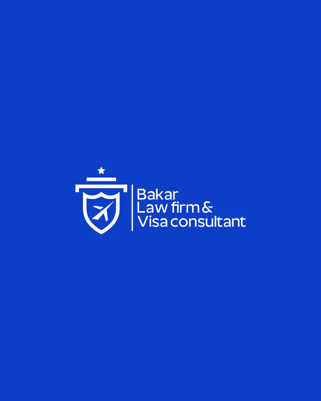
Try it Now!Logo review of Bakar Law firm & Visa consultant
 Logo analysis by AI
Logo type:
Style:
Detected symbol:
Negative space:
Detected text:
Business industry:
Review requested by Zidiboy
**If AI can recognize or misinterpret it, so can people.
Structured logo review
Legibility
![]() Text is clear and crisp with excellent contrast on blue background
Text is clear and crisp with excellent contrast on blue background![]() Whitespace supports readability
Whitespace supports readability
Scalability versatility
![]() Simple shapes ensure good reproduction at various sizes
Simple shapes ensure good reproduction at various sizes![]() Works well on digital platforms and office signage
Works well on digital platforms and office signage
![]() Airplane detail may blur when used at favicon or very small sizes
Airplane detail may blur when used at favicon or very small sizes![]() Thin shield lines may not embroider cleanly on apparel
Thin shield lines may not embroider cleanly on apparel
200x250 px
100×125 px
50×62 px
Balance alignment
![]() Centered shield and text alignment create a balanced composition
Centered shield and text alignment create a balanced composition![]() Consistent line thickness across symbol and dividing line
Consistent line thickness across symbol and dividing line
![]() Weight of the symbol is heavier than the text block, causing slight visual imbalance
Weight of the symbol is heavier than the text block, causing slight visual imbalance

Originality
![]() Combines legal (shield) and travel (airplane) concepts
Combines legal (shield) and travel (airplane) concepts![]() Effective use of negative space
Effective use of negative space
![]() Shield and airplane are overused industry symbols and lack distinctiveness
Shield and airplane are overused industry symbols and lack distinctiveness![]() Star element is generic for this industry
Star element is generic for this industry
Logomark wordmark fit
![]() Modern sans-serif typeface matches geometric symbol style
Modern sans-serif typeface matches geometric symbol style![]() Vertical divider provides clear separation
Vertical divider provides clear separation
![]() Logomark slightly overpowers wordmark due to its height and prominent top bar
Logomark slightly overpowers wordmark due to its height and prominent top bar
Aesthetic look
![]() Minimal and clean design fits professional services
Minimal and clean design fits professional services![]() Color palette is appealing and trustworthy
Color palette is appealing and trustworthy
![]() Design verges on generic due to use of common legal/travel icons
Design verges on generic due to use of common legal/travel icons
Dual meaning and misinterpretations
![]() No inappropriate shapes or unintended meanings detected
No inappropriate shapes or unintended meanings detected
Color harmony
![]() Excellent high-contrast combo suitable for professional services
Excellent high-contrast combo suitable for professional services![]() Limited color scheme prevents visual clutter
Limited color scheme prevents visual clutter
Science Blue
#0456E2
White
#FFFFFF