Wondering how your logo performs? 🧐
Get professional logo reviews in seconds and catch design issues in time.
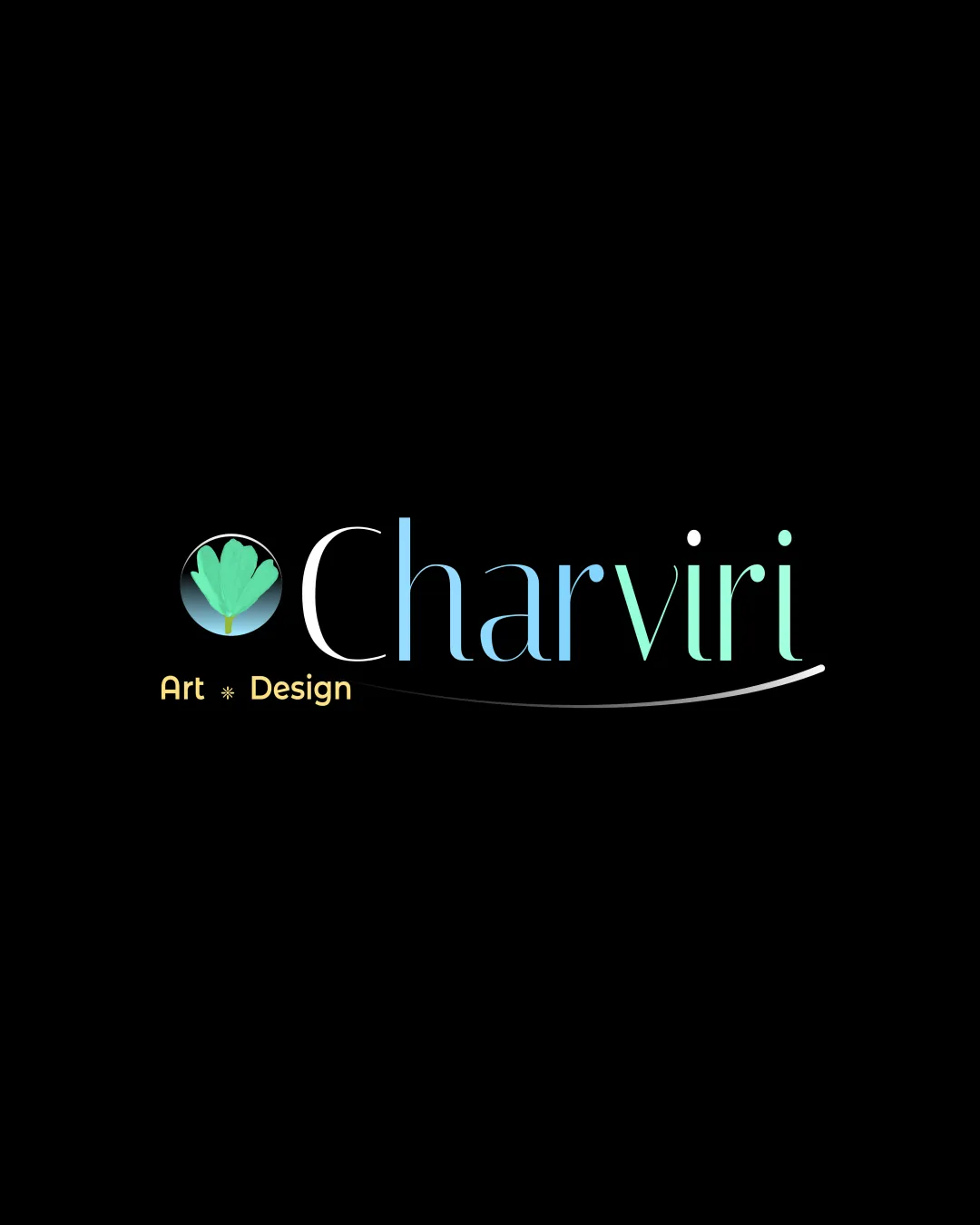
Try it Now!Logo review of Charviri Art Design
 Logo analysis by AI
Logo type:
Style:
Detected symbol:
Negative space:
Detected text:
Business industry:
Review requested by Vissu678
**If AI can recognize or misinterpret it, so can people.
Structured logo review
Legibility
![]() Main 'Charviri' wordmark is clear and the font choice is elegant.
Main 'Charviri' wordmark is clear and the font choice is elegant.![]() 'Art Design' secondary text is legible at normal size.
'Art Design' secondary text is legible at normal size.
![]() Gradient color on 'Charviri' slightly affects legibility at smaller sizes, especially on lighter backgrounds.
Gradient color on 'Charviri' slightly affects legibility at smaller sizes, especially on lighter backgrounds.![]() 'Art Design' in light yellow may lose contrast on white or light backgrounds.
'Art Design' in light yellow may lose contrast on white or light backgrounds.
Scalability versatility
![]() Simple flower icon can scale moderately well.
Simple flower icon can scale moderately well.![]() Wordmark retains elegance at medium to large sizes, ideal for print and digital headers.
Wordmark retains elegance at medium to large sizes, ideal for print and digital headers.
![]() Thin strokes in type and flower detail will struggle at very small sizes such as favicon or embroidery.
Thin strokes in type and flower detail will struggle at very small sizes such as favicon or embroidery.![]() Gradient effect complicates single-color reproduction for use on stamps or monotone applications.
Gradient effect complicates single-color reproduction for use on stamps or monotone applications.
200x250 px
100×125 px
50×62 px
Balance alignment
![]() General alignment of icon, wordmark, and tagline is cohesive.
General alignment of icon, wordmark, and tagline is cohesive.![]() Curved underline adds nice movement and balance to the whole composition.
Curved underline adds nice movement and balance to the whole composition.
![]() The flower icon feels slightly offset from the wordmark due to its vertical centering.
The flower icon feels slightly offset from the wordmark due to its vertical centering.![]() The tagline 'Art Design' disrupts horizontal balance, pulling focus downward.
The tagline 'Art Design' disrupts horizontal balance, pulling focus downward.

Originality
![]() Custom floral illustration stands out from generic icons.
Custom floral illustration stands out from generic icons.![]() Gradient blend in 'Charviri' adds a unique visual element.
Gradient blend in 'Charviri' adds a unique visual element.
![]() Flower-in-a-circle motif is somewhat common within the art/design sector and could be further abstracted for more distinction.
Flower-in-a-circle motif is somewhat common within the art/design sector and could be further abstracted for more distinction.
Logomark wordmark fit
![]() Visual theme between flower mark and typeface matches in elegance and flow.
Visual theme between flower mark and typeface matches in elegance and flow.![]() Palette and gradients are consistently applied across both elements.
Palette and gradients are consistently applied across both elements.
![]() Logo mark might be too intricate compared to the delicate wordmark lines, causing a slight mismatch in visual weight.
Logo mark might be too intricate compared to the delicate wordmark lines, causing a slight mismatch in visual weight.
Aesthetic look
![]() Overall look is modern, upscale, and visually attractive.
Overall look is modern, upscale, and visually attractive.![]() Color transitions and font selection create a refined feel.
Color transitions and font selection create a refined feel.
![]() Multiple small graphic elements (flower, gradient, underline, star separator) make the logo slightly busy.
Multiple small graphic elements (flower, gradient, underline, star separator) make the logo slightly busy.![]() Yellow tagline introduces an extra color, creating mild disharmony.
Yellow tagline introduces an extra color, creating mild disharmony.
Dual meaning and misinterpretations
![]() No inappropriate or unintended associations detected; visual metaphor is clear.
No inappropriate or unintended associations detected; visual metaphor is clear.
Color harmony
![]() Soft gradient on wordmark and floral icon feels cohesive.
Soft gradient on wordmark and floral icon feels cohesive.![]() Individual palette choices are tasteful and evoke a creative, gentle vibe.
Individual palette choices are tasteful and evoke a creative, gentle vibe.
![]() Adding yellow to the tagline introduces a fourth color, which makes the palette feel slightly disjointed.
Adding yellow to the tagline introduces a fourth color, which makes the palette feel slightly disjointed.![]() Gradients could be challenging to replicate in single color applications.
Gradients could be challenging to replicate in single color applications.
Seafoam
#73E0C0
LightTurquoise
#7FDACB
LightGreen
#C6E6A8
LightYellow
#FFE481
Black
#000000