 View review
Logo score
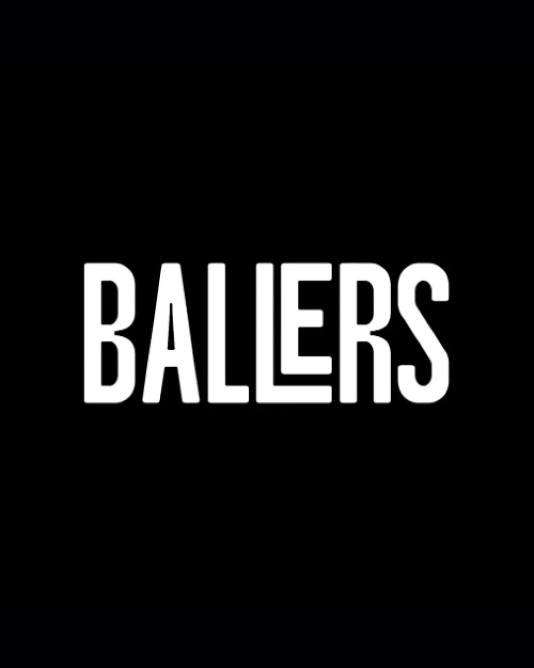
Logo review ofBallers
Review the detailed scores below to see what is working and what should be refined first.
Legibility
Originality
Misread
Balance
Scale
Detailed review
Logo performance breakdown
Legibility
![]() Strong contrast between the white lettering and black background enhances readability.
Strong contrast between the white lettering and black background enhances readability.![]() Clean, sans-serif typeface ensures that the letters are easily distinguishable at first glance.
Clean, sans-serif typeface ensures that the letters are easily distinguishable at first glance.
![]() The modified 'L' letter may momentarily disrupt legibility, as the unusual form could cause a slight pause in reading for some viewers.
The modified 'L' letter may momentarily disrupt legibility, as the unusual form could cause a slight pause in reading for some viewers.
Originality
![]() Creative use of the 'L' character adds a unique touch to the otherwise standard wordmark.
Creative use of the 'L' character adds a unique touch to the otherwise standard wordmark.![]() Modern stylization sets the logo apart from completely generic letterforms.
Modern stylization sets the logo apart from completely generic letterforms.
![]() Aside from the custom 'L', the rest of the design relies on a common typographic approach, which is not highly distinctive.
Aside from the custom 'L', the rest of the design relies on a common typographic approach, which is not highly distinctive.
Color harmony
![]() Classic black-and-white scheme delivers maximum clarity and timelessness.
Classic black-and-white scheme delivers maximum clarity and timelessness.![]() Color simplicity ensures adaptability across all branding materials.
Color simplicity ensures adaptability across all branding materials.
White
#FFFFFF
Black
#000000
Balance alignment
![]() Consistent height and spacing maintain visual balance throughout the wordmark.
Consistent height and spacing maintain visual balance throughout the wordmark.![]() Letterforms are uniformly weighted and aligned, resulting in a clean composition.
Letterforms are uniformly weighted and aligned, resulting in a clean composition.
![]() The extended lower bar in the 'L' introduces a minor imbalance compared to the rest of the straight-edged letters, drawing disproportionate attention to the center.
The extended lower bar in the 'L' introduces a minor imbalance compared to the rest of the straight-edged letters, drawing disproportionate attention to the center.

Scalability
![]() Minimalist wordmark design ensures clarity at all sizes, from business cards to billboards.
Minimalist wordmark design ensures clarity at all sizes, from business cards to billboards.![]() No thin lines or overly detailed elements that could compromise recognition in small or large formats.
No thin lines or overly detailed elements that could compromise recognition in small or large formats.
200x250 px
100×125 px
50×62 px
Misinterpretations
![]() No unintended negative symbolism or inappropriate imagery present.
No unintended negative symbolism or inappropriate imagery present.
Try your own review
Review my logo
Wondering how your logo performs?
Get a clear logo score, key risks, and priority fix ideas before your client or audience sees it.
Keep exploring