View review
Cold Restaurant
Review the detailed scores below to see what is working and what should be refined first.
Objective AI feedback. Your creative decision.
What to fix first
The most important fixes to handle before polishing the full presentation.
Fix possible misinterpretation
High priorityFace silhouette can be interpreted as two profiles or a mask, but it's not problematic.
Impact: High · Effort: Medium
Logo performance breakdown
Legibility
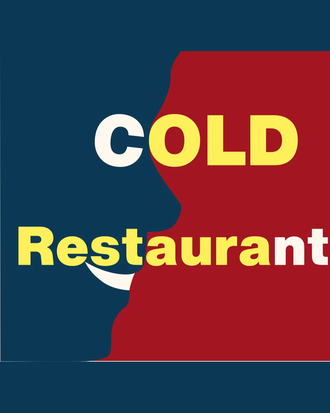
Bold sans-serif font for 'COLD' and 'Restaurant' enhances readability.
Color contrast between the background and text facilitates general recognition.
'COLD' text crosses between two very different background colors, slightly reducing legibility especially at the boundary.
'Restaurant' has multicolored characters, which breaks uniformity and may hinder readability.
The white 't' at the end of 'Restaurant' blends into the white smile, causing confusion.
Originality
Uses negative space for an abstract face profile, which is somewhat creative.
The smile adds a subtle, memorable twist.
Face profiles in negative space are an overused trope in food or communication brands.
Yellow and red color pairing is generic for restaurants and lacks uniqueness.
The execution doesn't push creative boundaries.
Color harmony
Dominant use of two to three main colors.
The shift from yellow to white in the wordmark is abrupt and visually discordant.
Color transitions between the background and foreground cause jarring contrast.
The palette is loud and lacks refinement.
Dark Cyan
#073C4B
Dark Red
#B51D1D
Off White
#FFF9EA
Yellow
#FFE54C
Color may be holding this logo back. Build a stronger strategic palette before updating the logo.
Build brand colorsBalance alignment
Visual weight is slightly balanced by color blocking.
The face silhouette feels disconnected from the text, creating an awkward alignment.
'COLD' appears crammed at the top with too much negative space below.
'Restaurant' overlaps the smile, disrupting compositional balance.
Scalability
Bold shapes theoretically allow reduction in size.
Detailed face silhouette and overlapping elements will lose clarity at small sizes such as on business cards or mobile favicons.
The multi-color text complicates monochrome application and embroidery.
Wordmark and abstract face don't translate well for signage or compact uses.
200x250 px
100×125 px
50×62 px
Misinterpretations
No apparent inappropriate or offensive symbols.
Face silhouette can be interpreted as two profiles or a mask, but it's not problematic.
Symbol & text fit
Attempt to merge logomark and wordmark using negative space.
The illustrative style of the face does not match the heavy geometric font.
Sizing and placement feel forced rather than harmonious.
The smile merging into the text causes confusion.
Wondering how your logo performs?
Get a clear logo score, key risks, and priority fix ideas before your client or audience sees it.




