Wondering how your logo performs? 🧐
Get professional logo reviews in seconds and catch design issues in time.
Try it Now!Logo review of darlise
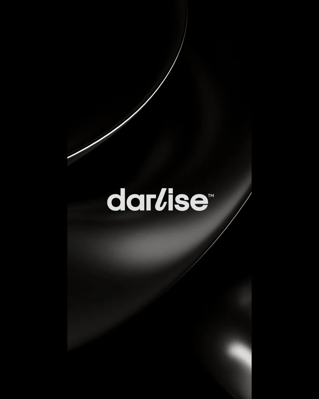
 Logo analysis by AI
Logo type:
Style:
Detected text:
Business industry:
Review requested by Webdo
**If AI can recognize or misinterpret it, so can people.
Structured logo review
Legibility
Excellent letter spacing and clean geometric forms help with overall readability.
Consistent stroke weight across letters adds to legibility.
The stylized 'l' and 'i' blend together and might momentarily confuse readers.
Scalability versatility
Wordmark’s thick strokes will remain visible at smaller sizes, such as business cards or website headers.
Minimalistic design translates well across different media and print applications.
Overlapping 'l' and 'i' may blur at micro sizes or low-res applications, causing legibility concerns.
Without a symbol, the mark may lack impact or recognizability on product tags or app icons.

200x250 px

100×125 px

50×62 px
Balance alignment
Letterforms are visually balanced and horizontally aligned.
Consistent vertical rhythm and proportional width of each letter create strong harmony.


Originality
A cohesive, geometric sans-serif wordmark gives a contemporary flair.
Overall geometric sans-serif style feels generic and lacks distinctive character.
No unique symbol or unexpected element that would make it distinctly memorable.
Aesthetic look
Clean and modern aesthetic; minimalism works well for upscale or fashion-forward brands.
The use of white on black background delivers strong contrast and high visual appeal.
Feels somewhat generic due to lack of strong brand personality or distinctive mark.
Dual meaning and misinterpretations
No inappropriate or ambiguous imagery present in the wordmark.
Color harmony
Monochrome palette is universally effective and highly versatile for fashion or luxury applications.
Color selection boosts readability and creates a premium vibe.
White
#FFFFFF
Black
#000000

