View review
Logo score
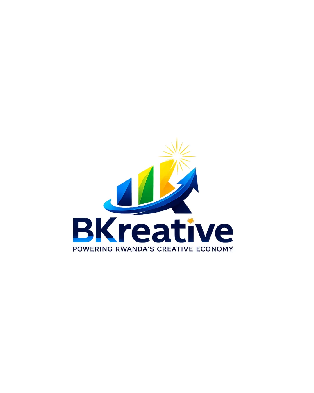
Logo review ofBkreative, Powering Rwanda's Creative Economy
Review the detailed scores below to see what is working and what should be refined first.
Legibility
Originality
Misread
Balance
Scale
Detailed review
Logo performance breakdown
Legibility
![]() Main wordmark 'BKreative' is bold and easy to read.
Main wordmark 'BKreative' is bold and easy to read.![]() Supporting text is legible and clear in a simple sans-serif font.
Supporting text is legible and clear in a simple sans-serif font.
![]() Small yellow star above the 'i' is less noticeable and may lose clarity at small sizes.
Small yellow star above the 'i' is less noticeable and may lose clarity at small sizes.![]() Color contrast between tagline and background is passable but could be improved for micro sizes.
Color contrast between tagline and background is passable but could be improved for micro sizes.
Originality
![]() Color usage is vibrant and lively, aiming to reflect creativity.
Color usage is vibrant and lively, aiming to reflect creativity.
![]() Uses generic visual clichés: bar graph, upward arrow, sun/starburst, which are overused in growth/creative industry logos.
Uses generic visual clichés: bar graph, upward arrow, sun/starburst, which are overused in growth/creative industry logos.![]() Lacks a memorable or unique twist—could easily be confused with dozens of similar marks.
Lacks a memorable or unique twist—could easily be confused with dozens of similar marks.![]() No clever use of negative space or unconventional approaches.
No clever use of negative space or unconventional approaches.
Color harmony
![]() Vivid colors evoke positive and creative energy.
Vivid colors evoke positive and creative energy.
![]() Four major colors (blue, green, yellow, gold) plus gradients and white produce a slightly cluttered palette.
Four major colors (blue, green, yellow, gold) plus gradients and white produce a slightly cluttered palette.![]() Too many color transitions—less harmonious in greyscale or plain color application.
Too many color transitions—less harmonious in greyscale or plain color application.
Blue
#0060A9
Green
#009034
Yellow
#F9C81A
Gold
#FECC00
White
#FFFFFF
Balance alignment
![]() Overall composition is grounded with strong horizontal alignment.
Overall composition is grounded with strong horizontal alignment.![]() Text and symbol are well centered relative to each other.
Text and symbol are well centered relative to each other.
![]() Logo mark visually outweighs the wordmark, with the arrow and sunburst pulling focus upward and right.
Logo mark visually outweighs the wordmark, with the arrow and sunburst pulling focus upward and right.![]() The 'i' with the star feels detached from the rest of the typography, causing slight visual imbalance.
The 'i' with the star feels detached from the rest of the typography, causing slight visual imbalance.

Scalability
![]() Distinctive icon and text separation make it recognizable at larger scales.
Distinctive icon and text separation make it recognizable at larger scales.![]() Good presence for digital banners, conference displays, and business signage.
Good presence for digital banners, conference displays, and business signage.
![]() Multiple gradients and detailed highlights make it problematic for small-scale reproduction such as business cards, favicons, or embroidery.
Multiple gradients and detailed highlights make it problematic for small-scale reproduction such as business cards, favicons, or embroidery.![]() Gradient arrow and sunburst are likely to lose visual clarity or merge at reduced sizes.
Gradient arrow and sunburst are likely to lose visual clarity or merge at reduced sizes.![]() Not suitable for single-color reproduction without losing essential brand elements.
Not suitable for single-color reproduction without losing essential brand elements.
200x250 px
100×125 px
50×62 px
Misinterpretations
![]() No inappropriate or unintended visual connotations.
No inappropriate or unintended visual connotations.
Symbol & text fit
![]() Both symbol and wordmark use similar color schemes and modern styling.
Both symbol and wordmark use similar color schemes and modern styling.
![]() Attempt made to integrate themes (starburst above 'i').
Attempt made to integrate themes (starburst above 'i').
![]() The style and weight of the logomark are visually heavier and more complex than the clean wordmark, causing a slight disconnect.
The style and weight of the logomark are visually heavier and more complex than the clean wordmark, causing a slight disconnect.
![]() Overlapping gradient styles create stylistic inconsistency between logomark and text portion.
Overlapping gradient styles create stylistic inconsistency between logomark and text portion.
Try your own review
Review my logo
Wondering how your logo performs?
Get a clear logo score, key risks, and priority fix ideas before your client or audience sees it.
Keep exploring