Wondering how your logo performs? 🧐
Get professional logo reviews in seconds and catch design issues in time.
Try it Now!Logo review of LOKHA TEA
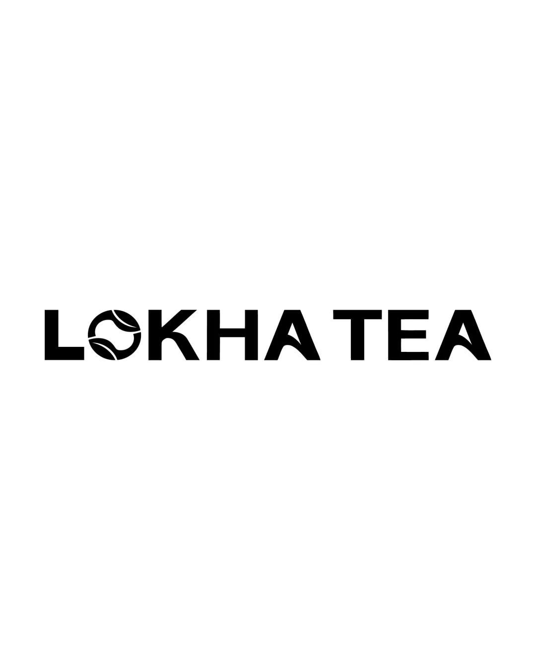
 Logo analysis by AI
Logo type:
Style:
Detected symbol:
Negative space:
Detected text:
Business industry:
Review requested by Slidefactory
**If AI can recognize or misinterpret it, so can people.
Structured logo review
Legibility
Text is clear and easy to read.
Letter spacing and proportions are well-considered.
Scalability versatility
Bold shapes ensure clarity even at smaller sizes.
Simple color scheme aids adaptability across print and digital formats.
Leaf detail inside the O may become less recognizable as a leaf at very small sizes or low resolutions.
Symbol and text are combined, limiting adaptability as an isolated logomark.

200x250 px

100×125 px

50×62 px
Balance alignment
Text is well-aligned, and symbol integration in the O is harmonious.
Overall visual weight is distributed evenly across the wordmark.


Originality
Tea leaf concept within the O is relevant and nicely executed.
Modern typographic approach adds a unique touch compared to generic tea logos.
Leaf-inside-letter motif is somewhat common in food & beverage branding.
Logomark wordmark fit
Leaf O integrates seamlessly into the wordmark without disrupting reading flow.
Stylistic consistency between the logomark and the rest of the text.
Aesthetic look
Minimalist, clean, and visually strong.
Modern sans serif style is appealing and on-trend.
May appear too generic for high-end or luxury tea brands.
Dual meaning and misinterpretations
No unintended or inappropriate visual connotations.
Color harmony
Monochrome palette maximizes versatility and keeps focus on form.
Strong contrast between design and background.
Black
#000000
White
#FFFFFF

