 View review
Logo score
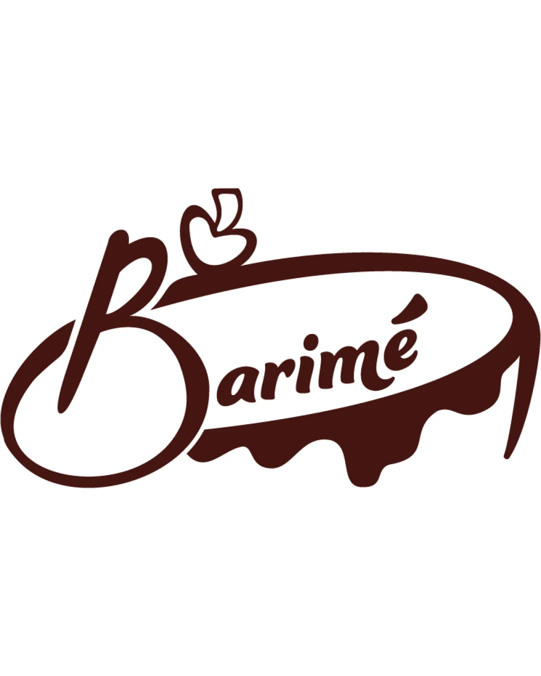
Logo review ofBarimé
Review the detailed scores below to see what is working and what should be refined first.
Legibility
Originality
Misread
Balance
Scale
Detailed review
Logo performance breakdown
Legibility
![]() The script typeface is mostly clear and legible, especially for the word 'Barimé.'
The script typeface is mostly clear and legible, especially for the word 'Barimé.'![]() Font style aligns with a bakery/cafe aesthetic.
Font style aligns with a bakery/cafe aesthetic.
![]() The stylized 'B' with the apple can be misread or confused at a glance.
The stylized 'B' with the apple can be misread or confused at a glance.![]() Slight overlap between decorative shapes and text may reduce clarity in smaller sizes.
Slight overlap between decorative shapes and text may reduce clarity in smaller sizes.
Originality
![]() Combining an apple with a cake motif and script font is creative and relevant to the food industry.
Combining an apple with a cake motif and script font is creative and relevant to the food industry.![]() Unique illustrative execution distinguishes it from typical bakery logos.
Unique illustrative execution distinguishes it from typical bakery logos.
![]() Use of an apple as a food symbol is a bit common, but the integration into the letter 'B' is a nice touch.
Use of an apple as a food symbol is a bit common, but the integration into the letter 'B' is a nice touch.
Color harmony
![]() Monochromatic brown-on-white color palette is harmonious and strongly suited to the food/bakery industry.
Monochromatic brown-on-white color palette is harmonious and strongly suited to the food/bakery industry.![]() High contrast ensures legibility in most settings.
High contrast ensures legibility in most settings.
Brown
#4B2217
White
#FFFFFF
Balance alignment
![]() Overall oval and flowing shapes create a sense of unity.
Overall oval and flowing shapes create a sense of unity.![]() Upper elements (apple, arc, and accent on é) complement the script placement.
Upper elements (apple, arc, and accent on é) complement the script placement.
![]() The overly large and dominant 'B' disrupts the balance compared to the rest of the word.
The overly large and dominant 'B' disrupts the balance compared to the rest of the word.![]() The right side droop of the oval border and dripping effect creates asymmetry, making the logo appear right-heavy.
The right side droop of the oval border and dripping effect creates asymmetry, making the logo appear right-heavy.

Scalability
![]() Design works well on larger formats such as signage, menus, or packaging.
Design works well on larger formats such as signage, menus, or packaging.![]() Unique illustrative style makes it stand out at display size.
Unique illustrative style makes it stand out at display size.
![]() Fine lines and script font are likely to lose detail on small printing (business cards, stickers, embroidery).
Fine lines and script font are likely to lose detail on small printing (business cards, stickers, embroidery).![]() Complex shape and decorative dripping effect will not scale down cleanly to favicon/app icon size.
Complex shape and decorative dripping effect will not scale down cleanly to favicon/app icon size.
200x250 px
100×125 px
50×62 px
Misinterpretations
![]() No inappropriate or confusing imagery detected.
No inappropriate or confusing imagery detected.
Symbol & text fit
![]() The logomark and wordmark share the same color palette and flow together in a single gesture.
The logomark and wordmark share the same color palette and flow together in a single gesture.
![]() The apple logo is creatively connected to the curve of the 'B,' enhancing unity.
The apple logo is creatively connected to the curve of the 'B,' enhancing unity.
![]() The logomark is overpowering compared to the smaller, lighter wordmark.
The logomark is overpowering compared to the smaller, lighter wordmark.
![]() Style of the apple and the script are only moderately consistent; refinement could tighten cohesion.
Style of the apple and the script are only moderately consistent; refinement could tighten cohesion.
Try your own review
Review my logo
Wondering how your logo performs?
Get a clear logo score, key risks, and priority fix ideas before your client or audience sees it.
Keep exploring


