 View review
Logo score
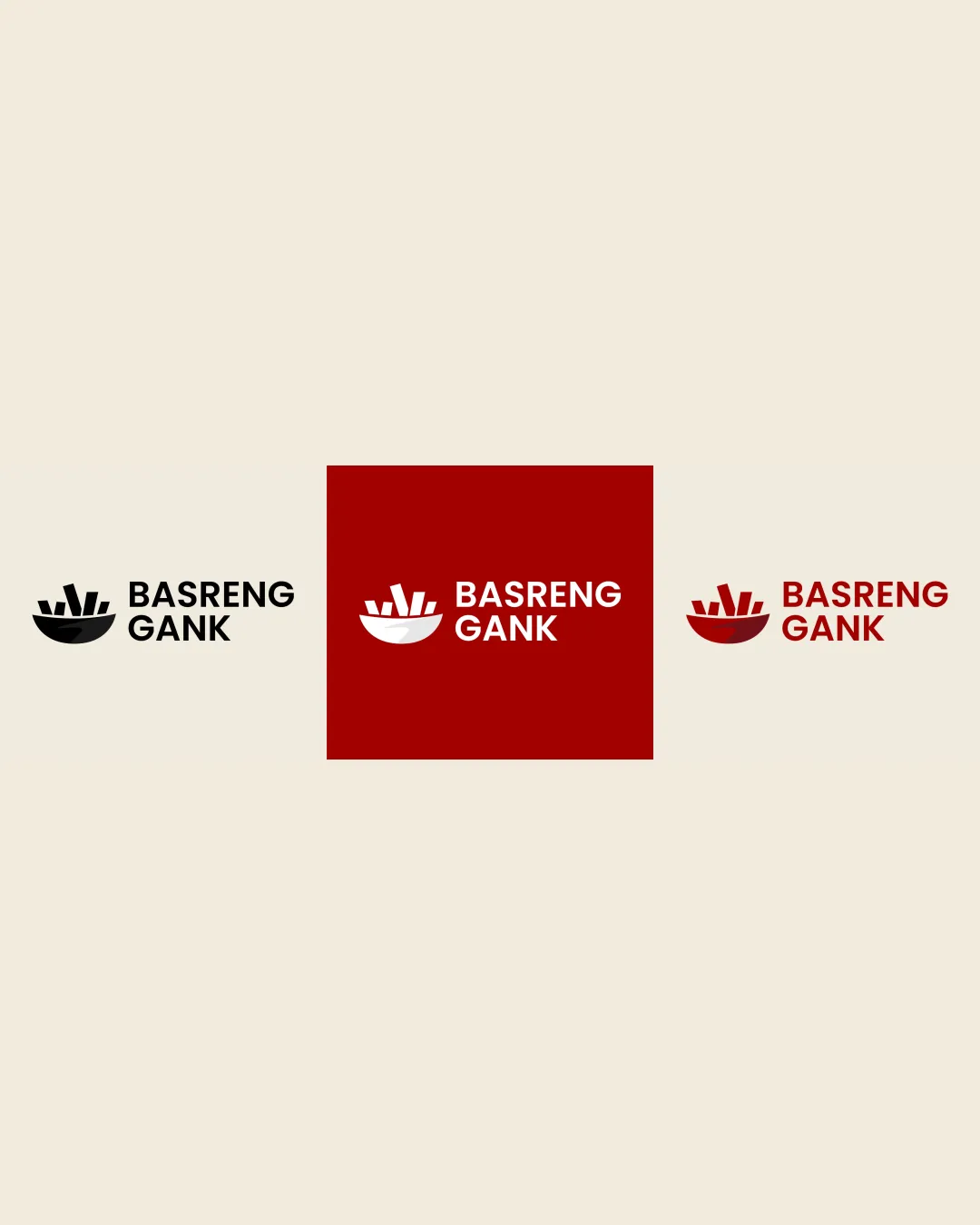
Logo review ofBasreng Gank
Review the detailed scores below to see what is working and what should be refined first.
Legibility
Originality
Misread
Balance
Scale
Detailed review
Logo performance breakdown
Legibility
![]() Text is clear, well-spaced, and easy to read
Text is clear, well-spaced, and easy to read![]() High contrast between text and background in all variations
High contrast between text and background in all variations
Originality
![]() Bowl and sticks is a recognizable, fitting symbol for food/snacks
Bowl and sticks is a recognizable, fitting symbol for food/snacks![]() Not overly generic due to specific arrangement
Not overly generic due to specific arrangement
![]() Concept (bowl with sticks) is common in food branding, not highly unique
Concept (bowl with sticks) is common in food branding, not highly unique
Color harmony
![]() Limited color palette keeps brand consistent
Limited color palette keeps brand consistent![]() Strong color contrast for legibility
Strong color contrast for legibility
Black
#000000
Dark Red
#B41109
White
#FFFFFF
Beige
#F1ECDF
Balance alignment
![]() Good alignment between symbol and wordmark
Good alignment between symbol and wordmark![]() Visual weight of symbol complements the wordmark
Visual weight of symbol complements the wordmark
![]() Slight imbalance as the bowl's width feels slightly heavier compared to the wordmark, minimal but worth refining
Slight imbalance as the bowl's width feels slightly heavier compared to the wordmark, minimal but worth refining

Scalability
![]() Simple geometric shapes ensure logo is recognizable at small sizes
Simple geometric shapes ensure logo is recognizable at small sizes![]() Works in monochrome and on different backgrounds
Works in monochrome and on different backgrounds
![]() Thin lines in the bowl detail might lose clarity at very small sizes (e.g. embroidery, favicon)
Thin lines in the bowl detail might lose clarity at very small sizes (e.g. embroidery, favicon)![]() May need simplification for ultra-small applications
May need simplification for ultra-small applications
200x250 px
100×125 px
50×62 px
Misinterpretations
![]() Nothing inappropriate or misleading in the visual
Nothing inappropriate or misleading in the visual
Symbol & text fit
![]() Style and weight of logomark and wordmark are harmonious
Style and weight of logomark and wordmark are harmonious
![]() Both elements are cohesive and look like a set
Both elements are cohesive and look like a set
Try your own review
Review my logo
Wondering how your logo performs?
Get a clear logo score, key risks, and priority fix ideas before your client or audience sees it.
Keep exploring


