Wondering how your logo performs? 🧐
Get professional logo reviews in seconds and catch design issues in time.
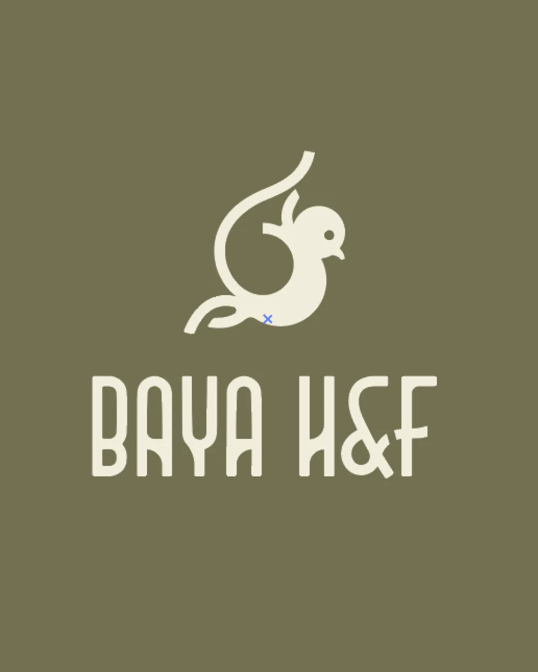
Try it Now!Logo review of BAYA H&F
 Logo analysis by AI
Logo type:
Style:
Detected symbol:
Detected text:
Business industry:
Review requested by Het
**If AI can recognize or misinterpret it, so can people.
Structured logo review
Legibility
![]() Text is clear and easy to read at medium to large sizes
Text is clear and easy to read at medium to large sizes![]() Typeface is unique and cohesive with the symbol
Typeface is unique and cohesive with the symbol
![]() Letter 'H&F' could be slightly confusing at very small sizes, especially ampersand styling
Letter 'H&F' could be slightly confusing at very small sizes, especially ampersand styling![]() Low contrast between text and background reduces clarity in certain contexts
Low contrast between text and background reduces clarity in certain contexts
Scalability versatility
![]() Minimal detail in the bird symbol aids scalability
Minimal detail in the bird symbol aids scalability![]() Simplicity helps in black and white or single-color applications
Simplicity helps in black and white or single-color applications
![]() Delicate lines in the tail may lose definition on tiny surfaces like embroidered goods or favicons
Delicate lines in the tail may lose definition on tiny surfaces like embroidered goods or favicons![]() Low color contrast could affect visibility on varied backgrounds
Low color contrast could affect visibility on varied backgrounds
200x250 px
100×125 px
50×62 px
Balance alignment
![]() Good central alignment between symbol and type
Good central alignment between symbol and type![]() Weight and proportion between logomark and wordmark are balanced
Weight and proportion between logomark and wordmark are balanced
![]() The looping tail makes the symbol feel slightly top-heavy, pulling attention upward
The looping tail makes the symbol feel slightly top-heavy, pulling attention upward

Originality
![]() Creative use of a bird as a symbol, fitting for health/wellness sector
Creative use of a bird as a symbol, fitting for health/wellness sector![]() Tail creates a distinctive shape uncommon in typical health or fitness logos
Tail creates a distinctive shape uncommon in typical health or fitness logos
![]() Bird as a concept is not unique, although execution is above average
Bird as a concept is not unique, although execution is above average![]() No negative space or hidden messages used for added depth
No negative space or hidden messages used for added depth
Logomark wordmark fit
![]() Typeface and symbol share rounded geometry, creating strong stylistic cohesion
Typeface and symbol share rounded geometry, creating strong stylistic cohesion![]() Relative sizing feels proportional and well-considered
Relative sizing feels proportional and well-considered
Aesthetic look
![]() Minimalist execution feels modern and professional
Minimalist execution feels modern and professional![]() Color choice provides a calm and welcoming impression
Color choice provides a calm and welcoming impression
![]() Background color may limit broader appeal or flexibility
Background color may limit broader appeal or flexibility![]() Loops of bird symbol feel visually busy compared to typeface simplicity
Loops of bird symbol feel visually busy compared to typeface simplicity
Dual meaning and misinterpretations
![]() No inappropriate or confusing visual references detected
No inappropriate or confusing visual references detected
Color harmony
![]() Two-color palette is harmonious and non-distracting
Two-color palette is harmonious and non-distracting![]() Suits natural/wellness industries
Suits natural/wellness industries
![]() Low contrast between beige and olive dulls impact, potentially problematic for accessibility
Low contrast between beige and olive dulls impact, potentially problematic for accessibility
Olive
#9A936E
Beige
#E8E1C1


