Abstract BEE monogram logo logo review
3.6/5
Logo score Monogram category

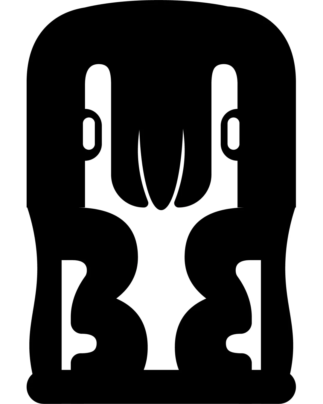
Abstract BEE monogram logo

creative971521 Essential logo review

Distinctive and visually impactful monogram with strong geometric balance, but letter clarity and small-scale performance require validation.

This monogram shows solid execution, supported by distinctive construction and visual balance; improving clarity at smaller sizes is the clearest next step.

Monogram Abstract/geometric, Solid Fill
3/5
Legibility
4/5
Originality
4/5
Balance
3/5
Scale
Your next steps

What to fix first

Focus on the changes that matter. Keep what makes the logo work.

1

main monogram

Test viewer recognition of intended letters to ensure core meaning is communicated.

High priority Worth testing Low effort

The abstract negative/positive space suggests letterforms that could be interpreted as 'BEE', but the shapes are highly stylized, which may impair instant readability for some viewers.

See the category review

Detailed review

Logo performance breakdown

Not scored

Brief & logo match

There isn't enough brand context to assess the match.

5/5

Misinterpretations

  • No clear risk of sexual, offensive, or unintended readings.
4/5

Originality

  • Striking symmetrical silhouette and ambiguous figural/letterform play set it apart.
  • The mirrored, geometric approach creates a unique, memorable silhouette uncommon among standard monogram logos.

    Optional refinement entire mark
4/5

Balance alignment

  • Symmetrical balance and clearly mirrored axes create a feeling of structure and intentionality.
Uploaded logoAlignment guide overlay

Inspect spacing with the guide. Optical balance may differ from geometric centering.

3/5

Legibility

Available in Advanced logo reviews
3/5

Scalability

Available in Advanced logo reviews
Try your own review

Wondering how your logo performs?

Get a clear logo score, key risks, and priority fix ideas before your client or audience sees it.

Review my logo