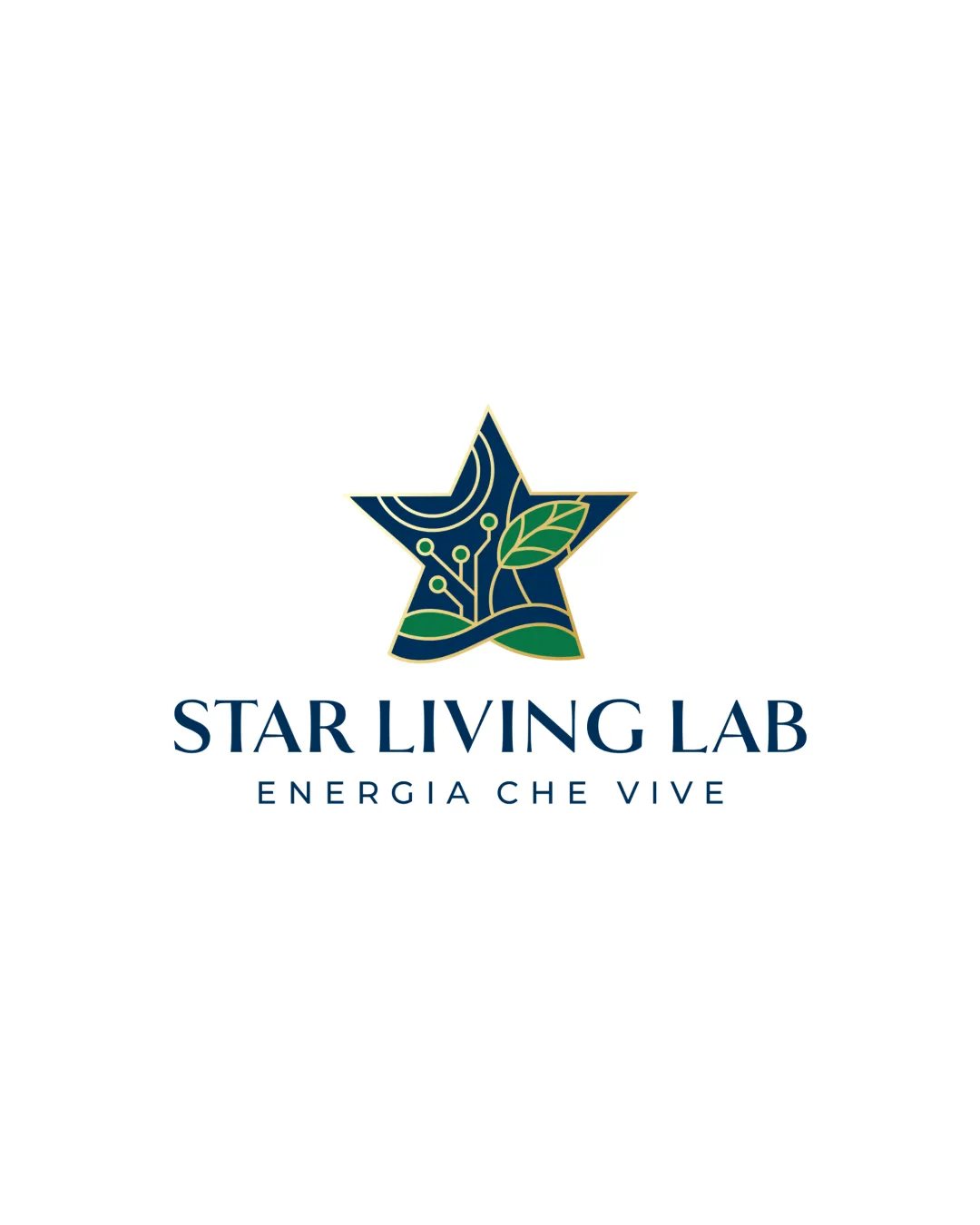

STAR LIVING LAB logo logo review
4.3/5
Logo score Combination mark category

STAR LIVING LAB logo

Ginklabstudio Essential logo review

A contemporary, meaningful logo that visually balances sustainability, technology, and energy, with a minor need to optimize fine-detail clarity at small sizes.

This logo lockup shows strong execution, supported by visual balance and distinctive construction; improving clarity at smaller sizes is the clearest next step.

Combination Mark Fine-line Geometric And Organic Hybrid Renewable Energy / Technology / Sustainability
5/5
Legibility
4/5
Originality
4/5
Balance
4/5
Scale
5/5
Color
5/5
Style consistency
Your next steps

What to fix first

Focus on the changes that matter. Keep what makes the logo work.

1

Standalone mark

Test mark visibility at reduced resolutions (e.g., 32–64px) and simplify lines if necessary.

Medium priority Worth testing Medium effort

Fine-line details and gold outline may lose clarity or blend together in small or low-resolution outputs.

See the category review
Detailed review

Logo performance breakdown

5/5

Brief & logo match

The geometric star, organic and tech motifs, and color palette convincingly express innovation, sustainability, and reliability for advanced solar and energy retrofit solutions, fully addressing the brand's stated goals.

5/5

Legibility

Wordmark 5/5 · Layout 5/5

  • Clear, elegant type with strong contrast; both brand name and descriptor are highly readable.
5/5

Color harmony

Symbol 5/5 · Wordmark 5/5

  • Sophisticated palette blends deep blue, green, and gold, reinforcing clean tech and environmental positioning.
Deep Navy#103055
Green#18A561
Gold#C6A142
Light Green#E5FACC

Estimated colors. Use the original design file for exact values.

Create a full color palette using these colors

Create new palette
5/5

Misinterpretations

  • No negative alternate readings or accidental symbols detected.
5/5

Style consistency

  • Elegant, contemporary letterforms and symbol share color and gold accents, supporting theme coherence.
4/5

Originality

Symbol 4/5 · Wordmark 4/5

  • Circuit-tree-leaf integration is creative and thoughtful, if slightly trended in sector.
  • Motifs (circuit lines, leaves, waves) are well-integrated and original, though the abstract circuit elements are now increasingly common in green-tech sectors, slightly reducing uniqueness.

    Optional refinement Standalone mark
4/5

Balance alignment

Symbol 4/5 · Wordmark 4/5 · Layout 4/5

Available in Advanced logo reviews
4/5

Scalability

Symbol 3/5 · Wordmark 5/5 · Layout 4/5

Available in Advanced logo reviews
Try your own review

Wondering how your logo performs?

Get a clear logo score, key risks, and priority fix ideas before your client or audience sees it.

Review my logo