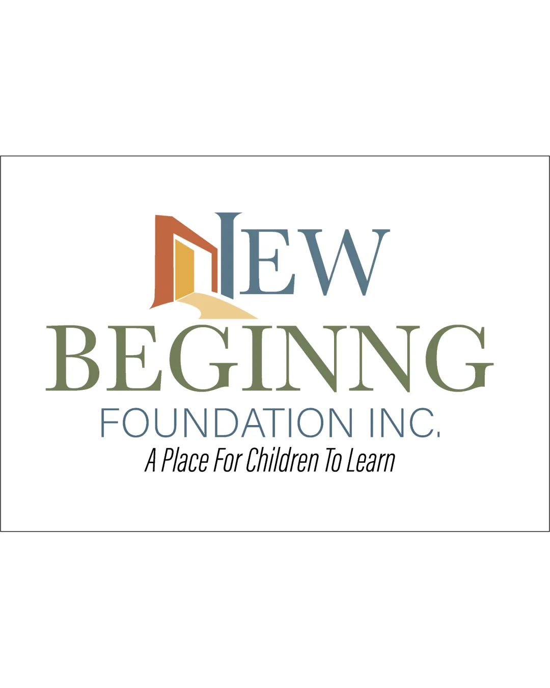
NEW BEGINNING FOUNDATION INC. logo logo review
3.5/5
Logo score Combination mark category

NEW BEGINNING FOUNDATION INC. logo

creative110900 Essential logo review

A visually cohesive and category-appropriate logo with a meaningful, well-connected symbol, but the tagline weakens the overall compositional balance and should be addressed.

This logo lockup shows solid execution, supported by text readability and text hierarchy; improving distinctiveness is the clearest next step.

Combination Mark Transitional Serif + Abstract Symbol Education, Non-profit
4/5
Legibility
3/5
Originality
3.5/5
Balance
3.4/5
Scale
4/5
Color
4/5
Style consistency
Your next steps

What to fix first

Focus on the changes that matter. Keep what makes the logo work.

1

tagline and lockup spacing

Increase tagline size or adjust spacing to strengthen lockup cohesion and readability.

High priority Visible issue Low effort

The tagline 'A Place For Children To Learn' is much smaller and less visually connected to the core name elements, creating a visual imbalance; it risks being overlooked and slightly disrupts hierarchy.

See the category review

Detailed review

Logo performance breakdown

4/5

Brief & logo match

The logo concept effectively aligns with an educational nonprofit, using a doorway motif to communicate new opportunities for children, though the tagline risks being underemphasized.

5/5

Misinterpretations

  • No ambiguity or unintended interpretation in symbol or wordmark observed.
4/5

Legibility

Wordmark 4/5 · Layout 4/5

  • Main name words are highly readable; tagline clear in larger formats.
4/5

Color harmony

Symbol 4/5 · Wordmark 4/5

  • Muted, harmonious color palette reflects a calm and nurturing educational context.
brownish orange#97674A
light yellow#E5CB88
blue-grey#567085
olive green#7D8461
black#000000

Estimated colors. Use the original design file for exact values.

Create a full color palette using these colors

Create new palette
4/5

Style consistency

  • The symbol and wordmark are visually integrated, with the motif flowing naturally from the word 'NEW'.
3.5/5

Balance alignment

Symbol 4/5 · Wordmark 3/5 · Layout 3/5

  • Main lockup is reasonably well balanced; smaller tagline weakens lower composition.
  • The tagline 'A Place For Children To Learn' is much smaller and less visually connected to the core name elements, creating a visual imbalance; it risks being overlooked and slightly disrupts hierarchy.

    Visible issue tagline and lockup spacing

    Try: Increase tagline size or adjust spacing to strengthen lockup cohesion and readability.

Uploaded logoAlignment guide overlay

Inspect spacing with the guide. Optical balance may differ from geometric centering.

3.4/5

Scalability

Symbol 3/5 · Wordmark 4/5 · Layout 3/5

Available in Advanced logo reviews
3/5

Originality

Symbol 3/5 · Wordmark 3/5

Available in Advanced logo reviews
Try your own review

Wondering how your logo performs?

Get a clear logo score, key risks, and priority fix ideas before your client or audience sees it.

Review my logo