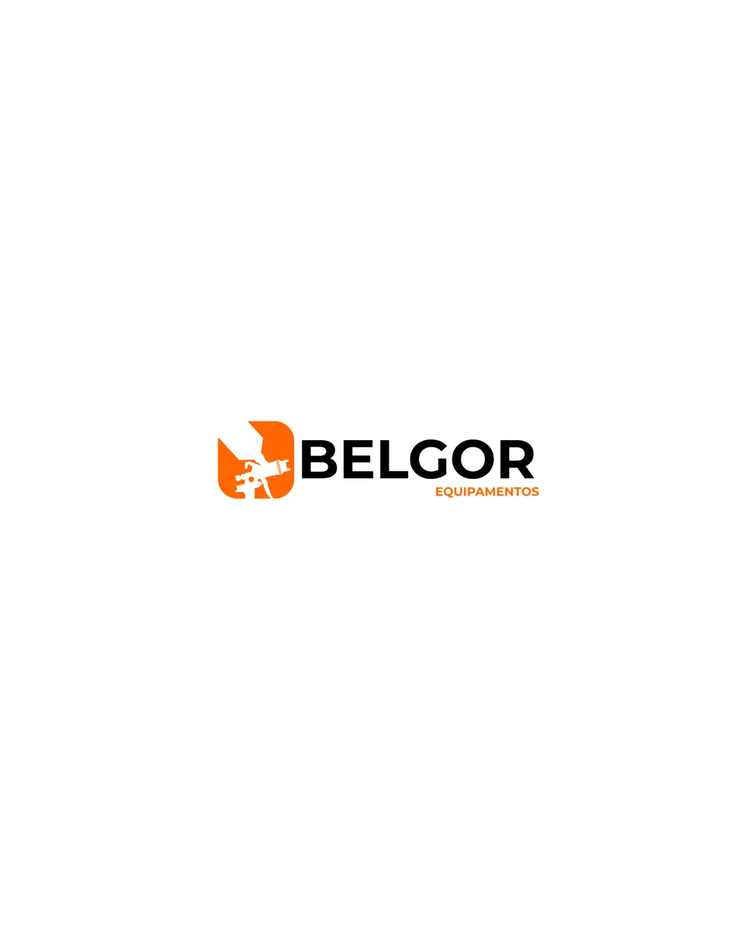
BELGOR EQUIPAMENTOS logo review
3.5/5
Logo score
Logo review of

Belgor Equipamentos

Effective and industry-appropriate, but detail adjustments are needed for optimal performance.

Combination Modern Industrial Ferramentas E Equipamentos Elétricos
4.5/5
Legibility
3/5
Originality
5/5
Misread
3.5/5
Balance
3/5
Scale
Your next steps

What to fix first

Focus on the changes that matter. Keep what makes the logo work.

1

Standalone mark

Test small-scale reproduction and thicken fragile sections if necessary.

Visible issue High priority Medium effort
Area to inspectApproximate location

The spray gun silhouette has thin details and inner negative space that may lose clarity at very small sizes.

How to check

Print at small sizes and inspect for detail loss.

See the category review
2

wordmark/tagline

Increase vertical spacing or adjust tagline alignment for a clearer hierarchy.

Optional refinement Medium priority Low effort

The tagline sits close underneath the wordmark and feels slightly crowded on the right due to length imbalance, reducing clarity and hierarchy.

How to check

Review tagline spacing to ensure comfortable separation.

See the category review
Detailed review

Logo performance breakdown

4/5

Brief & logo match

Based on your brief
Compared with

Equipamentos elétricos e ferramentas de pintura, MIRKA, NAUBER, PDR, DEWALT, STANLEY

Logo reflects paint tools and equipment effectively, but spray gun mark could be more distinctive for category differentiation.

  • Industry Relevance

    Spray gun symbol and strong type directly reference electric equipment and painting tools.

  • Professional Association

    Robust, geometric wordmark supports an established, reliable perception, suiting tool brands.

4.5/5

Legibility

  • Clear, bold primary text
  • Supportive tagline is readable
3/5

Originality

  • Relevant spray gun shape communicates field
  • While the spray gun icon is relevant, its common silhouette style is somewhat generic for the tools category.

    Optional refinement Standalone mark

    Try: Explore subtle tweaks or unique linework to distinguish the mark further.

    Check: Compare with category symbols for greater distinctiveness.

4/5

Color harmony

  • Bold orange and black pairing fits industrial context
Orange#F39219
Black#000000

Estimated colors. Use the original design file for exact values.

Create a full color palette using these colors

Create new palette
3.5/5

Balance alignment

  • Solid mark-to-type alignment
  • The tagline sits close underneath the wordmark and feels slightly crowded on the right due to length imbalance, reducing clarity and hierarchy.

    Optional refinement wordmark/tagline

    Try: Increase vertical spacing or adjust tagline alignment for a clearer hierarchy.

    Check: Review tagline spacing to ensure comfortable separation.

Uploaded logoAlignment guide overlay

Inspect spacing with the guide. Optical balance may differ from geometric centering.

3/5

Scalability

  • Strong primary shape with simple palette
  • The spray gun silhouette has thin details and inner negative space that may lose clarity at very small sizes.

    Visible issue Standalone mark

    Try: Test small-scale reproduction and thicken fragile sections if necessary.

    Check: Print at small sizes and inspect for detail loss.
    Area to inspectApproximate location
Uploaded logo at 200 pixels wide
200 × 250 px
Uploaded logo at 100 pixels wide
100 × 125 px
Uploaded logo at 50 pixels wide
50 × 63 px

Compare the detail at different sizes. Labels show the full image dimensions.

5/5

Misinterpretations

  • No plausible misunderstanding or negative spaces
4/5

Symbol & text fit

  • Mark and type complement the industry focus

Black & white

Does the shape still work without color?

These tests are available only for logos uploaded in vector (SVG) format.

Background contrast

Find the surfaces where your logo stays clear.

These tests are available only for logos uploaded in vector (SVG) format.

Blur & silhouette

A 3px blur softens fine details so you can check whether the overall shape stays recognizable. If key gaps close or elements merge, the logo may rely too heavily on detail.

These tests are available only for logos uploaded in vector (SVG) format.

Try your own review

Wondering how your logo performs?

Get a clear logo score, key risks, and priority fix ideas before your client or audience sees it.

Review my logo