Concept & direction
A modern, rounded wordmark that uses playful curves to reinforce a creative, friendly vibe, especially with the unique treatment of the 'k'.
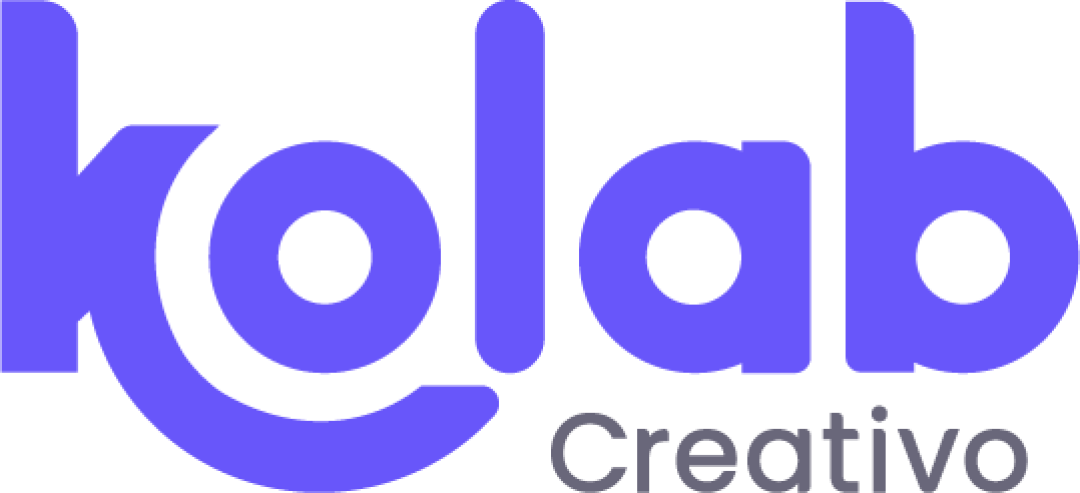
A creative, well-constructed wordmark with a cohesive geometric style; primary attention should be given to tagline weight for optimal balance in all uses.
This logo lockup shows solid execution, supported by text readability and distinctive construction; improving visual balance is the clearest next step.
Focus on the changes that matter. Keep what makes the logo work.
A modern, rounded wordmark that uses playful curves to reinforce a creative, friendly vibe, especially with the unique treatment of the 'k'.
baseline tag
The word 'Creativo' feels slightly underweighted relative to the bold primary wordmark, making the hierarchy clear but visually imbalanced when reduced.
See the category reviewThe logo effectively conveys a creative/design focus with its bold, connected letterforms and friendly geometric styling, though the secondary tagline requires clearer visual balance for universal functionality.
Wordmark 5/5 · Layout 4/5
The extended curved stroke from the 'k' creatively wraps into the 'o', producing a memorable and cohesive visual motif rather than using a generic typeface alone.
Estimated colors. Use the original design file for exact values.
Create a full color palette using these colors
Create new paletteWordmark 4/5 · Layout 4/5
The bold, rounded letter shapes of the main wordmark are likely to scale well, but the lighter tagline may lose clarity at small sizes.
This review includes a score but no supporting explanation for this category.
Wordmark 3/5 · Layout 3/5
The word 'Creativo' feels slightly underweighted relative to the bold primary wordmark, making the hierarchy clear but visually imbalanced when reduced.
Try: Increase the weight or spacing of 'Creativo' for improved visual cohesion, especially at small sizes.

Inspect spacing with the guide. Optical balance may differ from geometric centering.
Get a clear logo score, key risks, and priority fix ideas before your client or audience sees it.
More credits needed
Add credits to continue without losing your work.
Then $7/month. Cancel anytime.
Essential logo review with AI
Estimated progress